Would agree. Battery life and temperature much better and more stable on the 15 Pro.Much better than betas 1-2 though.
Got a tip for us?
Let us know
Become a MacRumors Supporter for $50/year with no ads, ability to filter front page stories, and private forums.
iOS 26 Beta 3 ― Bug Fixes, Changes, and Improvements
- Thread starter Banglazed
- WikiPost WikiPost
- Start date
- Sort by reaction score
You are using an out of date browser. It may not display this or other websites correctly.
You should upgrade or use an alternative browser.
You should upgrade or use an alternative browser.
- Status
- The first post of this thread is a WikiPost and can be edited by anyone with the appropiate permissions. Your edits will be public.
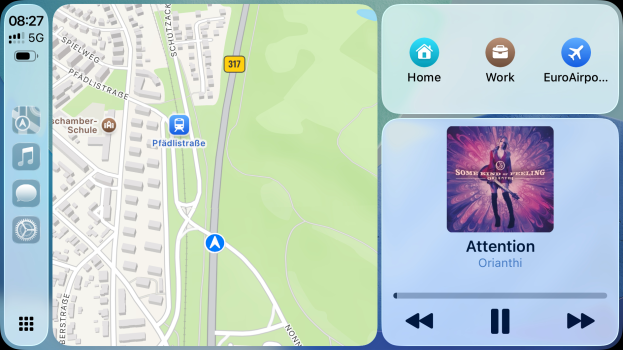
With the new Display Zoom setting turned on, the Now Playing widget on split screen has now returned to the album art being on the side, rather than above the song and artist names (which were previously middle aligned). Huge step back here in my opinion. Song names longer than just 10-12ish characters are now (again!) no longer visible when maps is navigating. And look at all that wasted space below the artist name!View attachment 2527167

no issue here, strange .. OK, my display zoom makes it 'bigger' ...
EDIT:
anyone else doesn't like the mix of dark and light icons on the left navigation bar?
Last edited:
Interesting, now I do too. Took a day until it was visible, strange.iOS 26 Beta 3 I see the percentages and the battery
This fixed almost all of my major issues from the last 15PM update such as:
Unable to create watch face from Photos
90% failed outgoing calls
Lags when on low power mode
SCREENSHOT USING ASSISTIVE TOUCH IS WORKING AGAIN!!
I can now play saved p0rn again the native File video player is working again!
the world is healing ✨
Unable to create watch face from Photos
90% failed outgoing calls
Lags when on low power mode
SCREENSHOT USING ASSISTIVE TOUCH IS WORKING AGAIN!!
I can now play saved p0rn again the native File video player is working again!
the world is healing ✨
It only occurs when you start navigation, as this is when the Now Playing widget shrinks to allow the directions to pop in bigger above it. If you have time, I’d love to see what yours looks like in navigation, as it appears we have similar widths of CarPlay screens. I’m hoping what I’m seeing isn’t the new intended view.View attachment 2527268
no issue here, strange .. OK, my display zoom makes it 'bigger' ...
EDIT:
anyone else doesn't like the mix of dark and light icons on the left navigation bar?
My shortcut which failed to find a string within a string just started working earlier today. Nothing had changed, so that's an odd one.Some of my shortcuts require the phone to be unlocked after running the first step, regardless of what the first and second steps are. Also, one which pattern matches text (an "if" statement checking if a variable contains some text) fails to match regardless of content.
Both the above issues didn't occur before I upgraded yesterday from 18.5. Minor issues. Logged.
Also, keyboard haptics have either turned themselves on, or were so weak before I never noticed them. I've turned them off.
As for the shortcuts which are now asking me to unlock my phone, they all use an app called Telefant. The command that Telefant runs (it sends commands to my Logitech harmony remote hub) works, and then must do something that now requires the phone to be unlocked.
I tested this by creating a shortcut with only one action (send "mute" to my AVR). It sent the command and then froze, asking me to unlock the phone. Weird. Hopefully it'll get fixed either by Apple or Telefant at some point.
Anyone else having issues deleting messages. When I go into recently deleted and try to delete it don’t do anything. It started with beta 3. I have reported it
No issues here in this regardAnyone else having issues deleting messages. When I go into recently deleted and try to delete it don’t do anything. It started with beta 3. I have reported it
Just noticed the same today. They def have some work to do.In phone app unified look. The search bar still bugs out for me. Can’t click in the box at first. I have to go back out to the call, contact or dial pad that’s circled just left of the bar. Then hit the search icon again and then it can actually search with flashing blue cursor. If phone app stays open, it sticks/stays per to search. If cleared out from app switcher. The cycle starts all over from the beginning.
And I thought I was giving away too much personal info when sharing my screenshots but you take the cake, sir.This fixed almost all of my major issues from the last 15PM update such as:
Unable to create watch face from Photos
90% failed outgoing calls
Lags when on low power mode
SCREENSHOT USING ASSISTIVE TOUCH IS WORKING AGAIN!!
I can now play saved p0rn again the native File video player is working again!
the world is healing ✨
Could have said literally any downloaded video plays fine but no, you went the extra mile 🤣🫡
I hope there will be a way to remove the frosted glass outer edge (I know there won't be). This has borked my clear widgets.
Mine too. I reported it in the Feedback app. Explained how it messed up transparent widgets. I don't like the line around the dock either.
Where are you guys talking about? This is on unified view.. search button is always to the right
EDIT: sorry, just noticed on classic view there is no search option. I still have it in contacts app but not on phone while using classic mode. I prefer unified anyways
View attachment 2527225
It’s there but go try using it
Seems like the search here is not working quite as it should.
Also, the annoying Safari cut off is still present.

Also, the annoying Safari cut off is still present.
Anyone else thinking apple doing liquid glass was a mistake? I know it’s beta 3 now and some areas getting better but it just looks a mess
Doesn’t look a mess to me at all and I’m enjoying the changes. This is the first time I’ve used dark icons because they look so much better with that little shine. Gives a little contrast and fixes how they looked much smaller compared to the normal ones.Anyone else thinking apple doing liquid glass was a mistake? I know it’s beta 3 now and some areas getting better but it just looks a mess
It’s fine for me. If I search a contact, if I recently called them it shows at the top for recents. And then I scroll down to the bottom and it shows just contacts.It’s there but go try using it
Not perfect behavior though so I’m sure it’ll be fixed
Does anybody feel like their “Adaptive” power toggle is working as intended?
Feels like it only kills my apps from background a bit faster and frequent
Feels like it only kills my apps from background a bit faster and frequent
Same here. 1st time I've used dark and like it. Even the normal icons look better to me. I'll never touch the clear icons. Kills the visual area in my mind.Doesn’t look a mess to me at all and I’m enjoying the changes. This is the first time I’ve used dark icons because they look so much better with that little shine. Gives a little contrast and fixes how they looked much smaller compared to the normal ones.
Def like the new features of CarPlay.
Like the new features with Phone like Live Detect Call Waiting and Screen Incoming Calls. Before, I'd panic when I was waiting for a call from a doctor, etc due to possibly not having all their numbers in my phone. As long as they start to leave a voice mail, I can grab the call.
New camera options/access is cool as well.
Actually loving the adjustments to the mail categories colors too


I prefer Liquid Glass to frosted glass. Hope they don’t just keep turning it down.
Trying the call hold feature for the first time… let’s see how this goes
Edit: I was never notified to pick up, and ultimately got hung up on
Edit: I was never notified to pick up, and ultimately got hung up on
Register on MacRumors! This sidebar will go away, and you'll see fewer ads.


