Got a tip for us?
Let us know
Become a MacRumors Supporter for $50/year with no ads, ability to filter front page stories, and private forums.
iOS 26 Features: The Ultimate Mega Guide
- Thread starter MacRumors
- Start date
- Sort by reaction score
You are using an out of date browser. It may not display this or other websites correctly.
You should upgrade or use an alternative browser.
You should upgrade or use an alternative browser.
Pedersenko
macrumors member
I’ve updated my Mac yesterday. My strong advice- don’t do it.I was actually excited for this update, it really grew on me over the month, seeing it in videos and screenshots.
After installing it yesterday I was shocked how little I like it on my iPhone 15. Maybe it feels better with higher refresh rate but it really looks like a cheap theme/skin and very unlike Apple to my eyes. I might be losing touch to what a new generation of designers likes. I don't know.
All I can say is that the first thing I did was going to accessibility and reducing the transparency and also changing that awful liquid clock on my lockscreen back to the regular one.
And that's beside all the many many glitches and inconsistencies that are still visible in the UI literally everywhere for me which just adds the cherry on top. I'll hold out updating MacOS as long as anyhow possible. This is hoping for some meaningful improvement in the future as I was really excited about the changes.
This roundy edges will make you sick
Also, little di you jnow - but old good launcher - is gone

Pedersenko
macrumors member
Try it and you shall seeI'm not saying that the poor readability was widely known and was also shown in every second MacRumors article with promotional images.
But the same ten hardcore fans flooded the comments to sow doubt about the facts.
You will be “impressed “. Guaranteed
🤬
Pedersenko
macrumors member
Absolutely agreeIt’s a pointless update that appears to achieve nothing but cause issues. The glass effect is a wasteful distracting gimmick and overall has made it feel more like a kids toy. I actually struggle to have anything positive to say about all this.
Plus keyboard- feela far worse. I make so many typos now (aa never before).
This was absolutely pointless, fully agree with you
Pedersenko
macrumors member
Wow, happy for you mate.So far I really like 26, on all of my Apple devices. I use all of them in dark mode, and the windows really pop now. The text is much clearer. For me, the Liquid Glass effect is subtle and pleasing.
I will cancel by iphone 17 order in the next few minutes
akb
macrumors regular
Could barely read my lock screen notifications while bleary-eyed this morning.
This UI is a step backwards.
This UI is a step backwards.
Sakurambo-kun
macrumors 6502a
I was very sceptical of this liquid glass thing when I first saw the screenshots, but I ignored it, assuming it would be fixed. And yet here we are, and my goodness it's truly hideous. The white "glow" around every icon on the home screen is the ugliest aspect, it looks like the return of skeumorphism by way of Windows Vista. It's genuinely unpleasant and makes the phone look cheap and very dated.
I can't stand the new UI - thinking of going back to previous version or even migrating to something completely different. The only thing that keeps me in Apple is the data and metadata stored (photos, messages etc). But honestly, what a crap Apple! HOW CRINGE! The core of Apple has always been simplicity and human approach. These are just gimmicks and marketing crap. No thinking. No ideas. No clear vision. Bottom line: no guts anymore.
Came to point out this very thing. I still believe that the design will mature over time, and like with iOS 7, one year from now the old OS will look dated. But this glare around the icons look like a TV in Dynamic mode, with sharpness cranked way too high. It feels… Android-y. Apple is usually so good at feeling organic instead of techy. This is a step in the wrong direction. I cling to my hope that it will be dialed back over time.I was very sceptical of this liquid glass thing when I first saw the screenshots, but I ignored it, assuming it would be fixed. And yet here we are, and my goodness it's truly hideous. The white "glow" around every icon on the home screen is the ugliest aspect, it looks like the return of skeumorphism by way of Windows Vista. It's genuinely unpleasant and makes the phone look cheap and very dated.
(Have not updated iPad and Mac yet - my watch doesn’t look much different)
akbarali.ch
macrumors 6502a
i feel nice about the update, i like the glass effect, i wish it could have more transparency and bit more contrast. or atleast a slider to play around with. its just makes the screen much larger.
Though the all clear icon style (introduced earlier) is pointless and useless, colorful icons are really important to identify them quickly, i tried using all-clear style, but in flat 3 seconds i can know that it just doesn't work for me. all icons having same shades, infact the entire screen becomes just washed. who would want that?
Though the all clear icon style (introduced earlier) is pointless and useless, colorful icons are really important to identify them quickly, i tried using all-clear style, but in flat 3 seconds i can know that it just doesn't work for me. all icons having same shades, infact the entire screen becomes just washed. who would want that?
CATiNTHESTORE
Suspended
emulator
Suspended
But it goes so nicely with the new toy colors.Krikey…this new OS looks so cartoonish. It all looks like a kid’s toy now
I absolutely HATE iOS now, it feels cheap and like my phone has slowed down way too much, the animations are too long and pronounced, launching things feels sluggish and slow. Hate it.
Don't do it. I just did and Liquid Glass is horrible. Even with 'reduce transparency' on in accessibility, it's one of the worst UI designs I've ever used.Still not sure whether I should install macOS 26
AppleFanBoyForever
macrumors member
12 pro max no issues. New glass OS has my thumbs up.👍
For the last several months, MacRumors has been working on a series of in-depth feature guides and how tos that walk you through the design changes and updates in Apple's new software.
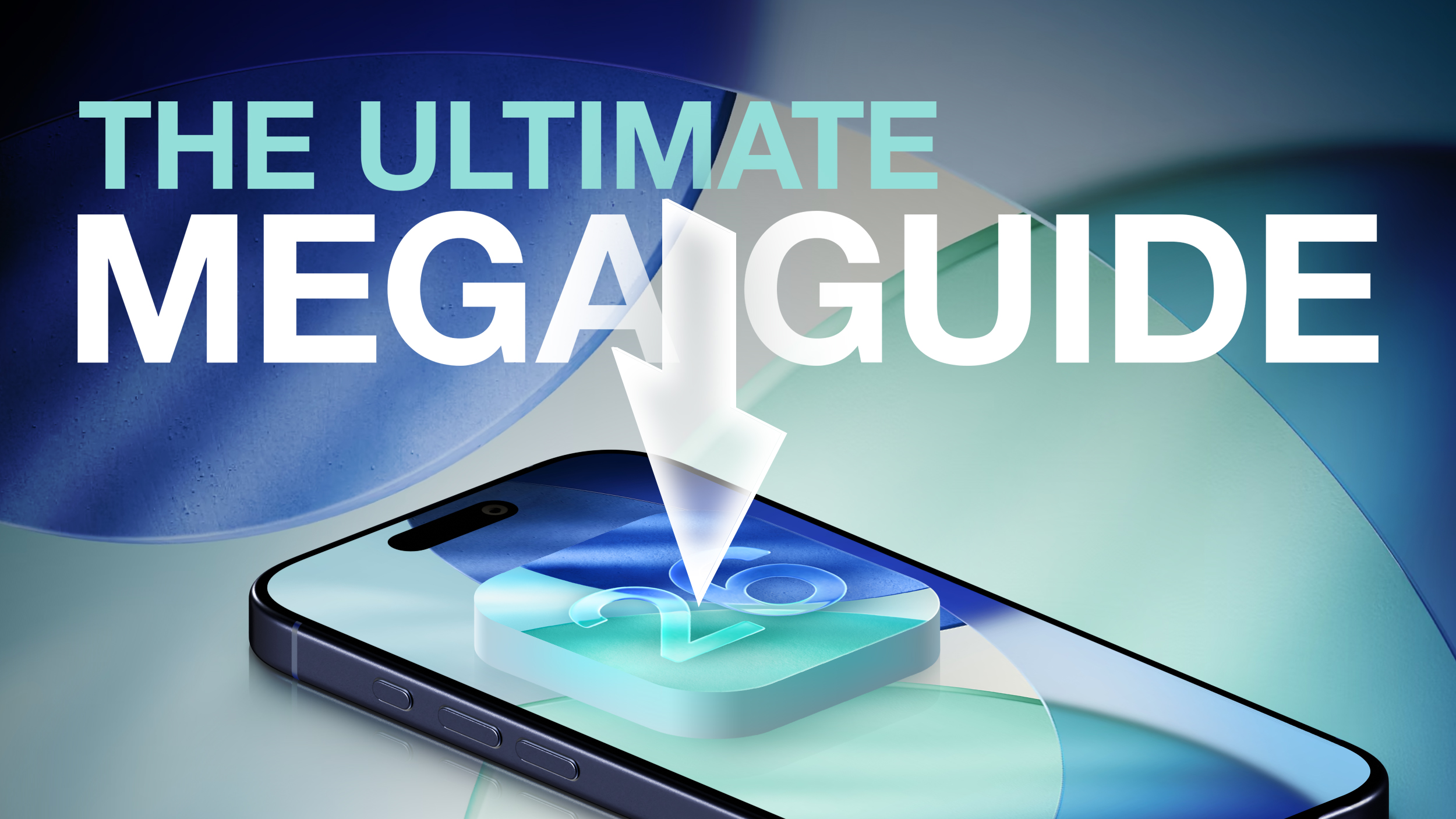
Our ultimate guide includes all of our iOS 26 coverage, and it is a useful resource for iPhone and iPad users who haven't had a chance to test out iOS 26, or those who might want a recap on what's new. We've organized it by app or feature to make it easy to find what you're looking for.
Liquid Glass
Apple's Liquid Glass design brings a big visual change to iOS 26. Icons, apps, menu bars, navigation bars, and all other interface elements feature a Liquid Glass aesthetic. It's not just translucency that you have to deal with. There are pop out menus, collapsing navigation bars, and a much more rounded aesthetic.
- iOS 26: Everything You Need to Know About the Liquid Glass Redesign
- How to Reduce Transparency of Apple's Liquid Glass
Lock Screen
The Lock Screen clock has embraced Liquid Glass in a big way, and there are also new options for wallpaper and widgets.
- iOS 26: New Lock Screen Features
- How to Change iPhone Clock to Liquid Glass
- Turn Lock Screen Photos Into 3D Spatial Scenes
Home Screen
A new design means a new Home Screen, and there are new features for icons, widgets, and wallpapers.
- iOS 26: What's Changed With the iPhone's Home Screen
- Make App Icons Clear on Your iPhone Home Screen
- How to Add Web Apps or Bookmarks to iPhone Home Screen
Apple Intelligence
Apple is still recovering from the Apple Intelligence Siri delay and the company didn't make a major deal about Apple Intelligence features in iOS 26, but there are quite a few additions.
Live Translation auto translates messages and calls, Visual Intelligence now works with what's on your screen, the Wallet app can track all of your purchases, and there are other small additions to be aware of.
All of the Apple Intelligence features require a device that supports Apple Intelligence, which includes the iPhone 15 Pro, iPhone 15 Pro Max, all iPhone 16 models, and all iPhone 17 models.
- All of the New Apple Intelligence Features in iOS 26
- Here's What's New With Visual Intelligence in iOS 26
- iOS 26 Brings Major Changes to Image Playground
Messages
There are a bunch of new features in the Messages app, including the option to set custom backgrounds for each chat. Be warned, other people see the background that you set. Group chats support typing indicators and other features, and you can add polls to chats.
- iOS 26: Every Change to the Messages App
- How to Create Polls in Messages
- How to Selectively Copy Text Within a Message
- Add Custom Backgrounds to Messages Conversations
- Remove Custom Backgrounds in Messages Conversations
Phone
Some of the biggest changes in iOS 26 are to the Phone app. There's a whole Call Screening feature that can screen calls from unknown numbers, and a tool that'll wait for you when you're on hold.
- iOS 26: 10+ Features Coming to the Phone App
- How to Get a Callback Reminder for a Missed Call
- Set a Custom iPhone Ringtone in Seconds
- iOS 26: Here's What You Can Do With Apple's New Games App
AirPods
With an accompanying firmware update, the AirPods Pro 2, AirPods Pro 3, and AirPods 4 support Live Translation for in-person conversations, plus there are options like pausing audio when you fall asleep and using the AirPods as a remote for the iPhone's Camera app.
- All the new AirPods Features in iOS 26
- Auto-Pause AirPods Audio When You Fall Asleep
- Remotely Control iPhone Camera With Your AirPods
Safari
Safari has an updated layout, a Liquid Glass design, tab bar changes, new privacy features, and more.
- Safari in iOS 26: Everything New From Design to Privacy
- Restore Safari's Old Layout From iOS 18
- How to Add Web Apps or Bookmarks to iPhone Home Screen
Apple Maps
The Maps app can learn your preferred route for your commute and alert you if there's anything that's going to make you late. It's also able to save your location history so you can remember your favorite locations when you travel.
Notes and Reminders
The Reminders app has some hidden Apple Intelligence features included, while the Notes app supports 3... Click here to read rest of article
Article Link: iOS 26 Features: The Ultimate Mega Guide

LeMo
macrumors regular
I suspect I will wipe my iPad and iPhone soon, system data is at 22Gb and 14Gb. Which on the phone bothers me less but I'd like to use the space on my smaller capacity iPad.
UI is a bit <meh>, I still have AI off since there is nothing compelling about it. Some aspects of iPadOS are better, more suited to the capabilities of the hardware but the ringing in the glass icons is a bit mental. I also feel the icons for my Apps look all a bit completely random and identity-less - the colour changes are so bold that it shouts at me, I preferred a flatter calmer look.
I assume by 26.1 it will *settle". I expect 26.01 by end of next week anyway, it's the law 😀 😀
The_Auryn
macrumors regular
25 years ago, Apple's Aqua UI was exciting. We had seen nothing like it before. It wasn't without it's critics (no big change is), but with such a revolutionary new OS (Mac OS X), the timing was perfect and I couldn't wait to have those lickable water-drop buttons pop out of my screen.
I wish Apple would allow us to choose our own interface. For those who want liquid glass, fine. I'd love a switch where I could instantly go back to Aqua or brushed steel.
The_Auryn
macrumors regular
Staying away, as always, until version 26.3.1. I'm not a beta userAll I’m reading is there’s bugs, bad performance, etc. Seems best to steer clear of iOS 26 for now…Well done, Tim and software team! Bravo! 👏
The_Auryn
macrumors regular
Is there a way to turn it off?I hate the transparency on the keyboard and taskbar. It’s way to distracting.
it's there on my iphone 14pro , at least it's somewhere as i do recall seeing that option. but now i can't find it so maybe it was in ios 18 and gone in ios 26Tap recents to call Feature to toggle on and off is missing on my iphone se 3rd generation phone. Its suppose to be under settings>app>phone and youre supposed to toggle it on or off. The whole feature is missing
Ahh ha!!!
go into Phone, turn ON unified view (top right ... button) then go back to settings, apps, phone and the option re appears. This is enough to make me use unified view since i do not like the call to start when i touch the name so i have it disabled.
Last edited:
emulator
Suspended
Exactly what we'd expect from a forever fanboy. 😄😁😆12 pro max no issues. New glass OS has my thumbs up.👍
I use SwiftKey but I know some people won't touch it for being owned by Microsoft.Is there a way to turn it off?
Last edited:
cicalinarrot
macrumors 65816
Ultimate form-over-function upgrade.
Some text is harder to read, some menus are just poorly realised and/or bugged (try the quick bluetooth device selector), all is less clean.
Slower on my iPhone 13, of course.
General feeling of a first public beta.
All of this to get a "cool" new look that I really don't like. Feels like iOS 1.
Some text is harder to read, some menus are just poorly realised and/or bugged (try the quick bluetooth device selector), all is less clean.
Slower on my iPhone 13, of course.
General feeling of a first public beta.
All of this to get a "cool" new look that I really don't like. Feels like iOS 1.