Become a MacRumors Supporter for $50/year with no ads, ability to filter front page stories, and private forums.
People complaining of lag…it’s a Beta. If you’re in the Beta program file a bug report. As far as the lessening of the “Liquid Glass” look? Well, it is better for legibility and recognition as opposed to Betas 1 & 2. Good function should always come before good aesthetics.

I don’t know why Apple couldn’t have a slider in Settings > Display & Brightness to adjust the Liquid Glass opacity to one’s own taste. Perhaps Beta 3 is gauging sentiment between the extremes so as to set a slider limit from more “Liquid Glass” effect to less like we see now in Beta 3.
 
  • Like
Reactions: Moonlight
Being truly transparent 'glass' only works if the background is VERY simple. A complex background such as many photos causes way too much 'noise' in the controls that hover above it forcing you to stare an extra second or more to be sure which control you need. There are multiple, subtle ways to fix that problem and I suspect they still haven't arrived at the final answer. I suspect part of the final answer will be a setting to let the user make the adjustment that suits them.
For starter, they could make icons non-transparent (cuz they aren't). And they could add a very tiny more opaque layer just around them, without impacting the whole "glass" area they are encompassed in.
 
What a downgrade. And beta 3 is far more laggy than beta 2.
I think beta 3 is less laggy then the last 2 from my experience maybe liquid glass is just to much for their hardware but i also liked beta 1 look but was so laggy i couldnt stand it
 
I think beta 3 is less laggy then the last 2 from my experience maybe liquid glass is just to much for their hardware but i also liked beta 1 look but was so laggy i couldnt stand it

Sounds like many people will need to buy new iPhones & iPads!

1752079957946.png
 
Sounds like many people will need to buy new iPhones & iPads!
I said as much in a mac thread, in how performance was really bad, and I was shouted down with many people saying its a beta, and the GUI has no impact on the CPU/GPU. I suspect the more visual eye candy added will indeed have a cost to pay, in terms of computing power.
 
Liquid Glass may have been the wrong solution to the long-missing element of depth.
Aqua for Mac OS and iOS worked well because it communicated depth through texture and shadows without sacrificing legibility. UI elements were clearly separated from content, and that separation was totally lost in the jump to flat design.
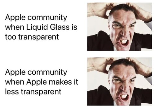
There's no happy medium with Liquid Glass – legibility will be poor if it's too transparent, but if it's too opaque it'll feel just as flat as the very bland design it was meant to replace.
 
Last edited:
I think the glass may have been the wrong solution to the thing that's been long missing: depth.
Aqua for Mac OS and iOS worked well because it communicated depth through texture and shadows without sacrificing legibility.
There's no happy medium with Liquid Glass – if it's too transparent legibility will be poor, but if it's too opaque it'll feel just as flat as the very bland design it was meant to replace.

You've hit it right on the head.
The LG concept is flawed from the get go, I'm afraid.
 
For what it's worth I am in the design industry, and I am just flabbergasted at how the original state of Liquid Glass was passed and presented to millions of people, and ONLY NOW they see issues and make drastic changes. It doesn't take user feedback to realize it's legibility flaws.

It now leads me to believe that this entire iOS redesign was rushed and half-baked, and that animations were the priority. For a large company this is not the feeling I should have about their design process. They should want to be known for careful planning and innovation... scary times for Apple.

This is what happens when management tells them "We need something shiny and new to wow people during the keynote!" and the designers try to push back but it's useless and so they just wait for the inevitable criticism and then the management caves and lets them do it properly. As designers, legibility is always a top priority. I doubt this is any different at Apple, and all of this stupidity came from the top because they want to distract from their recent AI blunders. And yet all it did was make them look even dumber.
 
For what it's worth I am in the design industry, and I am just flabbergasted at how the original state of Liquid Glass was passed and presented to millions of people, and ONLY NOW they see issues and make drastic changes. It doesn't take user feedback to realize it's legibility flaws.

It now leads me to believe that this entire iOS redesign was rushed and half-baked, and that animations were the priority. For a large company this is not the feeling I should have about their design process. They should want to be known for careful planning and innovation... scary times for Apple.

"Scary times" is making iterative tweaks to UI during Beta? lol
Don't be the chicken little of the design industry.

And what exactly do you do in the design industry that gives you this prognosticating ability?
 
  • Disagree
Reactions: freedomlinux
The truth is, liquid glass is the least of this system's problems. The bigger problem is that this system is poorly designed. The image from Music.app, posted many times here, shows how much space these strange bubbles take up, providing nothing in return, unless smaller fonts are a benefit. And this is repeated in the Mac Finder and many other applications. I understand that the system might not work, and that's fine. The number of applications is so large that they can't check everything, but this? Didn't anyone tell Alan it didn't work? They had plenty of time and a few system apps that should have been the showcase for the change.
 
  • Like
Reactions: 123 and TheHeron
Apple is dropping Liquid Glass, replacing it with Frosted Glass.
Another broken promise, Apple Intelligence never delivered and now Liquid Glass reverted back to Frosted Transparency all them years and nothing to show, just all hype.

Apple was never a company to hype and advertise something that wasn't out now they do is Apple coming to an end is the future Android and Windows 12 with liquid glass elements that Apple failed on.
 
Probably because it would look awful. Drop shadows are generally a not a good solution. Not to mention having a shadow over translucent glass makes no sense from a design or material perspective.
I was thinking about how Aero Glass handles text over the glass element. It doesn't look that bad to me. Besides, at least to me the glass design that was in DP1 was closer to transparent than translucent. (the effect looks like some object taped over a clear glass window, and the object would be clear and sharp, while the the background is blurry because the eye is focusing on the closer object on glass)

Classic Aqua (Mac OS X 10.0-10.9) and iOS 1-6 also employed plenty of drop shadows and they were fine.
 
I was thinking about how Aero Glass handles text over the glass element. It doesn't look that bad to me. Besides, at least to me the glass design that was in DP1 was closer to transparent than translucent. (the effect looks like some object taped over a clear glass window, and the object would be clear and sharp, while the the background is blurry because the eye is focusing on the closer object on glass)
Are you meaning something like this?
Screenshot 2025-07-10 at 11.42.56.png


If not, would you be able to share an example or two so that I can get a better understanding of what you mean?
 
yes. The white shadow below the text makes them more readable over the glass element
Honestly, that’s still just a version of the frosting essentially. I feel like it would be weird to have that in the middle of a button when, then immediately go to the blurry translucent glass, and then immediately after that is the shiny outer rim of the button. In title bars it works a little better since there’s a lot of room on either side of the text.

But all that said, I’m not a designer, so maybe they could make it work. I just know that from my many years working with designers, they always tried to avoid using dropshadows like that unless there was no other solution.
 
  • Like
Reactions: platinumaqua
How to fix it:

View attachment 2527184

Not even joking. Everything after iOS 6 has been AWFUL.
how odd to want a return to this version of iOS where the AppStore was even more tightly controlled and no game emulators allowed... after all you "hate" and "thumbs down" on any post saying the EU forcing Apple to open up iOS to alt app stores and payments...

you cant have it both ways ;)
 
Register on MacRumors! This sidebar will go away, and you'll see fewer ads.