The Photos app was redesigned in iOS 18, and in iOS 26, Apple has adjusted some of those original design changes and update the navigation. iOS 26 also includes new 3D image features and a few other useful updates.
Navigation
In iOS 18, Apple introduced a unified Photos app view that did away with tabs. The Tab bar is back in iOS 26, with buttons to swap between the newly separated Library and Collections sections in the Photos app.
Apple also added a separate Search button that's at the bottom of the Photos app, relocating it from the top.
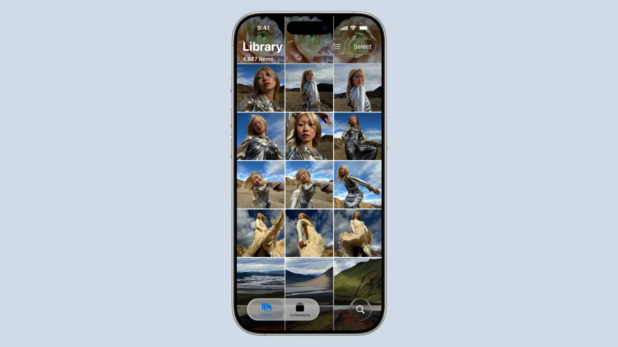
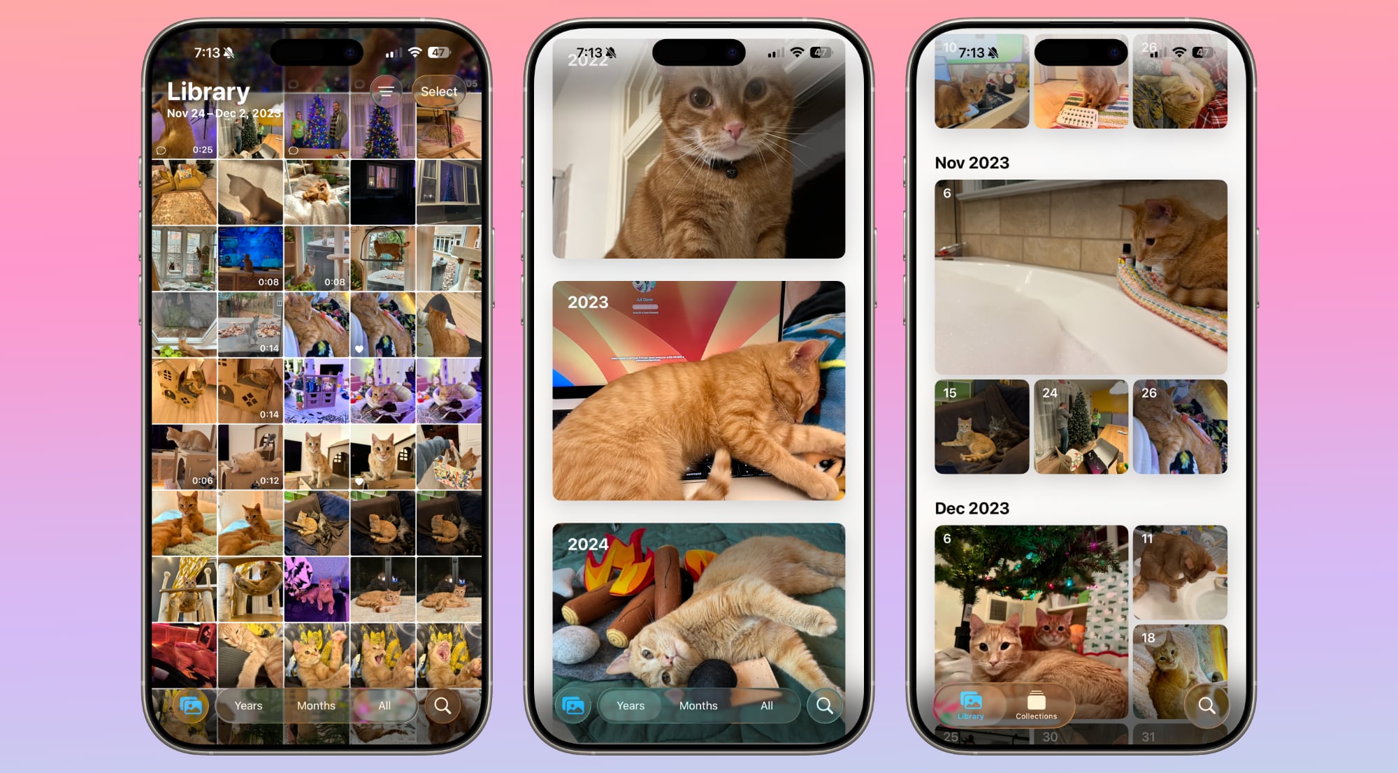
The Library view offers an overview of all the images and screenshots that you've taken, much like the iOS 17 Photos app. There is a larger Select button at the top of the Photos interface, along with a clearly visible button for accessing filters and view options for zooming in, zooming out, and excluding things like screenshots and Shared With You images.
Filters were available in iOS 18, but the button was hidden unless you started scrolling through the Photos Library, which could be confusing. The new layout makes it easier to find all of the different options in the Photos app.
Scrolling in the Library View continues to bring up the options to swap to Years and Months, with buttons for returning to the tab bar or launching a search.
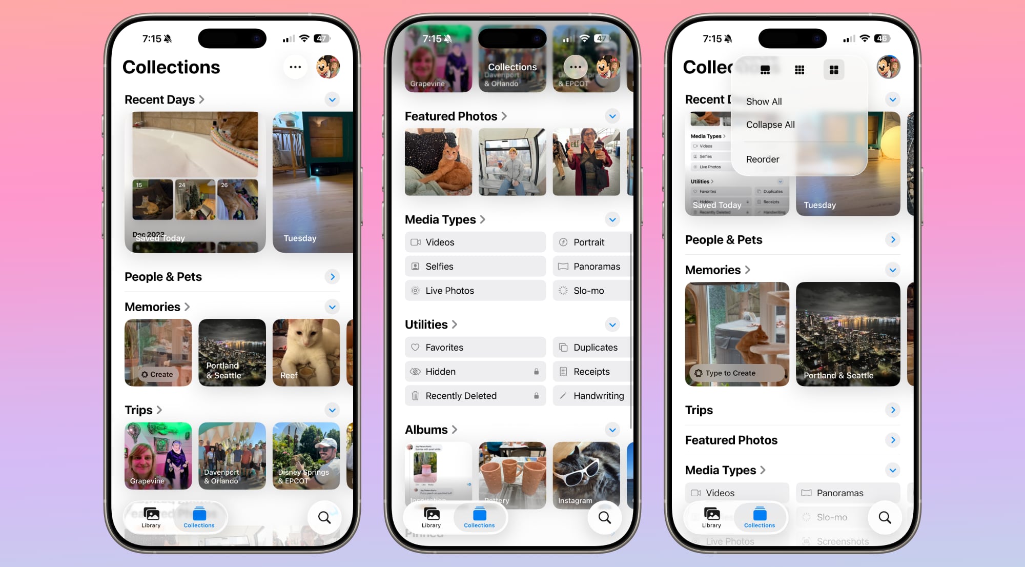
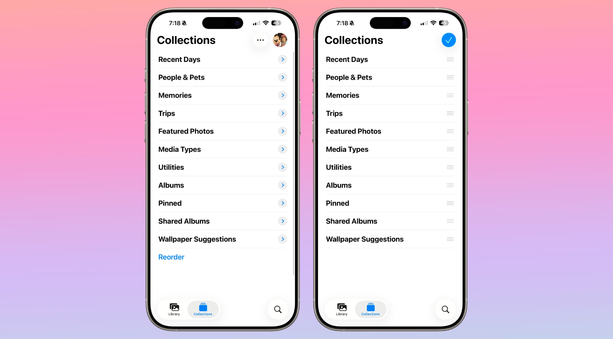
In the Collections tab, you'll see all of the different viewing options that used to be included in the unified view. Recent Days is at the top of the app, along with dedicated views like People and Pets, Pinned, Memories, Trips, Albums, and Featured Photos.
The dedicated view means you can see more of your Collections on one screen. The Media Types and Utilities sections under Collections have larger, more distinct buttons that make it clearer you can swipe or tap to get to more options.
Liquid Glass Design
As with all iOS 26 apps, Photos has a Liquid Glass redesign. It's one of the apps where the Liquid Glass look is the most noticeable.
The two-button tab bar uses translucency to show the photos that are behind it, and when it expands into the larger navigation bar that has options for months and years, it remains clear. With the more transparent look, focus is on the photos while buttons fade into the background.
The tab bar, the search button, the select button, and other buttons in the Photos app have the same translucency, and use the more rounded look that Apple adopted this year.
Spatial Scenes
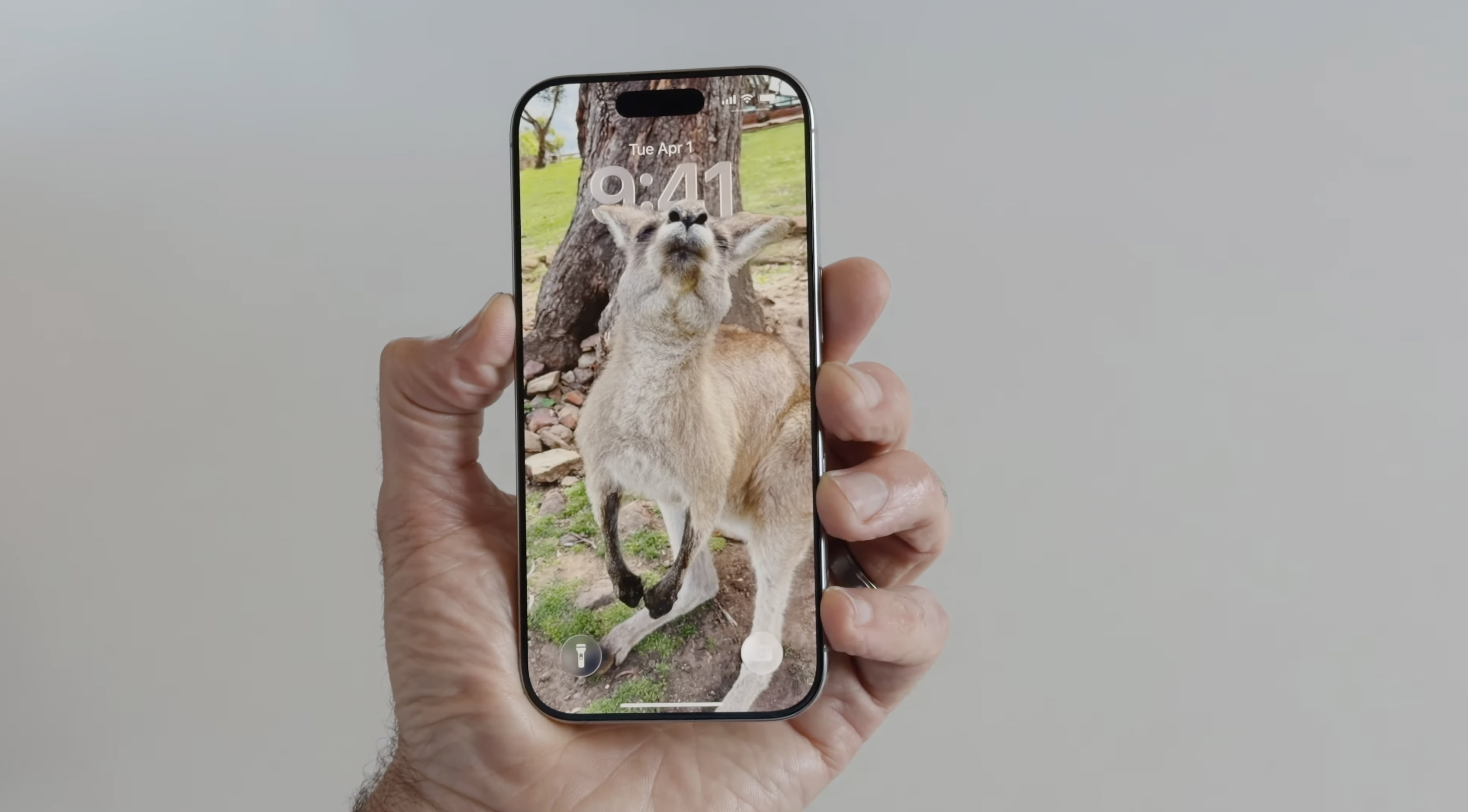
iOS 26 includes a Spatial Scenes feature that adds extra depth and realism to any image. It separates the subject from the background, introducing slight motion when you move your phone back and forth.
Spatial Scenes works with all photos, even those that have been in your Photo Library for years.
To use Spatial Scenes in the Photos app, tap into an image and tap on the small hexagon icon on the upper right side of the display. Once enabled, if you move your phone, you will see the depth effect.
Spatial Scenes uses generative AI to add depth to flat images, but it does not require Apple Intelligence. The feature is available on the iPhone 12 and newer.
Collections Customization
There's a more noticeable Reorder button in the Collections section, making easier to see that you can rearrange what you see. You can still grab and drag to reorder, but there is no longer an option to exclude certain types of collections.
Collections can be collapsed down until you tap into them, which is a new interface option. When collapsed, you'll only see the name of the collection rather than a thumbnail preview of what it includes.
There's a quick access interface option at the top where you can collapse all collections, show all collections, reorder, or choose a different view.
You can see collections in a view that makes the top collection thumbnails larger than the others, a view with all larger thumbnails, or a view with all smaller thumbnails.
Read More
We have a
dedicated iOS 26 roundup that goes into detail on all of the new features that are available in the update.
Article Link:
iOS 26 Photos App: Everything That's Changed