I will praying for you sirThe new liquid glass design is fantastic. Phone app is also getting a lot of changes. iPad files app is also much better. Will try out everything soon.
Got a tip for us?
Let us know
Become a MacRumors Supporter for $50/year with no ads, ability to filter front page stories, and private forums.
iOS 26: The Top 100 New Features and Changes
- Thread starter MacRumors
- Start date
- Sort by reaction score
You are using an out of date browser. It may not display this or other websites correctly.
You should upgrade or use an alternative browser.
You should upgrade or use an alternative browser.
So far, the only thing I don't like about the new OS are notifications on the lock screen. I'm older and wear reading glasses, but my vision is good enough that when I casually get a notification I could glance over and read it without glasses. That's now a bit harder. with the transparency
Do yourself a favour:
Settings > Accessibility > Display & Text Size > Reduce Transparency
Also:
Settings > Accessibility > Motion > Reduce Motion
The ugly lines around everything remain, but all of the search bars/folder backgrounds on the home screen are just blurred, mostly opaque backgrounds now that are much closer to iOS18.
Also:
Press and hold the lock screen > Customize > Click the clock > change from Glass to Solid > click Done in the top right.
This is the best I've been able to do. Unfortunately, reducing motion in this version creates a clunky cross-fade when you try to swipe up and switch apps which it did not do in iOS18, I don't know why that changed, it was one of the few animations that actually made sense and aligned with the action you're performing.
Also, all of these changes should slightly improve battery life.
there is no chance Alan Dye and his team of "designers" won't get fired over this fiasco, right?
This iOS version is extremely buggy and unstable. I’m on an iPhone 16 Pro, and I honestly can’t believe Apple released it in this state. I’ve never experienced such an unfinished product before. This is a product going downhill and it's noticeable that Apple has stopped focusing on their products and more how to be a bank. Also the first thing I immediately want to do is to TURN EVERY NEW FEATURE OFF!!!!
- The phone CRASHES and reboots when trying to send an image via iMessage.
- iMessage conversations occasionally take up to a 30 seconds to load.
- Countless smaller bugs make the entire experience frustrating and unreliable.
Last edited:
iOS26 really is that bad. I'll take delivery of my iPhone 17 on Friday but will return it within the 14-day window unless Apple do something about this s-show.
I searched around and can't find clear answer but has the dictation engine been improved? So far I think maybe but wondering. It's highly useful real value generating features like this that I care more about than whatever trendy lipstick (but bad UX veneer) they slap onto the UI.
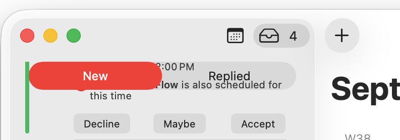
Hey editors, can you start of thread of major problems with 26? Like this UX nightmare in Calendar (and elsewhere), with reduce transparency on. Apple has set back its UX in a horrible way. Apple's core long standing user base has told them all the way: don't do this, it sucks. Yet here we are. Apple Design leadership seems to be asleep at the wheel, or there's no psychological safety for any of the excellent UX design staff to speak up, as anti-UX work like "glass" would have never happened if authentic radical candor was encouraged.
Attachments
Love the new design and UX. Always funny to see how much hate any change gets lol. People also want previous bad design choices back because they got used to them
Is it possible to move the search bar back to the top? If not I am def downgrading. Ughhhh
Apple released iOS 26 on September 15, and it's now available for all iPhone users with a compatible device. There are a lot of changes and features to learn about, so if you want a quick, easy-to-read list that outlines what's new, we've got you covered.

Design
Apple Intelligence
- Liquid Glass design that reflects light and refracts what's underneath. It's system wide, with dynamic tab bars and toolbars that morph to provide more tools or let you view more of what's on the screen.
- There are new animations for when accessing the Control Center, Lock Screen, and more.
- Buttons, sliders, switches, and other controls have new animations and a reflective Liquid Glass look.
- App icons have a layered glass look, plus there's an option for clear glass-like icons.
- The Time on the Lock Screen adapts to iPhone wallpaper and notifications, and you can make it larger or smaller.
- Buttons, the keyboard, menus, navigation bars, and other UI elements have a more rounded look.
Visual Intelligence
- Live Translation available for calls and texts in Messages, FaceTime, and Phone.
- In-person Live Translation with AirPods 4, AirPods Pro 2, and AirPods Pro 3.
- Two or more emoji can be mixed together to create a new emoji.
- Customize Genmoji based on people with expressions that show emotion like happy, sad, and more.
- You can change the hairstyle of Genmoji created based on people from your Photos Library.
- Customize Image Playground creations with expressions and emotion using emoji.
- Generate images in any style using ChatGPT.
- When you ask Siri for help with a device, Siri knows on-screen and on-device context, such as settings, model, and software.
- Siri can take action on responses from ChatGPT, such as playing a song in Apple Music when you ask ChatGPT for recommendations.
- The Siri ChatGPT integration feature now uses GPT-5 instead of GPT-4.
Music
- Ask questions about what's on your screen, from finding products to figuring out what you're looking at. It uses the screenshot interface.
- Summarize, read aloud, or translate text on your screen.
- Add an event to your Calendar from your screen.
- Visual Intelligence can identify more types of objects, including art, books, landmarks, and sculptures.
Safari
- AutoMix can smoothly transition from one song to the next using time stretching and beat matching. Apple says it's like a DJ in your pocket.
- Your favorite albums, songs, and playlists can be pinned to the top of the Music app.
- Playlists can be organized into Folders directly on the iPhone.
- You can get monthly replay insights rather than just a yearly report.
- There are Translation and Pronunciation guides for lyrics.
- When you AirPlay audio to a HomePod, everyone else in your house can see what's playing, control the music, and change which HomePod speakers are playing.
- The iPhone works as a microphone for karaoke on the Apple TV.
Camera
- Any website can be added to the Home Screen as a web app and will open as a web app.
- New Compact design option for tab bar, but Bottom and Top remain available.
- Advanced Fingerprinting Protection now automatically obscures browser and device data in all browsing modes.
Photos
- Simplified two-button navigation.
- Panoramic photos are captured faster with less motion blur.
- Alert to clean camera lens if it's dirty.
- AirPods work as a Camera remote.
- AirPods can be used to record high-definition audio.
Messages
- The Tab design separating Library and Collections is back.
- You can add 3D movement to 2D photos with Spatial Scenes.
- When searching, you'll now see video thumbnails in search results so you can find a specific video that matches your search term.
Phone
- A custom background can be set for every conversation. You can choose built-in options, use a photo, or generate an image with Image Playground.
- Messages supports polls, and Apple Intelligence can suggest a poll when it might make sense.
- There's new on-device spam detection that filters out spam messages. The model that determines what's considered spam is regularly updated with user feedback.
- Unknown Numbers can be filtered into a new list that's out of view. The feature separates out spam, transactions, promotions, and general unknown.
- You can copy and paste just a part of a text message instead of the whole thing.
- Group chats support typing indicators.
- Group chats support Apple Cash payments.
- Search understands natural language and can also show results based on related terms. So if you search for "sand," you might also see results with ocean or beach.
- Unfinished messages are saved in a Drafts filter section.
- When dictating a message or other text, the dictation feature supports spelling out names.
Battery
- Unified layout that aggregates Favorites, Recents, and Voicemails into one screen.
- Hold Assist waits on the line for you.
- Call Screening can ask unknown callers for their name and reason for calling so you can decide whether to answer. You can also ask for more information with Live Reply.
- Filter out spam calls and calls from Unknown Numbers. Unknown Numbers go into a separate list, but you can mark them as known.
- SharePlay works for Phone calls.
- There's an option to report voicemails as spam.
- Incoming voicemails are summarized.
- When traveling, eSIM setup is easier, and travel eSIMs turn off automatically when you return home.
- There's a SIM-based Focus Mode, so if you have two SIMs, you can change your Focus filter options.
- Using the eSIM Quick Transfer feature requires Face ID or Touch ID when Stolen Device Protection is turned on.
- There are seven new ringtones in iOS 26, including six variants of the Reflection ringtone and a ringtone called Little Bird.
- You can set a new custom ringtone by saving it to the Files app and using the Share Sheet.
... Click here to read rest of article
Article Link: iOS 26: The Top 100 New Features and Changes
Register on MacRumors! This sidebar will go away, and you'll see fewer ads.


