Become a MacRumors Supporter for $50/year with no ads, ability to filter front page stories, and private forums.

Dust-by-Monday

macrumors 6502a
Original poster
Aug 24, 2021
511
495
In this thread, I want to focus on iOS 26 visual and UI glitches/inconsistencies that you see across the OS.

All of the following bugs are in iOS 26.2 RC and they’ve also been reported to Apple in the feedback app


This first one has to do with how the toggle button becomes opaque upon doing a second search in the music app


In this video, the search text misaligns with the text box after the animation for a second before it fixes itself.


The word “songs” glitches through the search field because the search field gets stuck if you pull down on the screen.


If you have contact photos off, a strange shadow appears when you dismiss contact information.


Edge highlight animation doesn’t reset itself properly if you open an app before it’s in its default state. If you stay on the Home Screen and stop moving your device, it’s supposed to reset itself to default but if you quickly open an app before it does, it stays stuck until you force your device to move again. Looks ugly.


This one is probably hated by most people. The mini player going completely white is quite annoying especially when the text is already white so everything disappears for a second.


Watch the search icon and the library icon suddenly get a tiny bit larger after you’ve collapsed the full set.


The word “resents” gets misaligned if you’re at the top of the list when you open a file and then dismiss it (Files app)


When a widget is on the Home Screen, it goes blurry for a second when you close it. This doesn’t happen on the widget screen, just the Home Screen.


Small black outline appears around the back arrow in some apps when the back button disappears. Here it’s in the music app but I also spotted it in the App Store app.


Just notification wonkiness. Watch the header text glitch right through the bubble as well as different levels of background blur popping in and out after the animations.

 
Last edited:
IMG_9656.png
Okay.
 

Attachments

  • IMG_9655.png
    IMG_9655.png
    337.8 KB · Views: 21
  • Like
Reactions: turbineseaplane
The bottom nav bar bug isn’t fixed though. That gap shouldn’t be there.
 

Attachments

  • IMG_9659.png
    IMG_9659.png
    205.1 KB · Views: 44
  • Like
Reactions: Diopter
Another one...
Edit a photo, save it.
In the Photos app, display the photo, tap on the upper right hand-side button with the three dots and select Copy Edits. The popup window that appears looks fine.
But if you do the same thing in Edit mode, you get a crappy window.

See below 👇

IMG_3248.jpeg


This is crappy programming, Apple. Please go fix sh### like this which, accumulated, ruins the user experience.

I could go on and on.

Camera app gets often stuck, for no specific reason.
Accents don't display correctly on French keyboard.

I've rarely seen such a crappy iOS, and I've had iPhones for 17 years now.

It's been like this since iOS 26.0.
iOS 26.2 didn't change anything.
 
Another one...
Edit a photo, save it.
In the Photos app, display the photo, tap on the upper right hand-side button with the three dots and select Copy Edits. The popup window that appears looks fine.
But if you do the same thing in Edit mode, you get a crappy window.

See below 👇

View attachment 2587467

This is crappy programming, Apple. Please go fix sh### like this which, accumulated, ruins the user experience.

I could go on and on.

Camera app gets often stuck, for no specific reason.
Accents don't display correctly on French keyboard.

I've rarely seen such a crappy iOS, and I've had iPhones for 17 years now.

It's been like this since iOS 26.0.
iOS 26.2 didn't change anything.
Nice find! It's like this on 26.2 final as well
 
Just noticed this as well. WTAF is the weird pop-up?
lol.

If you slow down the video you can see that it's the entire bottom Safari navigation bar and buttons, which suddenly jump to the top of the screen and are then squashed into a tiny bar that auto-positions itself back down to sit above the keyboard. I assume the bar is supposed to have the website address in it, but instead it's blank (or maybe it's another case of white text on a white background?).

The floating controls are such a terrible idea for Safari and cause so many other website layout issues, like the other one you posted. I don't know what they were thinking. With the millions of different website layouts that exist, it's impossible to make floating controls work well (and look nice) for every situation.

This is apparently their idea of the UI "getting out of the way of your content"... by obscuring it!
 
I don’t know if I’m allowed to say this or if complaining about iOS 26 will get you barred from Apple Stores because you have to hand in those 5 years of online activity to Apple to be allowed to enter them (I see what I did there…)…..

BUT….and this I don’t know if it’s relevant in THIS PARTICULAR thread…but I feel it’s warranted.

EVEN if there are NO bugs in 26. In my personal opinion, the whole roundley, glassey, smoothey, softey, bouncey, blingey, see throughey vibe of 26 is bad. And each for a different reason. Its a regression in look and feel. It looks less modern and less sleek than 18.

AND it has the sort of feel Windows 10 did when it came and EVERYTHING was to supposed to look and feel fresh, but upon opening a lot of stuff on it brought back stuff just like they looked in 98, 7 and 8.

So…here’s the real "bug" the way I see it. It doesn’t feel like a completely new and fresh iOS. It feels like a half-arsed refresh of what we had, mostly, and not a good one.

(And NO, I’m not saying Apple go crazy and reinvent something here. I’m saying…it just feels like a skinned 18)
If MS were to roll back windows to windows 7 or xp I would be very happy. I’m giving Liquid Glass a chance as I’m not one generally that likes likes of visual glittery.
 
I don’t know if I’m allowed to say this or if complaining about iOS 26 will get you barred from Apple Stores because you have to hand in those 5 years of online activity to Apple to be allowed to enter them (I see what I did there…)…..

BUT….and this I don’t know if it’s relevant in THIS PARTICULAR thread…but I feel it’s warranted.

EVEN if there are NO bugs in 26. In my personal opinion, the whole roundley, glassey, smoothey, softey, bouncey, blingey, see throughey vibe of 26 is bad. And each for a different reason. Its a regression in look and feel. It looks less modern and less sleek than 18.

AND it has the sort of feel Windows 10 did when it came and EVERYTHING was to supposed to look and feel fresh, but upon opening a lot of stuff on it brought back stuff just like they looked in 98, 7 and 8.

So…here’s the real "bug" the way I see it. It doesn’t feel like a completely new and fresh iOS. It feels like a half-arsed refresh of what we had, mostly, and not a good one.

(And NO, I’m not saying Apple go crazy and reinvent something here. I’m saying…it just feels like a skinned 18)
I’ve got used to LG to an extent. But I hate the floating controls. Just attach them to the keyboard ffs. Round the corners if you must, but attach them!

It is no longer obvious what belongs to the webpage and what belongs to the OS. And that bothers me.
 
lol.

If you slow down the video you can see that it's the entire bottom Safari navigation bar and buttons, which suddenly jump to the top of the screen and are then squashed into a tiny bar that auto-positions itself back down to sit above the keyboard. I assume the bar is supposed to have the website address in it, but instead it's blank (or maybe it's another case of white text on a white background?).

The floating controls are such a terrible idea for Safari and cause so many other website layout issues, like the other one you posted. I don't know what they were thinking. With the millions of different website layouts that exist, it's impossible to make floating controls work well (and look nice) for every situation.

This is apparently their idea of the UI "getting out of the way of your content"... by obscuring it!
Oh I didn’t think to do that. Good catch. At least I know what it was now. There’s a new weird thing that’s popping up now instead. I’ll see if I can catch it in a video.

That bar was indeed supposed to have the URI in it – took me ages to work that out. I am still amazed this level of visual glitching got released.

I remember folk hating OS X (original release), and Leopard, but I simply don’t recall this level of sloppiness visually.
 
View attachment 2587639Can anyone explain what this weird circle is that appears when clicking the three dots?
Was gonna post this one—it happens upon pressing (and then dismissing) the ellipsis (…) menu popup or when long-pressing certain control buttons in Control Center when you have Prefer Cross-Fade Transitions (under Settings > Accessibility > Motion > Reduce Motion) enabled.

In iOS 26.2 the new liquidy submenu popup animations apparently clash with the Prefer Cross-Fade Transitions setting which is rather disappointing and irritating for those of us who don’t want to feel like we’re on a boat or a water slide every time we use our phone; I find it particularly disillusioning since this issue cropped up several betas ago around which time I submitted a report (FB21067417 [Long-Press/Ellipsis Button Visual Artifact], submitted Nov. 17).

And it is currently my main gripe (among several, although things are slowly but generally moving in the right direction since those early 26.0 beta days) as far as visual bugs in iOS 26 go.

Please submit a report and let’s hope for a fix come 26.3 or before. :)
 
  • Like
Reactions: Morgenland
Was gonna post this one—it happens upon pressing (and then dismissing) the ellipsis (…) menu popup or when long-pressing certain control buttons in Control Center when you have Prefer Cross-Fade Transitions (under Settings > Accessibility > Motion > Reduce Motion) enabled.

In iOS 26.2 the new liquidy submenu popup animations apparently clash with the Prefer Cross-Fade Transitions setting which is rather disappointing and irritating for those of us who don’t want to feel like we’re on a boat or a water slide every time we use our phone; I find it particularly disillusioning since this issue cropped up several betas ago around which time I submitted a report (FB21067417 [Long-Press/Ellipsis Button Visual Artifact], submitted Nov. 17).

And it is currently my main gripe (among several, although things are slowly but generally moving in the right direction since those early 26.0 beta days) as far as visual bugs in iOS 26 go.

Please submit a report and let’s hope for a fix come 26.3 or before. :)
Thank you for the explanation. I hadn’t noticed it before .2 (I had .0 and .1), and I haven’t changed my settings since first getting .0. I’ll submit a report for all the good it’ll likely do – none of my others seem to have been acknowledged, though one at least which I reported did get fixed (the white overlay I mentioned before).
 
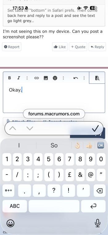
Just noticed this as well. WTAF is the weird pop-up?

View attachment 2587256
Terrible isn't it. What's with the random pill? Why do we need a tick when the enter button has been fine for 15 years (and is still there!). What do the up and down arrows even do? Why can't I tap and edit the text when you've made a mistake? (and you will because you can no longer see what you're typing). Why are the corner radii different top and bottom on the keyboard? So many things in this one thing alone.
 
Terrible isn't it. What's with the random pill? Why do we need a tick when the enter button has been fine for 15 years (and is still there!). What do the up and down arrows even do? Why can't I tap and edit the text when you've made a mistake? (and you will because you can no longer see what you're typing). Why are the corner radii different top and bottom on the keyboard? So many things in this one thing alone.
The random pill is the URI field. As of 26.2 it is now populated like it should be.

The bottom radii on the keyboard is the same as my phone – so you only notice it in screenshots/videos. I’d scrap it and just push the grey to the edge of the screenshot personally.

You can tap and edit, though it can be finicky.

The tick exits you from the form field. Same as clicking outside the form field – it’s not the same as return. In a field like this one return enters a line break. Depending on the website design you do need a button to get out of the field. Can’t work out the arrows though, I don’t recall them working anywhere.
 
Register on MacRumors! This sidebar will go away, and you'll see fewer ads.