Become a MacRumors Supporter for $50/year with no ads, ability to filter front page stories, and private forums.

MacRumors

macrumors bot
Original poster
Apr 12, 2001
67,961
38,673


In a lengthy report outlining his WWDC 2025 expectations today, Bloomberg's Mark Gurman shared more details about iOS 26's rumored new design.
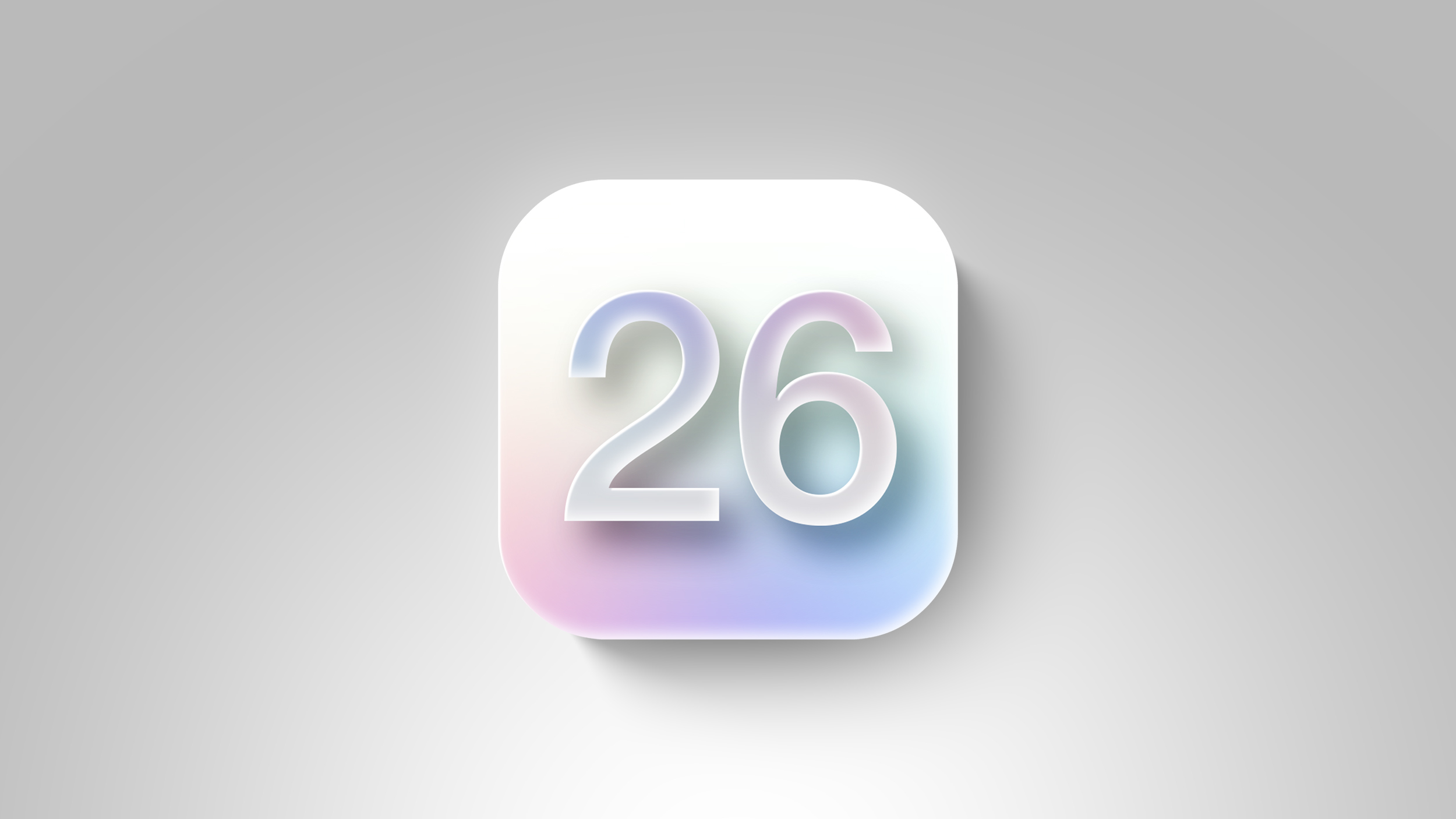
iOS-26-white.jpg

According to Gurman, iOS 26 will feature a "digital glass" design inspired by visionOS, the operating system for Apple's Vision Pro headset. That is a well-known rumor by now, but he goes on to provide some more specific details, as listed below:
  • There will be more use of light and transparency.
  • There will be redesigned app icons, but he does not expect them to be round.
  • Toolbars and tabs will be redesigned, with a focus on pop-out menus.
  • Home Screen widgets have been redesigned to match the new "digital glass" look.
  • Safari will feature a more transparent, glassy address bar.
  • The glass-like design changes should extend to the Camera app, which will be revamped with a focus on simplicity.
The design changes are expected to extend to iPadOS 26, macOS 26, tvOS 26, and watchOS 26.

Apple will announce iOS 26 and other software updates in just three days from now, during its WWDC 2025 keynote, which kicks off on Monday, June 9 at 10 a.m. Pacific Time. The first iOS 26 beta should be seeded to developers shortly after the keynote, and the update will likely be released to the general public in September.

Article Link: iOS 26's Digital Glass Design: Home Screen Widgets, Camera, and More
 
We already knew all of this? Lol

In all seriousness, I’m hoping Gurman is right about iOS 26 being focused on the redesign, stability, and battery life. Put off AI for another year to ensure that it’s ready and use this year as a reset year to bring back “Apple”. That’s what’s needed.
 
The whole Digital Glass design is not of interest I like my device screens, menus, icons with sharp color not this Damon transparent glass idea somehow standardizing the Vison Pro device that never interested me much. I how they allow us to turn it off and go to the things the way they are now its not of interest to me. Fluff, new paint job MEH
 
The whole Digital Glass design is not of interest I like my device screens, menus, icons with sharp color not this Damon transparent glass idea somehow standardizing the Vison Pro device that never interested me much. I how they allow us to turn it off and go to the things the way they are now its not of interest to me. Fluff, new paint job MEH
"Reduce Transparency" setting is for you. Set it and forget it.
 
  • Like
Reactions: I7guy
iOS desperately needs a redesigned camera app. The current one is a flat design but relies on the worst of skeuomorphic interactions as you need to slide invisible dials to switch modes and extend controls from the opposite edge.
 
  • Like
Reactions: ZZ9pluralZalpha
Windows 7 was its peak in UI design. Sleek and simple but not flat and boring. I don't mind Apple's UI/UX teams considering what worked in the past.
Glad you liked it! Win 7/Server 2008R2 was the last release I helped ship at MS and we were all pretty proud of it. My side project was making sure the Boot Camp drivers still worked when we shipped 😁.
 
Please don’t just be a fresh coat of paint to distract from the elephant in the room. I’d love split screen and a better keyboard, among other QoL updates
This is Apple they don’t have it anymore unfortunately, it will just be a minor ui change and that’s it. This should just be a press release. I actually thought maybe for once we will get a proper update
 
Register on MacRumors! This sidebar will go away, and you'll see fewer ads.