
It's been two days since iOS 26 was released, and Apple's new Liquid Glass design is even more divisive than expected.
Any major design change can create controversy as people get used to the new look, but the MacRumors forums, Reddit, Apple Support Communities, and social media sites seem to feature more criticism than praise as people discuss the update.
Complaints
There are a long list of complaints about Liquid Glass, from the impact on readability to lag caused by animations. Here are some of the main critiques:
- Animations run slow, and the interface feels sluggish on older iPhones.
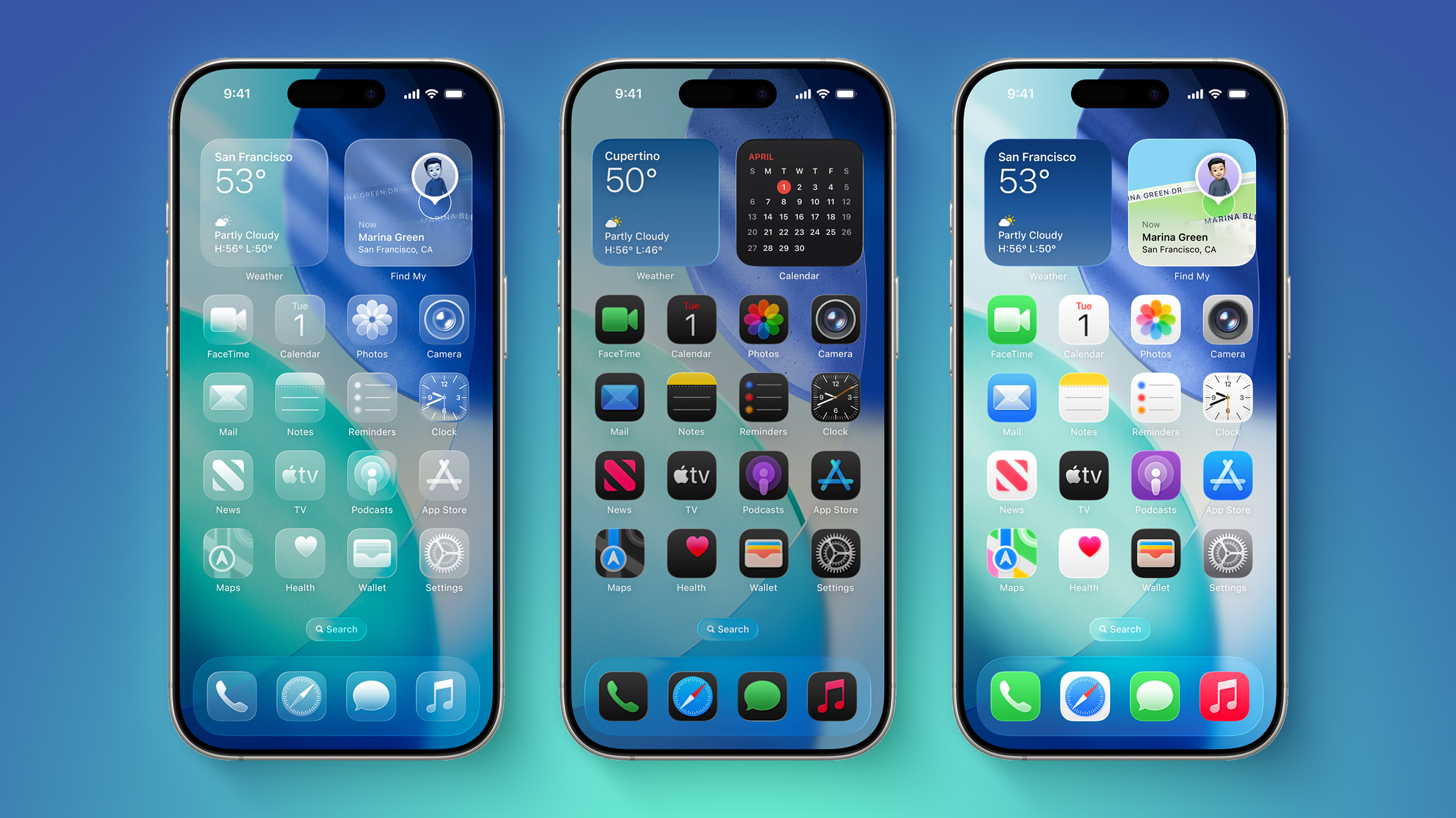
- The constantly changing colors, shapes, and shading are distracting.
- The animations make no sense.
- It looks like a Barbie phone with battery wasting features.
- Basic actions require too many taps.
- The bubbles and floaty icons are cartoony.
- The contrast is awful.
- Some app icons look blurry.
- The design is inconsistent, and some things are flat while some are glass.
- Highlights on UI elements are inconsistent.
- It's hard to read things like notifications.
- The effects are too subtle for the system overhead costs.
On the MacRumors forums, complaints about Liquid Glass are interspersed with responses from people who have been using it during beta, and the consensus is "you'll get used to it."
It does always take time to get used to a new look, and Liquid Glass will become less jarring as people become accustomed to the new animations and the behavior of buttons and other interface elements.
Not everyone hates Liquid Glass, and there are also many positive comments from people who prefer the new design. Some of that sentiment:
- It makes the iPhone feel faster.
- It feels modern and clean, and makes a boring smartphone a little more fun.
- It's bright, bouncy, and just plain cool to use.
- Getting notifications is satisfying, and the Lock Screen keypad is like bubbles.
- It's fresh and easy to get accustomed to.
- iOS 18's flat UI was depressing, so iOS 26 is an improvement.
- It's technologically impressive with the light refraction and diffusion of chromatic aberration.
- The icons are slick and it harkens back to the OG Apple UI design.
- The unbearable sameness of Liquid Glass
- Liquid Glass Could Be One of Apple's Most Divisive System Designs Yet
- This Liquid Glass Optical Illusion on iOS 26 Is Driving Me Insane
- Apple's Liquid Glass: The liquid works, but the glass is broken
Everyone remembers iOS 7, because it was the first big design change that Apple made to iOS. Apple did away with skeuomorphism in favor of a "flat" design, and it was not a change that people were prepared for. A lot of the comments shared when iOS 7 came out mirror the comments we're seeing now about Liquid Glass.
- iOS 7 Interface Design is so UGLY!
- The real problem with iOS 7 Design
- Does anyone dislike IOS 7 as much as I do?
- iOS 7 Bugs: Will They Ever be Fixed
- The biggest complaints about iOS 7 so far
- The design of iOS 7: simply confusing
Article Link: iOS 26's Liquid Glass Design Draws Criticism From Users
