Become a MacRumors Supporter for $50/year with no ads, ability to filter front page stories, and private forums.

irDigital0l

Guest
Original poster
Dec 7, 2010
2,901
0
http://dribbble.com/shots/636647-iOS-icons

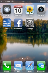
Saw this on appadvice. These look so much better and yea its just a couple changes, but nice ones considering some icons have been exactly the same for like 5 years now -_-

Also wondering if Apple will update the iPhone Clock app icon will be like the iPad one?
 
They look really nice except the Messages icon looks out of place with a white background.

Apple probably won't be changing the iPhone clock icon. The compatibility images on their site prove this.
 
They look really nice except the Messages icon looks out of place with a white background.

Apple probably won't be changing the iPhone clock icon. The compatibility images on their site prove this.

I think it looks sharp. Also, it would further differentiate the Messages and Phone app, making it easier to discern the latter.
 
Icons look good. Wish Apple would let us implement different themes
 
I think it looks sharp. Also, it would further differentiate the Messages and Phone app, making it easier to discern the latter.

It represents iMessage and everything between all Apple devices (Mac, iPad, iPhone, etc.)
 
Those look good except Mail. Apple's default Mail icon is awful. Why not make the icon the entire envelope (like how Contacts is a giant addressbook, or Calculator is a calculator).
 
Those look good except Mail. Apple's default Mail icon is awful. Why not make the icon the entire envelope (like how Contacts is a giant addressbook, or Calculator is a calculator).

Interesting thought, never really looked at it that way. So many stock apps are like that too. I've always thought the Mail icon on OSX was kind of ugly too as a postage stamp, seems out of place with current dock icons in ML.
 
I think the icons should look more like this

home-lg.png
 
Those look good except Mail. Apple's default Mail icon is awful. Why not make the icon the entire envelope (like how Contacts is a giant addressbook, or Calculator is a calculator).

i never noticed that.
just turned on my iphone and YES....you are correct.

the app should be an entire envelope, not an envelope inside of another screen (a blue sky)
 
Those icons look nice, just not too keen on the messages one!
I think it'd annoy me, it'd look wrong in my dock!

I've had the same Green > Blue > Blue > Green dock since the first iPhone!

Did a very quick shoddy edit. ;-)
I know it's a crappy edit, but it just looks out of place! haha
 

Attachments

  • 1IMG_2241.PNG
    1IMG_2241.PNG
    1 MB · Views: 194
  • 2IMG_2241.png
    2IMG_2241.png
    729.3 KB · Views: 242
Those icons look nice, just not too keen on the messages one!
I think it'd annoy me, it'd look wrong in my dock!

I've had the same Green > Blue > Blue > Green dock since the first iPhone!

Did a very quick shoddy edit. ;-)
I know it's a crappy edit, but it just looks out of place! haha

You're right, it looks cool when separated but the Messages icon looks odd without the green background. Maybe someone could photoshop that in to replace the white?

I'm used to the green sort of pointing out the phone's primary "phone" functions, i.e. calls and texts.
 
You're right, it looks cool when separated but the Messages icon looks odd without the green background. Maybe someone could photoshop that in to replace the white?

I'm used to the green sort of pointing out the phone's primary "phone" functions, i.e. calls and texts.

Yeah same, kinda just jump to the green for phone & text.
Tried it again (quickly) - it looks better, but I don't know.....

I hated the new iTunes logo when it first came out....now I love it. So maybe I'm just stuck in my old ways ;)
 

Attachments

  • 3IMG_2241.png
    3IMG_2241.png
    721.8 KB · Views: 184
Awesome, that's really not that bad at all.

Like you said, it's one of things we'll just get used to...I think the old iTunes logo looks ugly now, for example.

I gave it a minute and now the old Messages logo is starting to look plain!

:)
 
Register on MacRumors! This sidebar will go away, and you'll see fewer ads.