That's not new; it says the same for me on iOS 6.When I go into 'Mobile' it now says Mobile Data and not Cellular Data. Basically they have replaced the word Cellular with Mobile across settings.

That's not new; it says the same for me on iOS 6.When I go into 'Mobile' it now says Mobile Data and not Cellular Data. Basically they have replaced the word Cellular with Mobile across settings.
What other apps? I don't believe any non-stock Apple apps have really changed their look (yet).
find my phone? apple store app?
find my phone? apple store app?
The currently released versions of those apps don't appear to have an iOS 7 look (yet).find my phone? apple store app?
Hadn't really noticed it. Thought it was new.
It changes if you set it to British English. If you have it on English (which is actually American English) it's says cellular
Hmm...I just exited calendar and even went to lock screen...and it comes back up in list mode when I go back into the app? Not sure if there is a time limit, but it does seem to stay up even after exiting.
I'll admit the arrow annoys me slightly. The other two I don't mind.
That's funny cos a lot of people on the forum here practically demanded apple add an arrow as they claimed people wouldn't know what direction to swipe to unlock.....
That's funny cos a lot of people on the forum here practically demanded apple add an arrow as they claimed people wouldn't know what direction to swipe to unlock.....
Despite having owned every model of iPhone and countless tens of thousands of unlock swipes, with the first arrowless betas, I frequently found that I was mistakenly swiping from right-to-left as though the homepage was on the right side of the lockscreen and I was swiping to move over there.
Then every time I gave my phone to my son, he'd try to unlock it by swiping up (even though he has an iPhone as well and should know better) since the Control Center icon used to be an up arrow.
So, personally, I'm glad the arrow and dashes are there
it's not as simple as not knowing which direction to swipe. it's the fact that users have to think about it - even if just for a fraction of a second - and they've never had to think about it before. no arrow might be aesthetically more pleasing - more symmetrical, etc. - but apple's software has always been about removing cognitive overhead, and allowing people to do things on their devices with as little 'mental stress' as possible. and these people aren't all macrumors visitors - some will be very young, and could give up at the lock screen; some will be very old, and could suffer from memory loss. the constant visual indicator of which way to swipe helps both these crowds. apple has always been about accessibility, after all
I'm not against it, the person I quoted was, I was just pointing out that a lot of people on here were requesting this during the early stages of the beta. You are probably better off responding to him than me, as I don't mind either way about the arrow.
Anyone else getting remarkably frustrated by having to wait for the new animation sequences to finish before other input is recognised? Why should i have to wait for a folder to 'close' and be static before I can swipe?
I'm really enjoying iOS7, but man there are a couple of little things like that which drive me nuts lol
...isn't it the same in iOS 6 though? When you have a folder open and you swipe to close it - you still have to wait for the animation of closing the folder to finish before you can swipe again.
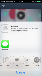
Found in beta 6. Weird mail, safari and chrome icon...
Found in beta 6. Weird mail, safari and chrome icon...
Two things:
1. Hate the color selection used in the app "theme". I've used Pandora and actually enjoy the darker blue look. It makes Apple's version seem very feminine to me. I like a lot about ios7 but, to me, I think Apple made an incredibly weak statement with the Radio app.