Got a tip for us?
Let us know
Become a MacRumors Supporter for $50/year with no ads, ability to filter front page stories, and private forums.
iOS 7 fixes icons, somehow
- Thread starter Ram27
- Start date
- Sort by reaction score
You are using an out of date browser. It may not display this or other websites correctly.
You should upgrade or use an alternative browser.
You should upgrade or use an alternative browser.
It couldn't have added the drop shadow to the clock, though. It's changed from an inner shadow to a drop shadow. Weird.
Correct me if I'm wrong, but don't iPads show slightly different (developer provided) icons than the iPhone version of the app? So all universal apps would come with two icons. Perhaps because there's no gloss, it's showing this version?
I might be completely wrong
Correct me if I'm wrong, but don't iPads show slightly different (developer provided) icons than the iPhone version of the app? So all universal apps would come with two icons. Perhaps because there's no gloss, it's showing this version?
I might be completely wrong
As most developers know, Apple adds an option for you to "add a layer" gloss to your icon via xcode settings. All Apple has done is removed this.
So apps that have this setting ticked in xcode, will have their gloss removed. Some apps use their own designed gloss, some don't. That's why you see inconsistencies.
So apps that have this setting ticked in xcode, will have their gloss removed. Some apps use their own designed gloss, some don't. That's why you see inconsistencies.
this was covered in a podcast I was listening to. Apparently the Dunkin Donuts app icon is completely different on iOS 7 and no one knows why LOL.
Yeah I saw this on 9to5mac. Still not sure how the Dunkin Donuts app got completely changed though...
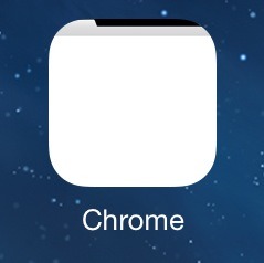
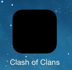
A couple of my icons are broken.... I tired deleting and reinstalling but they are still broken.View attachment 419794View attachment 419795
My chrome icon shows fine... Try hardbooting...
Yeah I saw this on 9to5mac. Still not sure how the Dunkin Donuts app got completely changed though...
Cracked.com changed to, looks like these developers are step ahead.
As most developers know, Apple adds an option for you to "add a layer" gloss to your icon via xcode settings. All Apple has done is removed this.
So apps that have this setting ticked in xcode, will have their gloss removed. Some apps use their own designed gloss, some don't. That's why you see inconsistencies.
Re-quoting myself so you guys can see the answer.
Re-quoting myself so you guys can see the answer.
That doesn't explain how the clock's hands went from having rounded edges to having straight edges. There's more going on here besides a simple gloss removal automation.
That doesn't explain how the clock's hands went from having rounded edges to having straight edges. There's more going on here besides a simple gloss removal automation.
You realize the icons you see in the App Store (or on iTunes on your PC) are NOT the app icons you see on your homescreen?
I mean yes, most designers match both the iTunes-Large.png(or w/e it's called) and the icon64.png(or w/e it's called, can't remember off hand) but some do not.
That's why you are seeing differences. The iTunes/App Store icons are SEPARATE from the iOS springboard icons but are usually designed to match eachother, not always the case.
So yes, this is just a case of Apple removing the gloss effect from icons that have it enabled on the springboard. The developers with their own custom designed gloss will not see this change.
Last edited:
That doesn't explain how the clock's hands went from having rounded edges to having straight edges. There's more going on here besides a simple gloss removal automation.
You are showing a screen shot of the App Store. When submitting an app, multiple icons must be submitted, and the large App Store icon is different than the icon you see on your home screen. It's possible that they did not have a large icon when that requirement was made and had to make a new one (but still used the old small app icons that already existed). That's what I had to do with my app.
On a slightly related note, I hope twitter change their icon soon. I hated it before but now it also looks out of place. I never understood why they didn't use a flat icon like the majority of their design work is! 
On a slightly related note, I hope twitter change their icon soon. I hated it before but now it also looks out of place. I never understood why they didn't use a flat icon like the majority of their design work is!
ha! I just tweeted at them this after noon to get their act together
My chrome icon shows fine... Try hardbooting...
Tried a hard reboot, didn't fix it.
Deleted the apps and then did another hard reboot. Same thing happened again once the apps were reinstalled.
Its strange as they show the correct icon while downloading and installing but as soon as it finishes the install the icon breaks... Chrome's icon seems to show a tiny preview of a blank tab and Clash of the Clans just has a black icon.
ha! I just tweeted at them this after noon to get their act together
I'm proud of you! :')
iBooks is still glossy in b2.
Check these:
So yes, this is just a case of Apple removing the gloss effect from icons that have it enabled on the springboard. The developers with their own custom designed gloss will not see this change.
Some icons have the gloss added within the icon and then in the applications plist definition, instruct apple not to add a gloss... Which would explain why some icons have the gloss even though iOS 7 removes the gloss effect.
Register on MacRumors! This sidebar will go away, and you'll see fewer ads.


