Become a MacRumors Supporter for $50/year with no ads, ability to filter front page stories, and private forums.

boltjames

macrumors 601
Original poster
May 2, 2010
4,876
2,852
I really like putting my phone on a mount in landscape mode and using it as an in car GPS when on family vacation.

The one thing I did not like is that in order to see the remaining time and distance in my trip, I had to tap the screen and open up a bar at the top which takes up real estate. Can someone let me know how iOS 7 handles this? Any other meaningful changes to how iOS 7 and an in car GPS experience is different from iOS 6?

BJ

Currently only portrate seems to be available and yes you need to tap to get the details up still
 
I really like putting my phone on a mount in landscape mode and using it as an in car GPS when on family vacation.

The one thing I did not like is that in order to see the remaining time and distance in my trip, I had to tap the screen and open up a bar at the top which takes up real estate. Can someone let me know how iOS 7 handles this? Any other meaningful changes to how iOS 7 and an in car GPS experience is different from iOS 6?

BJ

Not sure what the other poster is talking about.

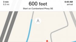
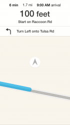
iOS 7 seems to have fixed your issue. Here's a screenshot I just pulled in landscape mode.
 

Attachments

  • image.jpg
    image.jpg
    85.3 KB · Views: 1,954
Not sure what the other poster is talking about.

iOS 7 seems to have fixed your issue. Here's a screenshot I just pulled in landscape mode.

IMG_5921.png


Thanks.

But wait......are all the green road signs missing? And replaced with a white banner like that?

BJ
 
But they looked so good.
I mean just look at those 2 screenshots...
:(

Get ready for the following replies:

Arghhh!
- You are not ready for change (or any variation such as you are AFRAID of change, etc.)
- Don't criticize beta software, don't you understand what BETA is????
- You are a Android fan trolling these boards
- You are not a developer
- You complained about iOS being stale are now you are complaining!!!
- Then don't upgrade to iOS 7, better yet you can leave!


Just to be clear, these are not my opinions but a sampling of what you get when you dare to critique anything regarding iOS 7. Good luck!
 
But they looked so good.
I mean just look at those 2 screenshots...
:(

They did look good but those green signs are pretty much a US thing. Not every country uses them and Apple wants to be more universal.
And the new ones look better than those screen shots show.
You get all the same info (plus more) in a crisp and clean interface.
My $0.02.
 
They did look good but those green signs are pretty much a US thing. Not every country uses them and Apple wants to be more universal.
And the new ones look better than those screen shots show.
You get all the same info (plus more) in a crisp and clean interface.
My $0.02.

The green signs were kinda big...
 
ummm...they're not green in every country though, right? I think they are correct per country.

In Germany they are blue in iOS6. Which is sort of correct and true to life.

Well, actually just signs on the Autobahn are blue. Everything else outside of towns is a yellowish orange. Signs inside towns are just plain white. But even that is not the whole truth. What those signs really show is via which road you get to a destination, more or less. So if you are outside of town but not on a Autobahn a yellowish orange sign will have some town names on it and sometimes under the town names a white box with destinations inside that town (like a hospital or an airport).

Autobahn signs are a bit different. Since you will always travel on other roads to get to your destination when you leave the Autobahn town names are just on a blue background. Otherwise those Autobahn signs would be full of yellowish orange boxes. However, destinations inside town are still on a white background and the numbers of non-Autobahn roads you can reach via the Autobahn are yellowish orange.

Inside town you will see names of other towns on yellowish orange signs if you get there via some road outside the city that is not the Autobahn and on blue signs if you get there via the Autobahn. So actually even inside of town many signs are yellowish orange or blue. Just destinations inside of the town are white (library, town hall, whatever).

Oh, yeah, and street name signs are different from place to place. I have seen blue ones and white ones. Munich, for example, is pretty well known for its blue street signs. Wikipedia tells me that there are apparently also red ones in Mainz. Street signs are much less standardised than all other road signs you will typically see in Germany (as is the case in many places in Europe).

Now, apart from me thinking that this is an interesting system this should also tell you something about Apple’s approach. It’s skeumorphism is its downfall since Apple didn’t manage to make something accurate at all. It’s just gloss. Decoration. Not functional. Not even trying to be functional.

I’m sorry, but plain white is better. Much better.
 
Here is something different, the navigator's voice speaks too quickly like playing a 78rpm record on the wrong machine! LOL :eek:
 
Awful. Just awful.

Although I suspect GPS hardware makers are quite pleased. I'll have to get my Garmin out of storage.
 
Awful. Just awful.

Although I suspect GPS hardware makers are quite pleased. I'll have to get my Garmin out of storage.

apple-maps-new-app-635.jpg


+1

I was blown away by the look/feel of the Apple maps (left) as a turn-by-turn GPS navigator. They finally had the animation correct, and the signs were a spot-on match for the real thing, really was a pleasure.

Alas I will be forced back to Google maps (right) whose UI looks like a 2005 Tom Tom (ugh).

BJ
 
Get ready for the following replies:

Arghhh!
- You are not ready for change (or any variation such as you are AFRAID of change, etc.)
- Don't criticize beta software, don't you understand what BETA is????
- You are a Android fan trolling these boards
- You are not a developer
- You complained about iOS being stale are now you are complaining!!!
- Then don't upgrade to iOS 7, better yet you can leave!


Just to be clear, these are not my opinions but a sampling of what you get when you dare to critique anything regarding iOS 7. Good luck!

This post is perfect. Absolutely spot-on.
 
Not all of the skeuomorphism was bad...the green signs in the Maps app gave it character and something we're all accustomed to in real life. Just like the old notes app and ibooks app, skeuomoprphism worked well in those apps.
 
attachment.php


Not all of the skeuomorphism was bad...the green signs in the Maps app gave it character and something we're all accustomed to in real life. Just like the old notes app and ibooks app, skeuomoprphism worked well in those apps.
Agreed. However, the worst part of the IOS7 maps application is the lack of contrast. Drivers need to be able to see where they are and what's upcoming with quick glance. A high contrast UI with distinct colors for the vehicle, path, streets, and signs is critical to see where you are and what's upcoming in a fraction of a second. The "white-ification" and the flattening of the maps application makes it largely unusable as a car navigation device.
 
Last edited:
Wow so people can't use maps unless they have big green signs that look like real world road signs?
 
Wow so people can't use maps unless they have big green signs that look like real world road signs?
No. I like the green road signs, but that's not a deal breaker. However, being unable to see where you are and what you need to do in your car, at a quick glance, with lots of direct sunlight, is a deal breaker.
 
No. I like the green road signs, but that's not a deal breaker. However, being unable to see where you are and what you need to do in your car, at a quick glance, with lots of direct sunlight, is a deal breaker.

I've used iOS 7 maps for three 12 hour drives and daily in-city driving with no issues.
 
I've used iOS 7 maps for three 12 hour drives and daily in-city driving with no issues.

Can you post some screencaps in landscape orientation during a drive?

The only screencap seen this far is at the very start of a drive and we can't see any street signs.

Thanks.

BJ

----------

No. I like the green road signs, but that's not a deal breaker. However, being unable to see where you are and what you need to do in your car, at a quick glance, with lots of direct sunlight, is a deal breaker.

fr_1538.jpg


Great point.

In my BMW I keep my maps in night mode all the time because the white streets against the black background makes it very easy to see durning the daytime as well.

Not to mention that the sexy-thin ios 7 font makes the map even more illegible at 80 mph when you need reliable information the most.

BJ
 
Wow so people can't use maps unless they have big green signs that look like real world road signs?

I think the green signs were a great use of skeuomorphism...you are trying to relate something on the screen to something in real life. And when you are driving, this is what makes it easier to confirm that you are going where you need to go. One of the reasons I like the "Exit sign" screen that pops up on my Garmin. I can see that it matches the actual sign at the exit so I am sure I am taking the correct one.

Also, the white letters on green signs are that way in real life for a reason...they are very easy to read!

Apple also got all of the state related signs as well. Just look at the example boltjames gives above. The Michigan state road for M-39 is exactly as it would be seen on the road sign. Believe it or not, Google gets this wrong. Defaults to an oval for some reason and might make someone think they were taking the wrong road.
 
Image

Thanks.

But wait......are all the green road signs missing? And replaced with a white banner like that?

BJ

This is precisely what I thought when I post in anotherdiscuss(so sad it seems only few people are agree with me). I called this change "flat only for the sake of flat".
The Green sign is not only part of beautiful UI in iOS 6 Map (the road guide and UI is the only good thing for Apple Map), when you drive in the freeway, this mimic the true road sign you saw on the freeway.

The change in iOS just remaind me as Google Map iOS UI, it just the major deal breaker for me on Google iOS Map, which keep me sticking at iOS map.

This is really a great example why skeuomorphism are not all bad.
Another example is: I use several Bank app like CHASE, BoA, ets.
They have the icon exactly matched to their logo.

But these shinny icon just looks real weird in iOS 7 if you put together with stock app, but they have a good reason to keep that way. I keep wondering how these Apps icon will change?


*I think it is very serious. Since the beauty of iOS Map 6 UI is the only reason I use Apple map, and I believe there are many people like me.
 
Register on MacRumors! This sidebar will go away, and you'll see fewer ads.