I'm a bit of a perfectionist, so I thought I'd let it all out for once and complain about the tiniest details that probably nobody cares about but me.
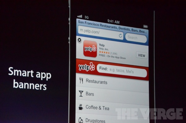
The status bar adapts itself to the color or the menu bar. This is inconsistent throughout iOS, like you see here in Safari. Here it doesn't adapt. Either match the color everywhere or don't.
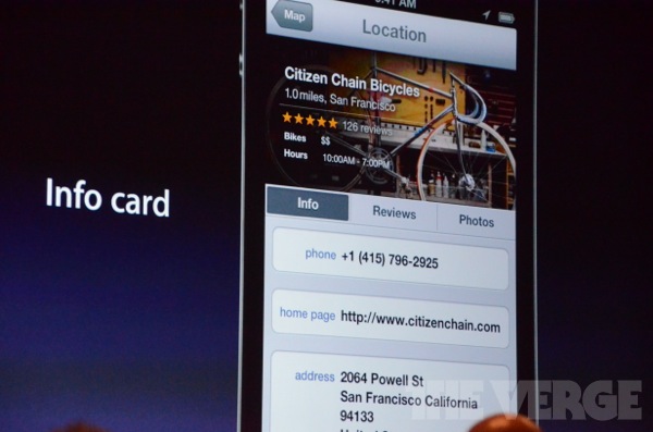
The Info, Reviews and Photos buttons look odd to me. They look squished, I think they should have the same height as the menu bar up top.
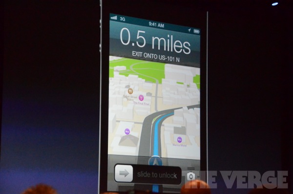
I dislike the all-caps "EXIT ONTO US-101 N". I'd like it not to scream at you, and use less caps, like this: "Exit onto US 101 N".
I don't really like the 3D-ish road line displayed in the 2D map. Make it also flat, and maybe a bit smoother round the edges. Also the text in the menu bar isn't vertically centered.
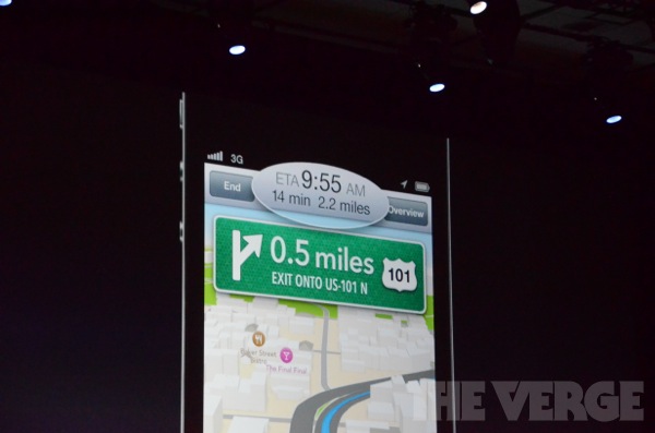
This may be the most annoying design in the entire OS, the different size font in the menu bar. It doesn't look very nice.
The status bar adapts itself to the color or the menu bar. This is inconsistent throughout iOS, like you see here in Safari. Here it doesn't adapt. Either match the color everywhere or don't.
The Info, Reviews and Photos buttons look odd to me. They look squished, I think they should have the same height as the menu bar up top.
I dislike the all-caps "EXIT ONTO US-101 N". I'd like it not to scream at you, and use less caps, like this: "Exit onto US 101 N".
I don't really like the 3D-ish road line displayed in the 2D map. Make it also flat, and maybe a bit smoother round the edges. Also the text in the menu bar isn't vertically centered.
This may be the most annoying design in the entire OS, the different size font in the menu bar. It doesn't look very nice.