Become a MacRumors Supporter for $50/year with no ads, ability to filter front page stories, and private forums.

iDron

macrumors regular
Original poster
Apr 6, 2010
219
252
Do you guys feel the same. I noticed some details that really look “cheap”. For example:
- Calendar App icon got a very big font
- this spinning wheel when searching for an update, WiFi hotspots etc. also got simplified, just a few fat bars spinning
- Homescreen 3D/motion effect much less pronounced

that’s the few things I noticed so far. Do you guys agree? Or did you find more changed in the appearance that is either an improvement or a letdown?
 

C DM

macrumors Sandy Bridge
Oct 17, 2011
51,392
19,460
Not sure it's something uglier, just more that's different. The calendar icon is somewhat more readable at a glance. The other things are not necessarily something that's all that noticeable/meaningful. However, it's fairly subjective, so to some something might be more noticeable and perhaps make some sort of a difference.
 

Moakesy

macrumors 6502a
Mar 1, 2013
576
1,209
UK
Much prefer iOS 14's look....overall the differences are subtle, but what has changed looks generally better to me.

Then you have the less intrusive UI when a call comes in, the widgets, Siri etc....there is far more good than bad IMO.
 
  • Like
Reactions: Skika

EM2013

macrumors 68020
Sep 2, 2013
2,485
2,317
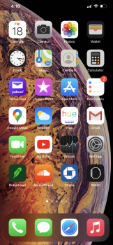
Widgets look terrible to me.

No widgets might be worse.

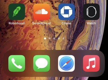
They can fit an entire extra row of icons with that huge gap.
 

Attachments

  • 7CCE2FD8-69AE-4AC2-9155-74202BF48F36.png
    7CCE2FD8-69AE-4AC2-9155-74202BF48F36.png
    2.1 MB · Views: 116
  • 53B6C3DD-A510-4394-87DA-AB5110B7468B.jpeg
    53B6C3DD-A510-4394-87DA-AB5110B7468B.jpeg
    912.6 KB · Views: 108

Seanm87

macrumors 68020
Oct 10, 2014
2,178
4,349
I really like it. It’s basically the same with some minor differences. Not sure how something that is essentially the same with very little change can suddenly be ugly.
 

redbeard331

macrumors 68030
Jul 21, 2009
2,874
5,311
Do you guys feel the same. I noticed some details that really look “cheap”. For example:
- Calendar App icon got a very big font
- this spinning wheel when searching for an update, WiFi hotspots etc. also got simplified, just a few fat bars spinning
- Homescreen 3D/motion effect much less pronounced

that’s the few things I noticed so far. Do you guys agree? Or did you find more changed in the appearance that is either an improvement or a letdown?

The things that really bother me so far.

The widgets: Yea it’s cool and all, but the design of them is pretty bland and there’s so much useless blank space that most of them look bad to me. At first I thought this would only apply to Apples own widgets but then all the third party widgets look the same, as if Apple gave a template to use and there’s no other option. Haven’t seen one beautifully designed third party widget yet, maybe there’s some, might help if so many of them just didn’t not work whatsoever. And the today view is a huge step backwards, total mess, the iOS 10?-13 today view was awesome, on iOS 14 it looks like crap. First thing I noticed back in I think beta 2 or 3 was that they pinched down the size of the third party widgets to match the width of Apple’s widgets which are 4 icons in width. Problem with that is it pinched down all the widgets and they look cramped, awkward, and goofy. And then there’s this weird and wasteful empty space on the sides, as if we lost half an inch of screen size in width. And then the widgets themselves are no longer nicely spaced together, there are huge, ridiculous looking gaps between widgets. To top this all off they have lost the ability to be interactive, they are basically giant app icons now that provide little info. AND you can no longer collapse/expand apps in today view, they are just static. Now, apps that haven’t been updated for iOS 14 widgets still retain their iOS 13 goodness, yet they are pinched, of course these will go away as more and more of them get that iOS 14 update.

As someone who is a big fan of widgets I’m just greatly disappointed by iOS 14, for the ability to pin them to the home screen we lost a lot in the process. I see this as a big step back, especially since they disabled 3D Touch widgets! I use 3D Touch widgets constantly all day to peek into apps, and now it’s gone completely. If you do so with let’s say 25 apps per day, you’d have to fill page after page on the springboard with Apples giant widgets just to have some kind of similarity, and that’s ridiculous. And remember, apps that haven’t been updated or may never be, don’t have widgets you can put anywhere on the springboard. It’s like they took one step forward and ten steps back, there was no reason to disable 3D Touch app widgets, none, whoever decided to do that should be fired.
 
  • Like
Reactions: alejandrooo

danny842003

macrumors 68000
Jun 6, 2017
1,967
2,252
The things that really bother me so far.

The widgets: Yea it’s cool and all, but the design of them is pretty bland and there’s so much useless blank space that most of them look bad to me. At first I thought this would only apply to Apples own widgets but then all the third party widgets look the same, as if Apple gave a template to use and there’s no other option. Haven’t seen one beautifully designed third party widget yet, maybe there’s some, might help if so many of them just didn’t not work whatsoever. And the today view is a huge step backwards, total mess, the iOS 10?-13 today view was awesome, on iOS 14 it looks like crap. First thing I noticed back in I think beta 2 or 3 was that they pinched down the size of the third party widgets to match the width of Apple’s widgets which are 4 icons in width. Problem with that is it pinched down all the widgets and they look cramped, awkward, and goofy. And then there’s this weird and wasteful empty space on the sides, as if we lost half an inch of screen size in width. And then the widgets themselves are no longer nicely spaced together, there are huge, ridiculous looking gaps between widgets. To top this all off they have lost the ability to be interactive, they are basically giant app icons now that provide little info. AND you can no longer collapse/expand apps in today view, they are just static. Now, apps that haven’t been updated for iOS 14 widgets still retain their iOS 13 goodness, yet they are pinched, of course these will go away as more and more of them get that iOS 14 update.

As someone who is a big fan of widgets I’m just greatly disappointed by iOS 14, for the ability to pin them to the home screen we lost a lot in the process. I see this as a big step back, especially since they disabled 3D Touch widgets! I use 3D Touch widgets constantly all day to peek into apps, and now it’s gone completely. If you do so with let’s say 25 apps per day, you’d have to fill page after page on the springboard with Apples giant widgets just to have some kind of similarity, and that’s ridiculous. And remember, apps that haven’t been updated or may never be, don’t have widgets you can put anywhere on the springboard. It’s like they took one step forward and ten steps back, there was no reason to disable 3D Touch app widgets, none, whoever decided to do that should be fired.

Apple don’t have 3D Touch in new devices so they Won’t continue to develop OS for it.
 
Register on MacRumors! This sidebar will go away, and you'll see fewer ads.