Become a MacRumors Supporter for $50/year with no ads, ability to filter front page stories, and private forums.
For some reason, most people's icons are way too big on the dock. I really like the icons from icreatemagazine, but the icons are enormous compared to the actuall OSX icons. The best example I've seen is this person's work, although I don't like them as much as some others, these have been made to fit well on the dock.

Image

Image

http://dribbble.com/tristanedwards

Edit: Hmm, I just noticed that there are a few that are exactly the same as the OP's. Well this is awkward.

Haha. I was thinking the same thing. lol. I'll snag a few from here too anyway.

----------

I see, thanks. What about if I want to go back to the default ones? Do I need to make backups or will OS X take care of that?

That I'm not 100% sure about. Sometimes if I try to change the icon again, it reverts to the original. So I'm pretty sure the original icons are still there, so there could be some terminal command or something to change them all back. If you want, there is the third party app called candybar that can revert them all back to the original.
 
Don't know if anyone has mentioned this yet, but you copied some of this from Tristan Edwards. His icons overall also look a lot better.

http://dribbble.com/shots/1118732-Sevenesque-An-iOS7-inspired-Mac-icon-set

EDIT: Looks like someone else was thinking the same way

For some reason, most people's icons are way too big on the dock. I really like the icons from icreatemagazine, but the icons are enormous compared to the actuall OSX icons. The best example I've seen is this person's work, although I don't like them as much as some others, these have been made to fit well on the dock.

Image

Image

http://dribbble.com/tristanedwards

Edit: Hmm, I just noticed that there are a few that are exactly the same as the OP's. Well this is awkward.
 
Last edited:
I switched up some of the icons yesterday and even made a new one for my Last.fm icon


The screenshot messed up the quality of the image, but I can't help but notice how much better the iOS 7 style icons look compared to the older ones that I didn't change. They just look so much cleaner (especially the Safari and Mail icon, the old was so ugly!)
 
I switched up some of the icons yesterday and even made a new one for my Last.fm icon

The screenshot messed up the quality of the image, but I can't help but notice how much better the iOS 7 style icons look compared to the older ones that I didn't change. They just look so much cleaner (especially the Safari and Mail icon, the old was so ugly!)

Looking at your screenshot I realised it looks pretty well, but, the Safari icon it's like out of place with that thick outer border.
 
Looking at your screenshot I realised it looks pretty well, but, the Safari icon it's like out of place with that thick outer border.

I thought so too but the original artist seemed to do that intentionally as all the other icons with the white border are smaller. Safari is the only one to have a thicker border for some reason :confused:
 
Sorry for project bumping but I've got a series of my own icons, which are slightly altered versions of the iOS icons with my own little touch ups here: http://fav.me/d69bu68

Although I haven't finished them, they are still quite nice to use. ^^
 
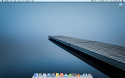
I thought I'd share how my dock turned out.

Desktop_zps99bdf5e7.png


dockhalf1_zps19ab72e6.jpg


dockhalf2_zps6773282a.jpg


I'm very happy with the way it is now. I used these two sources: http://dribbble.com/tristanedwards and http://www.icreatemagazine.com/icreate-blog/ios-7-mac-icon-project-textedit/. But neither had exactly what I wanted so I made some adjustments to both of them to make them play nicely together, and made a few of them myself if I didn't like the options I found from them.

The Contacts, Reminders, Notes, and Photos icons came as is from Tristan Edwards. I think these are great examples of using the iOS 7 style in an OS X way.

Photobooth, Mail, Messages, and Game Center came from icreatemagazine. I had to make adjustments though because these icons take up the entire canvas and end up being way bigger on the dock than they should be. If you tried to used the icons from here you may have noticed that. I resized each of these and added a very slight (almost invisible) drop shadow to match the Tristan Edwards icons. Without the drop shadow, the bottoms of the icons merge right into the dock and it doesn't look good.

Launchpad, Mission Control, Safari, and Calculator I did myself (I think the perspective on Calculator is a little too much right now, I plan on changing that eventually)

For iTunes and AppStore, I took from both the sources and made something that I think fits best. Tristan Edward's icons have too thick a border and use the old same music note and apps store icons. The ones from icreatemagazine have far too thin a border. I made the border on these the same size as the thickness of the circle on the iTunes and App Store icons from iOS 7.

I haven't decided on the trash yet, I don't like any of the designs that have been floating around. And, for now, the finder is left mostly unchanged, but I'll probably try to do something to it.

When you edited your app store icon did you notice a problem where it reverts back to the default one when the app is actually open ?
 
Nice designs, but they are simply too homogenous with everything being the same shape. Remember when apple removed color from the folder icons in Finder, or from the Finder / iTunes sidebars? Everything became much more difficult to find.

IMO OSX looks leagues better than iOS7, and it's also moving in a 'flatter' direction with Mavericks already.

Also, one huge reason iOS7's look works is due to the accelerometer and parallax. Many have said screenshots don't do it justice, which is true because movement and context of the background photos add a lot to it. You don't move a desktop or laptop around very much, not nearly as much as you would a phone, so the dimension (which is a huge element of iOS7's design) gets completely lost.

I agree, OSX looks much better. But, it looks like Apple is going for the flat look in future versions of OSX if iCloud beta is any indicator.
 

Attachments

  • cloud beta.png
    cloud beta.png
    344.9 KB · Views: 136
I just tried it and the icon stays the same for me. Are you using CandyBar?

I changed my icons by using "Get Info" and then dragging the icons over the old ones. Is that possibly the reason why?

edit: Used Candybar and now it stays the same
 
Last edited:
I thought I'd share how my dock turned out.

Image

Image

Image

I'm very happy with the way it is now. I used these two sources: http://dribbble.com/tristanedwards and http://www.icreatemagazine.com/icreate-blog/ios-7-mac-icon-project-textedit/. But neither had exactly what I wanted so I made some adjustments to both of them to make them play nicely together, and made a few of them myself if I didn't like the options I found from them.

The Contacts, Reminders, Notes, and Photos icons came as is from Tristan Edwards. I think these are great examples of using the iOS 7 style in an OS X way.

Photobooth, Mail, Messages, and Game Center came from icreatemagazine. I had to make adjustments though because these icons take up the entire canvas and end up being way bigger on the dock than they should be. If you tried to used the icons from here you may have noticed that. I resized each of these and added a very slight (almost invisible) drop shadow to match the Tristan Edwards icons. Without the drop shadow, the bottoms of the icons merge right into the dock and it doesn't look good.

Launchpad, Mission Control, Safari, and Calculator I did myself (I think the perspective on Calculator is a little too much right now, I plan on changing that eventually)

For iTunes and AppStore, I took from both the sources and made something that I think fits best. Tristan Edward's icons have too thick a border and use the old same music note and apps store icons. The ones from icreatemagazine have far too thin a border. I made the border on these the same size as the thickness of the circle on the iTunes and App Store icons from iOS 7.

I haven't decided on the trash yet, I don't like any of the designs that have been floating around. And, for now, the finder is left mostly unchanged, but I'll probably try to do something to it.

I used some of the same icons, some of which I edited, and some are my own, and here is the result:
 

Attachments

  • Screen Shot 2013-08-26 at 10.00.28 PM.png
    Screen Shot 2013-08-26 at 10.00.28 PM.png
    118.7 KB · Views: 173
Here is my fully (almost) themed mac to look like iOS 7:
 

Attachments

  • Screen Shot 2013-08-26 at 9.57.24 PM.png
    Screen Shot 2013-08-26 at 9.57.24 PM.png
    1.1 MB · Views: 305
Sometimes I honestly feel like I am living on a different planet from the rest of you who seem to relish the new design language. I've tried and tried and tried again to appreciate the aesthetic quality of the iOS 7 icons and failed. I had hoped that, with time, I would warm to them but this has yet to happen. These icons are so similar in design language that they also do not communicate any aesthetic beauty to me.

I find myself almost having to squint my eyes and physically pull back away from them when I see them. To me they look so immature, unrefined, and drained of life and character. I cannot explain with enough clarity exactly how they make me feel but it is with almost the same revulsion that I feel when I look at a some of the 'art' of Jackson Pollock and Lee Krasner.

If OSX were ever to adopt iOS 7's style of design I think I will have to jump ship! And after over 15 years of using Macs, that is not an easy decision to make.

I really doubt you'd "jump ship" after 15 years. Just saying. Especially with how easy they are to change back. If you don't like moving forward and change, then go back to Windows 98 or something. We are looking toward the future.
 
I agree, OSX looks much better. But, it looks like Apple is going for the flat look in future versions of OSX if iCloud beta is any indicator.

Do you think they'll be changing those iWork app icons to a more flat design? They don't fit with all the other icons in that beta.cloud (or within iOS 7), so I'm wondering if they didn't want to "give it away" or if they're really planning on keeping those?
 
Do you think they'll be changing those iWork app icons to a more flat design? They don't fit with all the other icons in that beta.cloud (or within iOS 7), so I'm wondering if they didn't want to "give it away" or if they're really planning on keeping those?

They haven't updated the apps themselves yet. Just the cloud versions.

When they roll out iWork 2014 and the new updated iOS apps, yes, I bet they have new flat icons.

They will want every version to match each other.
 
Last edited:
I thought I'd share how my dock turned out.

Image

Image

Image

I'm very happy with the way it is now. I used these two sources: http://dribbble.com/tristanedwards and http://www.icreatemagazine.com/icreate-blog/ios-7-mac-icon-project-textedit/. But neither had exactly what I wanted so I made some adjustments to both of them to make them play nicely together, and made a few of them myself if I didn't like the options I found from them.

The Contacts, Reminders, Notes, and Photos icons came as is from Tristan Edwards. I think these are great examples of using the iOS 7 style in an OS X way.

Photobooth, Mail, Messages, and Game Center came from icreatemagazine. I had to make adjustments though because these icons take up the entire canvas and end up being way bigger on the dock than they should be. If you tried to used the icons from here you may have noticed that. I resized each of these and added a very slight (almost invisible) drop shadow to match the Tristan Edwards icons. Without the drop shadow, the bottoms of the icons merge right into the dock and it doesn't look good.

Launchpad, Mission Control, Safari, and Calculator I did myself (I think the perspective on Calculator is a little too much right now, I plan on changing that eventually)

For iTunes and AppStore, I took from both the sources and made something that I think fits best. Tristan Edward's icons have too thick a border and use the old same music note and apps store icons. The ones from icreatemagazine have far too thin a border. I made the border on these the same size as the thickness of the circle on the iTunes and App Store icons from iOS 7.

I haven't decided on the trash yet, I don't like any of the designs that have been floating around. And, for now, the finder is left mostly unchanged, but I'll probably try to do something to it.

Best I have seen. This looks amazing!
 
I think it's obvious Mac OS will take some cues from the new design language in the near future, not sure however, it will be quite so obvious as depicted a little above this post. I'd expect less blue borders, and it to be a little more subtle on the big screen :)
 
I really like your icons... Mind sharing where you found them?

Thanks!

Some of them:

- http://dribbble.com/shots/1095726-Flat-Icons-Part-1?list=users

- http://nerdspace.co/266

Some other I no longer remember the page I found them. But mostly after some Google searches using "flat" + "icons" + "mac" I found them.

I'll try and upload them to a dropbox folder in the night. Specially some icons I no longer found, which are the ones of the Folders+Drives+CDs flat icons.

Right now my icons look like this:
 

Attachments

  • Screen Shot 2013-08-27 at 4.31.36 PM.png
    Screen Shot 2013-08-27 at 4.31.36 PM.png
    1.7 MB · Views: 198
Sometimes I honestly feel like I am living on a different planet from the rest of you who seem to relish the new design language. I've tried and tried and tried again to appreciate the aesthetic quality of the iOS 7 icons and failed. I had hoped that, with time, I would warm to them but this has yet to happen. These icons are so similar in design language that they also do not communicate any aesthetic beauty to me.

I find myself almost having to squint my eyes and physically pull back away from them when I see them. To me they look so immature, unrefined, and drained of life and character. I cannot explain with enough clarity exactly how they make me feel but it is with almost the same revulsion that I feel when I look at a some of the 'art' of Jackson Pollock and Lee Krasner.

If OSX were ever to adopt iOS 7's style of design I think I will have to jump ship! And after over 15 years of using Macs, that is not an easy decision to make.

Yes, you explained my feelings exactly!
 
The blue borders used is one of the ugliest things I've ever seen and why I am not fond of iOS 7 so much anymore. I hope they don't ever consider bringing that to OS X
 
Register on MacRumors! This sidebar will go away, and you'll see fewer ads.