Assuming that the leaked icons pictured here are indicative of the design languages:

Zooming in, you can see very intentional blending on the interior corners of the screen in HLSipad2, this blending is not present in HLSipad. Assuming they use vector graphics software to create the originals and then export the originals to these rasterized icons, it would make sense that some blending/antialiasing would happen at this size if the original vector image had a rounded interior.
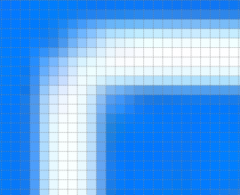
Zoomed in, for reference:
HLSipad

HLSipad2

Zooming in, you can see very intentional blending on the interior corners of the screen in HLSipad2, this blending is not present in HLSipad. Assuming they use vector graphics software to create the originals and then export the originals to these rasterized icons, it would make sense that some blending/antialiasing would happen at this size if the original vector image had a rounded interior.
Zoomed in, for reference:
HLSipad
HLSipad2