Become a MacRumors Supporter for $50/year with no ads, ability to filter front page stories, and private forums.

MacRumors

macrumors bot
Original poster
Apr 12, 2001
67,962
38,676


The fourth beta of iPadOS 15 that was released today introduces tweaks to Safari, with the Safari layout now mirroring the updated layout that was introduced in macOS Monterey Beta 3.

safari-redesign-ipados-15-beta-4.jpg
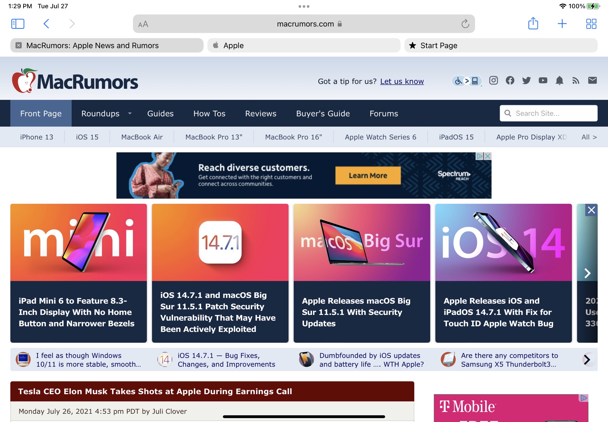
The new Safari design in iPadOS 15 beta 4​

Prior to this beta, Safari on iPad was similar to Safari on iOS with no dedicated tab bar, but after the update, Apple has added a dedicated tab bar that's activated by default, which is the same layout that's now used in macOS Monterey.

ipados-15-safari-design-original.jpg
The original Safari design in iPadOS 15 beta 3​

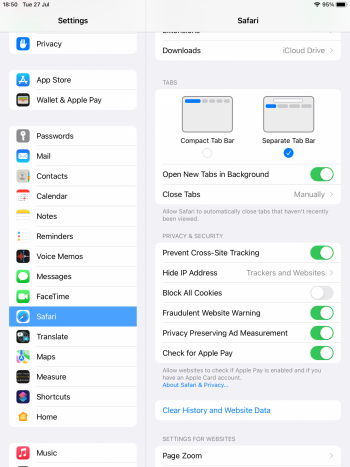
While the separate tab bar is enabled automatically when updating, in the Safari section of Settings, there is an option to toggle on the original compact tab bar that merged everything together.

Apple in iOS and iPadOS 15 introduced a compact and unified Safari design that did away with the dedicated URL and search interface, instead letting any individual tab be used for navigation input.

safari-ipados-15-controls.jpg

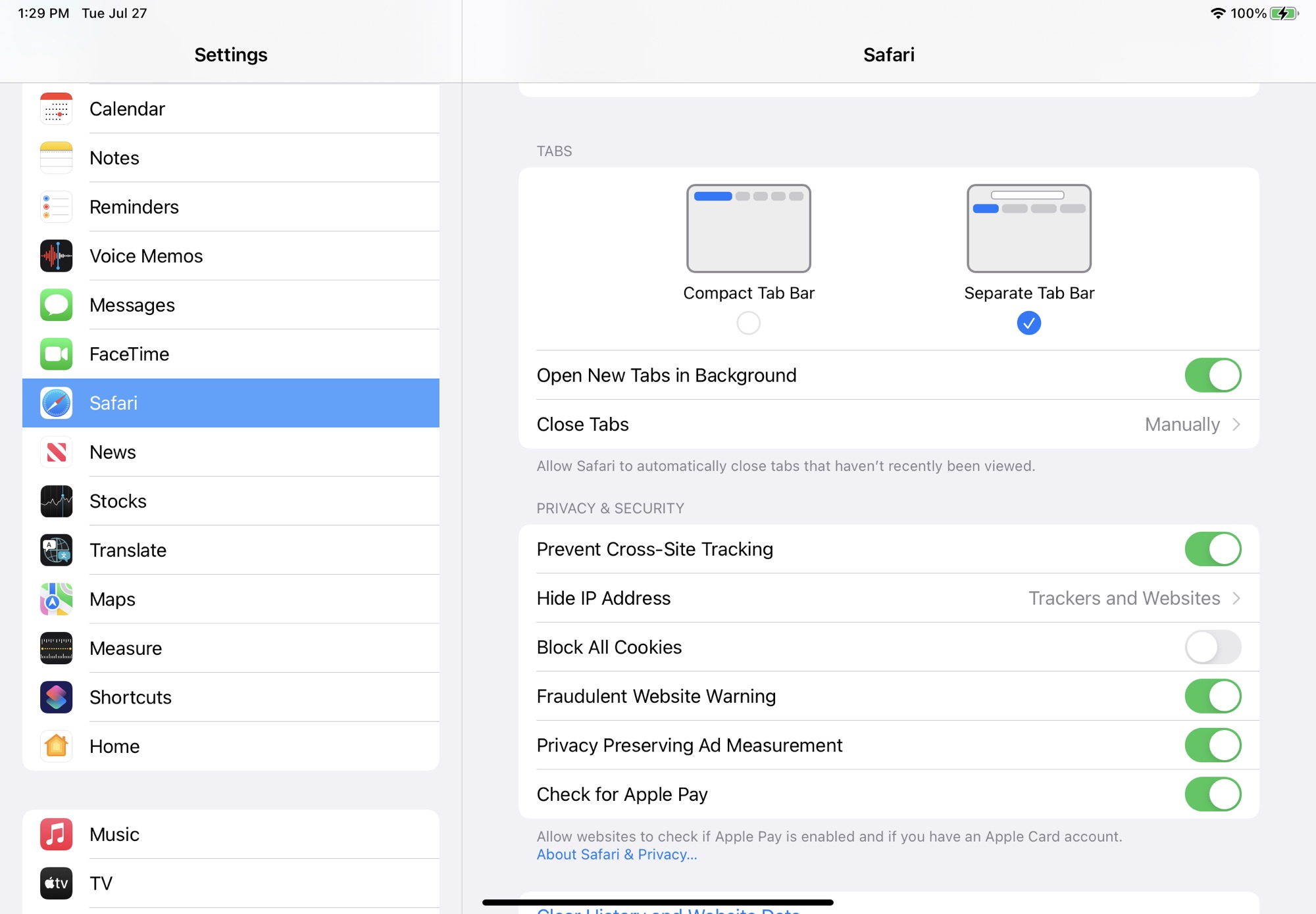
This design has not been popular with users, which has led to Apple making some changes during the beta testing period. As of now, Safari on iPadOS mirrors Safari on macOS Monterey, though additional design tweaks could come in the future.

Article Link: iPadOS 15 Gains macOS Monterey's Redesigned Safari Tab Interface
 
Why are they bubbles with padding below them? If they're not connected to the web content rectangle then it breaks the metaphor of what a tab is.

They’ve never really been “tabs.” They’ve always represented “web pages.” Subtle distinction, and probably an unhelpful one.
 
  • Love
Reactions: peanuts_of_pathos
They’ve never really been “tabs.” They’ve always represented “web pages.” Subtle distinction, and probably an unhelpful one.
To me they've always been tabs connected to pages just like physical tabbed pages in a paper notebook or tabbed file folders in a cabinet. And as such it has always made the most sense to me to have them just above the content, and connected to it. Not independent buttons, and not at the top of the screen.
 
Why do the bubbles have white padding below them? If they're not connected to the web content rectangle then it breaks the metaphor of what a tab is.

I think the tab metaphor is outdated. Safari on iOS has never had “tabs” yet they still call them tabs. It’s not like people are going to suddenly not know how tabs work because the metaphor is broken. That being said the old design was better
 
I wasn’t convinced at first of the compact design of Safari on macOS, but after using it, it is more convenient and arguably better designed than this version. I hope that option for both designs will stay in the public release
 
To me they've always been tabs connected to pages just like physical tabbed pages in a paper notebook or tabbed file folders in a cabinet. And as such it has always made the most sense to me to have them just above the content, and connected to it. Not independent buttons, and not at the top of the screen.

While that’s how you may have thought of them, that’s never really been how Apple has presented them (at least as far back as I can remember). Even on older OS’s, while the “tab” buttons blend seamlessly with the title bar, they do not do so with the page content - there is a line underneath the button.

While the standard MacOS tab control used to really be tabs, I don’t remember if Safari was available during that time. And, certainly, on iPhoneOS/iOS/iPadOS, it has never been the case that the standard tab control was really a “tab” as opposed to a horizontal button strip.
 
  • Like
Reactions: peanuts_of_pathos
I wasn’t convinced at first of the compact design of Safari on macOS, but after using it, it is more convenient and arguably better designed than this version. I hope that option for both designs will stay in the public release

In what way is it better designed? It seems worse in almost every possible way - controls that don’t appear when you need them, more taps required for common operations, touch targets that move in random ways, inability to see title bars, legibility problems caused by background coloration under text, etc.
 
Why do the bubbles have white padding below them? If they're not connected to the web content rectangle then it breaks the metaphor of what a tab is.

View attachment 1811650
I totally agree. Not having the tab connected to the content it is associated with makes it much harder to know which tab is the active one. This update is better than the previous beta but I think it’s still worse than Safari 14.
 
Register on MacRumors! This sidebar will go away, and you'll see fewer ads.