The Game 161
macrumors Nehalem
A better question is people who don’t?People still use Safari?
A better question is people who don’t?People still use Safari?
Source please… or I guess sources in the case of its universality.You mean other than the fact that it's universally derided as the world's worst web browser and by large margin?
They’ve never really been “tabs.” They’ve always represented “web pages.” Subtle distinction, and probably an unhelpful one.
Huh? It's "tabbed browsing" as a concept across the industry and referred to "tabs" by Apple in iOS and macOS.
View attachment 1811675View attachment 1811674
It’s literally the only browser on iOS so no choice. Every other one is just a shell.People still use Safari?
I don’t, outside of iOS device. Edge and chrome all the way, even Firefox.A better question is people who don’t?
I don’t dispute that. I dispute that they have been *visually* tabs, as opposed to a horizontal strip of buttons.
Dude - I was talking about macOS/iOS. I clearly said so if you look at the chain of messages. You are proving my point - true tabs exist in lots of OS's, but never in iOS/iPadOS/iPhoneOS, and not for a very long time in Mac OS's (which is something i expressly said in this chain of posts).Gotta disagree. But maybe we're touching on one of the problems with psuedo-skeuomorphic design.
The concept of tabs being "visually tabs" in the UI (in all GUI OSs) goes back pretty far.
View attachment 1811685
No they don't. To be an actual tab, the horizontal line should be on the TOP of the "tab," and there should be no separator on the BOTTOM of the tab.View attachment 1811678
In the current version of Safari tabs totally look like actual tabs of the browser window.
I said "tab of the browser window". The interface. Not the content of the window. In the way you described, if you want to keep tabs on the bottom, the active tab should also be in the color of the page being displayed and have no border between.No they don't. To be an actual tab, the horizontal line should be on the TOP of the "tab," and there should be no separator on the BOTTOM of the tab.
I said "tab of the browser window". The interface. Not the content of the window. In the way you described, if you want to keep tabs on the bottom, the active tab should also be in the color of the page being displayed and have no border between.
Dude - I was talking about macOS/iOS. I clearly said so if you look at the chain of messages. You are proving my point - true tabs exist in lots of OS's, but never in iOS/iPadOS/iPhoneOS, and not for a very long time in Mac OS's (which is something i expressly said in this chain of posts).
Yep, and as someone who has bookmarks in folders a couple of layers deep, having to click back all the way up the folder tree to the top layer to be able to close to the sidebar after choosing a bookmark when using the iPad in landscape mode is a massive PITA. In portrait mode the sidebar gets closed automatically when you choose a bookmark. I want that to happen in landscape too, even if it is an option I have to turn on!It looks like bookmarks are still hidden away. They need to make that as simple as it was in iOS 14. Should not take multiple clicks to get to the bookmarks.
According to this, Safari's got roughly 50% market share on the Mobile Web.People still use Safari?
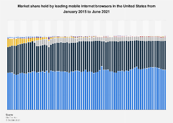
 www.statista.com
Unfortunately, the reload option in Safari on iOS is in the same spot as the Reader View icon… while extra space remains at the bottom.And the reload button is back to where it belongs, progress! 👍
