The option to make apps icons bigger on ipad like before is nowhere to be found now… So on top of a retrograde with Safari, they remove a feature? Great..
Got a tip for us?
Let us know
Become a MacRumors Supporter for $50/year with no ads, ability to filter front page stories, and private forums.
iPadOS 15 : we are stuck with 6x5 apps on home screen now?
- Thread starter SoYoung
- Start date
- Sort by reaction score
You are using an out of date browser. It may not display this or other websites correctly.
You should upgrade or use an alternative browser.
You should upgrade or use an alternative browser.

Must be because of the changed widgets placement anywhere on the home screen.The option to make apps icons bigger on ipad like before is nowhere to be found now… So on top of a retrograde with Safari, they remove a feature? Great..
Tim Apple gives, Tim Apple takes away. 🥺😂
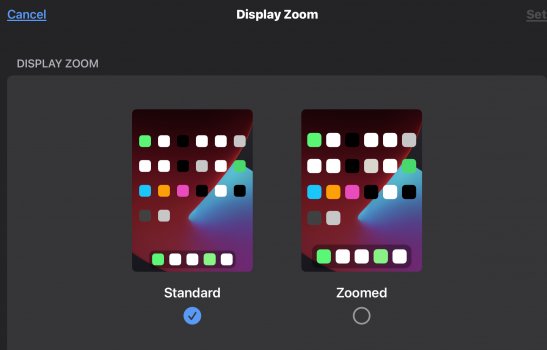
I can't see Apple releasing it in its current state. The spacing looks odd whether you use Standard or Zoomed, especially in portrait. The Display Zoom comparison shot shows what it's supposed to look like spacing-wise. Hopefully, it'll be fixed in upcoming builds. I hope.
Attachments
My totally uninformed guess is they merged the springboard code from iOS into iPadOS but haven’t had a chance to update it for the iPad’s width. I’ll bet this is fixed in a future beta.
I’d say the single column widget setup left of the Home Screen would back up that guess.My totally uninformed guess is they merged the springboard code from iOS into iPadOS but haven’t had a chance to update it for the iPad’s width. I’ll bet this is fixed in a future beta.
Thank you for this! I’m wondering this too! And like the others have said I really do hope it changes back in a coming update. Widgets are freaking huge. And we get less apps on a page. Back to iPad being a giant iPhone again basically.
No, display zoom is also available on the 12,9 iPad pro models as well.Good guess. Zoomed display option was only ever available on iPhones.
My 12.9 iPad Pro is 4x6 portrait and 6x4 landscape. I don't remember "Display Zoom" in iPadOS 14, I thought there was a similar setting in Display to "make icons larger or smaller." Either way, I hope it gets fixed because it looks strange especially in portrait.
Before iPadOS 15, I could've sworn Books used to display books and magazines in Library 3 across in portrait, now it's 4 (zoomed) 5 (standard).
Before iPadOS 15, I could've sworn Books used to display books and magazines in Library 3 across in portrait, now it's 4 (zoomed) 5 (standard).
Last edited:
Finally decided to check out Beta 2 this weekend on my 12.9 and losing an entire row of icons along with not being able to have a few widgets on the left (without losing even more icons) is a massive step backwards.
The amount of unused space on my Home Screen is absurd. I really hope they get this sorted out. I can’t image anyone sees this as an upgrade.
The amount of unused space on my Home Screen is absurd. I really hope they get this sorted out. I can’t image anyone sees this as an upgrade.
Surprised more people with 12.9-inch iPad Pros have been relatively silent on this new spacing. It looks like the member above me said, "ABSURD" and not what one would expect visually on Apple's highest-end iPad Pro. I know we're still in beta, so hopefully they fix this. iOS 15 and iPadOS 15 were already letdowns, don't make it worse with what looks like taking the iPhone's Display Zoom feature and just slapping it into iPadOS 15 without seeing how bad the results look. Apple's Batteries widget surely won't ship like this, they'll fix the spacing.
Attachments
Last edited:
This was the first thing I noticed on my iPad Air 2…wasted space on the sides when in portrait mode and looks silly. The reason why it looks fine/better in landscape mode is because the dock is taking up some of that “extra” space. Like some others have already mentioned, this change is likely so that widgets can be placed anywhere. To expand on that, the icons now have the same amount of spacing on all sides in both orientations, unlike previous versions of iOS. 2x2 icons now make square, and is the same size in both orientations. 2x1 and 4x2 icons are also now the same size in both orientations as well. I have a feeling this is how it’ll be and likely won’t change any time soon. I’m hoping it’ll at least look better on my 11" iPad Pro due the the aspect ratio difference (it’s taller/skinnier than other iPads).
I wish I knew about this 6x4/4x6 issue before updating to the public beta. It sucks losing a whole row in landscape, but more importantly it looks terrible in portrait and changing the number of columns and rows in portrait means apps aren’t in the same relative location anymore. I really hope this is all unintentional and it goes back to 6x5 in both portrait and landscape by final release.
This beta looks terrible on my 11“ iPad Pro. I sincerely hope that a lot of work will be done on the spacing and on the unimaginative and boring widget designs as is.
I'm glad they have a public beta like this... you, along with many others feel this is terrible. I'm really hoping that this gets changed before official release.I wish I knew about this 6x4/4x6 issue before updating to the public beta. It sucks losing a whole row in landscape, but more importantly it looks terrible in portrait and changing the number of columns and rows in portrait means apps aren’t in the same relative location anymore. I really hope this is all unintentional and it goes back to 6x5 in both portrait and landscape by final release.
Apple mention in their iPadOS 15 Preview that widgets will remain in the same location whether portrait or landscape... by that statement, they need to address this issue.
Everybody that doesn't like this. Fill in the feedback app and submit it to apple. Unless people make it known that it's really awful, there's little chance they could change it.
Yup been doing that already.Everybody that doesn't like this. Fill in the feedback app and submit it to apple. Unless people make it known that it's really awful, there's little chance they could change it.
The homescreen is extremely bad now, widgets was ok in ios 14 on ipad, now it stinks and even give less apps on a screen…
My main issue is how much space there is between folders. Widgets are also super limited and a copy and paste from ios.The homescreen is extremely bad now, widgets was ok in ios 14 on ipad, now it stinks and even give less apps on a screen…

The new ipad homescreen is clearly designed to look good with widgets and bad with app icons. This makes me realise that I want all my apps to sport widgets. It used to come with a pretty huge opportunity cost on my iphone, because even the smallest widget takes up the space of 4 app icons. Which made me fairly hesitant to use them last year.
But on my ipad, where it’s 1 widget in place one 1 app, there really is no reason for me to use a normal icon when a widget is available. It just looks nicer, and can also double as additional information at a glance.
I just haven't found many widgets, from the apps I use, that I find worthwhile. Would much rather have my full app grid back.
Is it possible for them to give a “classic mode” for widgets? It Just seems more space efficient and cleaner with the widget sidebar than the new grid with huge spacing.
iPadOS 14 Widget Benefits:
- 6x5 App Grid
- Big clock
- Scrollable widget bar (mean more widgets)
iPadOS 14 vs iPadOS 15


iPadOS 14 Widget Benefits:
- 6x5 App Grid
- Big clock
- Scrollable widget bar (mean more widgets)
iPadOS 14 vs iPadOS 15
Register on MacRumors! This sidebar will go away, and you'll see fewer ads.