Become a MacRumors Supporter for $50/year with no ads, ability to filter front page stories, and private forums.
Isn't that the whole point in that it is well thought out (how widgets appear when changing orientation etc)?
On iOS 15 the way widgets work is absolutely weird, and we lost lots of screen space (12.9 here) as the new layout allows us to see fewer icons.

It is a poor implementation of a feature people wanted (repositionable widgets), as said, it seems added because they had to, but it is not well thought out.

It might be a beta thing and get fixed going forward, it is a pain to see for what it is now.

People before were complaining about a "missing feature", now for a poorly implemented one.
 
  • Like
Reactions: ediks
On iOS 15 the way widgets work is absolutely weird, and we lost lots of screen space (12.9 here) as the new layout allows us to see fewer icons.

It is a poor implementation of a feature people wanted (repositionable widgets), as said, it seems added because they had to, but it is not well thought out.

It might be a beta thing and get fixed going forward, it is a pain to see for what it is now.

People before were complaining about a "missing feature", now for a poorly implemented one.
But you have to think about how the widgets will work both in landscape and portrait. What’s a better way?
 
But you have to think about how the widgets will work both in landscape and portrait. What’s a better way?
Well, I think the old way was better, but also I imagine high-quality designers can design something better than what it is now iPad OS 15.

It's not up to me to fix it, but I am sure the screen can be used in a much better way, there's just too much wasted space.

Either that or at least allow people to pick the home screen they think is more functional, while I welcome the app library, it is not the solution as it requires way more steps than simply 1 finger click.

I expect more from the company that prides itself on making things "works" and "magic", I "complain" because I know they can do a lot more!
 
  • Like
Reactions: return2sendai
Like I mentioned earlier in the thread if the reason for the terrible implementation is because there is no other way due to orientation changes then just simply allow users to choose between Standard (iOS 14 Style) or Repositionable Widget (iOS15 Style).

Now we are stuck with a bunch of wasted space, especially on the 12.9". I can't imagine someone working in the UI department at Apple could possibly justify the loss of 6 icons + scrollable widgets to the left all so we can place widgets wherever we want.
Why does a widget need to be displayed exactly the same whether the iPad is in portrait or landscape? An app can be designed to adjust between portrait and landscape orientation. I don’t understand why that’s so difficult for a widget.

It seems like such an easy thing for Apple to just require a widget be designed for both orientations to get approved, and then we could have kept the same layout as before.
 
Now we are stuck with a bunch of wasted space, especially on the 12.9". I can't imagine someone working in the UI department at Apple could possibly justify the loss of 6 icons + scrollable widgets to the left all so we can place widgets wherever we want.
But thats another problem. Even though its a fixed grid, we CAN’T place widgets wherever we since it’s a permanently sorted grid from Top Left. So placing anything Bottom Right (the most thumb accessible quadrant) requires filling the screen with unnecessary Apps or distracting single-use widgets.

C8CA8F43-E40F-4D31-8AEC-BAD59E6220CA.jpeg
 
Last edited:
  • Like
Reactions: Frosties
But thats another problem. Even though its a fixed grid, we CAN’T place widgets wherever we since it’s a permanently sorted grid from Top Left. So placing anything Bottom Right (the most thumb accessible quadrant) requires filling the screen with unnecessary Apps or distracting single-use widgets.
Great point! All of this nonsense to implement the ability to place widgets “anywhere” - except exactly where people would find them most useful.
 
  • Like
Reactions: addamas
For me it’s more useful to have the widgets wherever I want As I found the today view too limiting but I agree that the new grid is just silly

I mean there are 16 app icons showing in my dock but I can only have 6 in a row on the page itself?

the grid should be 12 x 8 (double the rows and columns)
 
The one thing I loved about the 6x5 was icons staying in the same positions in both landscape and portrait. I hate the way they jump and change location between the two.

Too bad they couldn’t find a way to make widgets work with that 6x5 layout.
 
The whole implementation of those widgets has been horrible from the start. Every time I am about to add a widget, I am worried that it will f up my whole app layout and I have to move icons back and forth between home screens if the widget messes it all up. Try adding a widget to a stack on the first screen. Good luck with all the following pages!
 
For me, I think I will just need to reevaluate all my home screen pages and start moving things in anticipation of losing that row of icons before I update in the fall.
 
But you have to think about how the widgets will work both in landscape and portrait. What’s a better way?
Square grid with a permanent fixed Apple widget to replace today view. It could be a sleek combined time/weather/calendar Apple widget. I attached a very very rough mockup, but something like this. And it's flexible enough for 4x4 or 6x5! Before the reveal, I was actually expecting them to release something like this, but surprised we got what we got instead.

EDIT: The main reasoning for a square layout is the widgets and apps would stay in the same location when rotating. Currently they shift positions when rotating...a layout that looks good in landscape might look awful in portrait.
Web 1920 – 1.png
Web 1920 – 2.png
 
Last edited:
I couldn’t agree more. They have absolutely destroyed the utility of the Home Screen. This is the first time in 14 years where I’m not planning to upgrade to the new OS until I’m forced to. iPad OS 15 adds nothing that is worth the huge loss on the Home Screen. Just adding a preference to enable the ipad OS 14 Home Screen would completely solve the problem.
I believe you can go into system setting under Home Screen and select no Widgets on home screen. And you can also just long press on the Widgets on your Home Screen and remove them. Widgets on iPad OS 15 is no different than Widgets on iPhone. You don’t need to have Widgets on your Home Screen.
 
…hopefully the 10% of people out there who wanted this “feature” are fully satisfied with the massive gaps between every icon and the utter waste of space so they can have their garbage stacked smart widget placed smack in the middle of their screen.
How did you arrive at “10%”?
 
I believe you can go into system setting under Home Screen and select no Widgets on home screen. And you can also just long press on the Widgets on your Home Screen and remove them. Widgets on iPad OS 15 is no different than Widgets on iPhone. You don’t need to have Widgets on your Home Screen.
Selecting No Widgets does not bring back the tighter grid with more apps that was introduced iPadOS 13.
 
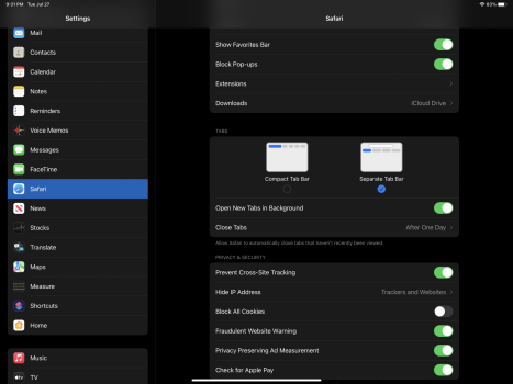
Just saw in the new Beta that in the Safari settings they are allowing us to choose between the old or new tab style. This is EXACTLY what a lot of us have been saying they need to offer for the Home Screen as well.
 

Attachments

  • 6D821878-59FA-4719-AAE8-8DF4B858D22D.png
    6D821878-59FA-4719-AAE8-8DF4B858D22D.png
    1.2 MB · Views: 212
Square grid with a permanent fixed Apple widget to replace today view. It could be a sleek combined time/weather/calendar Apple widget. I attached a very very rough mockup, but something like this. And it's flexible enough for 4x4 or 6x5! Before the reveal, I was actually expecting them to release something like this, but surprised we got what we got instead.View attachment 1811812View attachment 1811811
What would happen to a horizontal widget you placed in the bottom right corner that is 3 x 2 icons in size when you turned into portrait mode? Which 6 icons would it take up? And what would happen if you removed that giant widget you've got pictured or placed that somewhere else?
 
Last edited:
What would happen to a horizontal widget you placed in the bottom right corner that is 3 x 2 icons in size when you turned into portrait mode? Which 6 icons would it take up? And what would happen if you removed that giant widget you've got pictured or placed that somewhere else?
It would stay in the same position in portrait mode since its a square grid. And the giant widget is permanent/unremovable (Not an attractive proposition, but something’s gotta give. They could make that giant widget very customizable to appease the users)
 
  • Like
Reactions: The1andOnly
It would stay in the same position in portrait mode since its a square grid. And the giant widget is permanent/unremovable (Not an attractive proposition, but something’s gotta give. They could make that giant widget very customizable to appease the users)
I was about to say the original complaint was that the widgets were not movable!
 
Square grid with a permanent fixed Apple widget to replace today view. It could be a sleek combined time/weather/calendar Apple widget. I attached a very very rough mockup, but something like this. And it's flexible enough for 4x4 or 6x5! Before the reveal, I was actually expecting them to release something like this, but surprised we got what we got instead.
It does feel like a step backwards because all these active widgets made the iPad feel like an ugly version of Windows Live Tiles.

Ive tried replacing apps with all 1x1 widgets and I tried large widgets full of News Feeds, System Info, Files and Photos. But in the end it was all just space filler showcasing “twice-a-week- data that I just don’t need at all times.

For me, in the end then I think the old “Today View” is Apples most practical implementation of widgets. It highlighted always relevant info (Time, Date, Favorite Widget) and any “sometimes useful” widgets were just a scroll away. Apple surprised us by offering an option for classic Safari so I’m hoping they do the same for Widgets and grid spacing.
 
  • Like
Reactions: nick42983
d23ed609386a8cf6b0a7c09727ad75ea.png

The new ipad homescreen is clearly designed to look good with widgets and bad with app icons. This makes me realise that I want all my apps to sport widgets. It used to come with a pretty huge opportunity cost on my iphone, because even the smallest widget takes up the space of 4 app icons. Which made me fairly hesitant to use them last year.

But on my ipad, where it’s 1 widget in place one 1 app, there really is no reason for me to use a normal icon when a widget is available. It just looks nicer, and can also double as additional information at a glance.
How do the widgets look when the screen rotates to portrait mode?
 
How do the widgets look when the screen rotates to portrait mode?

Here’s mine currently.
15e72be6910f30ff3218bc5062d9bb0a.png

When you first turn your ipad to portrait, the icons may not re-arrange themselves in a manner that you want, but you can then proceed to arrange the icons again in portrait mode and iPadOS will remember the unique layouts for landscape and portrait.

So you will likely need to edit your homescreen twice. One for each orientation.
This. The layout can be completely different in both orientations to your liking... You could have a widget be in the upper-right corner in portrait mode, but have it be in the upper-left corner in landscape mode (or in the lower-left, or in the middle, etc.)

This also applies to the app icons. They can have their own unique positions in both orientations as well.
 
Register on MacRumors! This sidebar will go away, and you'll see fewer ads.