Become a MacRumors Supporter for $50/year with no ads, ability to filter front page stories, and private forums.

Aucun Express

macrumors regular
Original poster
Apr 30, 2009
187
0
I do not understand why Apple, a company which is so good with design, put such a lame default wallpaper on the iPhone 4.
When the iPad was released, I think that if it had a better looking wallpaper, we would have been a little more excited about it. Yes, I know it's stupid, but that's how marketing works.
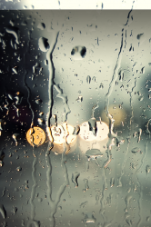
Putting bubbles is a nice idea because, when you see it, you get a sense of how intense the resolution is. But if the 10% of the top is average, the rest in gray is really lame.
We wouldn't care if this picture wasn't on EVERY promo material:
iphone-4-low-signal-358x480.jpg


What do you think?
 
I do not have such strong opinions but I do agree for their first phone with the ability to add backgrounds I am underwhelmed by this one. Could never see myself using it. Then again the whole point is to personalize it. ;)
 
I agree, it's one of the ugliest wallpapers I've ever seen. Teal gradient into gray with water drops? - yuk!
 
I like the wallpaper but it gets overused quickly.

I change my iPhone walls twice a week, anyways.
 
It's pretty visually unimpressive. They could've come up with something more vibrant to show off the screen.
 
Wow lol it's just a default wallpaper. Change it if you hate it. Lol

Personally I like it. It's pretty cool looking to me
 
I'm not a fan of wallpapers that look busy or complex, so I actually like the simplicity of the bubbles and the basic color choices. For some reason the bubbles wallpaper looks good on the iPhone 4 but horrible on the iPad (I'm guessing retina display helps)
 
I thought it was pretty nice as well, I kept it on for a while until I found a better wallpaper.
 
You might not like it, but in a photographic sense, it matches everything because of the grey/teal. My teacher once explained to us that the reason he used grey wallpapers instead of the default Aqua blue one was because the wallpaper would make it harder for us to work with images in Photoshop. Grey blends well, but not so much that it becomes part of the picture.

It's a basic wallpaper that works with the badges/folders/multitasking, and whether it's a model/cat/or whatever, it'll always work with the subject but not be so much of a distraction.
 
So OP, what is a good wallpaper? I personally love the stock iOS4 wallpaper, and the HTC Desire one is pretty great too.
 
Well this one, for instance, states something:
image-4.png

I wouldn't use it as default wallpaper because it wouldn't work with the icons. But when you see it, there is definitely a WOW factor. When you see the default settings of the iPhone 4, you don't say to yourself "WOW, this is beautiful!". You are more thinking "sure, it looks good."
Since the design of the iPhone 4 is so good (just look at it from behind or from its side), I think that it deserves a better default wallpaper. And I really talk about it as a way to promote the iPhone, not the actual wallpaper when you buy the phone. No one cares about the default wallpaper when you have it in your hands, you can just change it whenever you want. I am talking about it as a marketing point of view.
 
The OP's criticism is very valid and I actually agree with it. Apple goes as far as to caring about the gradient used on a 16x16 px button. So yes, It might just be a wallpaper to you but you bet your ass Apple spent quite sometime carefully choosing them.
 
I don't like this wallpaper too, but is this so big deal? I just change it same day I buy iPhone 4.
 
I like this "version" of water droplets much more.

But really, it's not that big of a deal.
 

Attachments

  • img_0177-1.png
    img_0177-1.png
    867.2 KB · Views: 369
It's something that's easily changeable. So do it!

I think this is the worst OCD post I've seen on here.
 
The people who complain don't get the point of this thread. It's not just that it's the default wallpaper, but also (correct me if I'm wrong, OP) a large part of the iPhone 4's public face. And it's uninspired and unattractive.
 
The people who complain don't get the point of this thread. It's not just that it's the default wallpaper, but also (correct me if I'm wrong, OP) a large part of the iPhone 4's public face. And it's uninspired and unattractive.

Considering how "crowded" is the iPhone screen due its small size and the many apps on it, any simple wallpaper would have had the same impact, if was too complex would have been confusing. I like the drops.
 
Register on MacRumors! This sidebar will go away, and you'll see fewer ads.