Got a tip for us?
Let us know
Become a MacRumors Supporter for $50/year with no ads, ability to filter front page stories, and private forums.
iPhone iPhone 4 Wallpaper Thread (Some NSFW)
- Thread starter Phat^Trance
- Start date
- Sort by reaction score
You are using an out of date browser. It may not display this or other websites correctly.
You should upgrade or use an alternative browser.
You should upgrade or use an alternative browser.
- Status
- Not open for further replies.
Can anyone make a Rocko's Modern Life wallpaper? Please and thanks in advance if able.
Oh and adding to the mix.

Oh and adding to the mix.
Would someone be willing to make me a pair of wallpapers?
Using this image as the lock screen
And this as the home screen
(Maybe change the color to deep purple or dark blue)
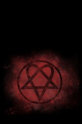
Using this image as the lock screen
And this as the home screen
(Maybe change the color to deep purple or dark blue)
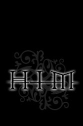
Would someone be willing to make me a pair of wallpapers?
Using this image as the lock screen
And this as the home screen
(Maybe change the color to deep purple or dark blue)
Hope these help. Please upload a screen dump ;-)
Attachments
Pretty amazing shot of two F-15's flying nearby shuttle Atlantis taking off.

Full-size image: http://www.af.mil/shared/media/photodb/photos/100514-f-0000c-603.jpg
That's amazing man!
Thanks a bunch very nice
Here's another one I cropped from a Mandolux image. I'm a huge Braves fan too. Grew up in Snellville.
Attachments
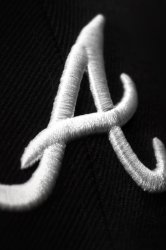

Here's another one I cropped from a Mandolux image. I'm a huge Braves fan too. Grew up in Snellville.
Wow... me too. Snellville has changed a lot over the past 10 years.
Wow... me too. Snellville has changed a lot over the past 10 years.
I left there in 88 going to the Navy. Been back a few times since and just can't believe the TRAFFIC, my God man, the traffic!!!
Some really awesome work in this thread! If any of you creative types have some time and wouldn't mind, I'd love to see a "flux capacitor" wallpaper (from Back to the Future)... I think it would look so slick as the wallpaper on the lock screen ")
Thanks!
Thanks!
Got a few more requests for bumper colors... Here you go!


hi,
can you do it in grey?
thx
marcip3
Here are my wallpapers...
Snow Leopard

Dude,
I love this little cutie snow leopard! Could you sent it to me foe download?
Thnaks!
Thanks, the pic in your link isn't working.
Here's the resulting lock screen (still like it as it is...probably a great wallpaper).
Thanks!
Edit...just read your part about moving it...results below. Definately an improvement. (Won't let me resize)
Ok I'll adjust it accordingly tonight when I get off work.
That's really not a great representation of android.... here's a nice thread with some screen caps of people's home screens... scroll down to post 14 to see a nice example of the level of customization you can achieve.
http://androidforums.com/htc-evo-4g/91853-lets-us-peek-your-screens.html
ps i'm a big fan of iOS, but thought you should at least see some decent android setups before you pass judgement!
http://androidforums.com/htc-evo-4g/91853-lets-us-peek-your-screens.html
ps i'm a big fan of iOS, but thought you should at least see some decent android setups before you pass judgement!
You can still see it regardless.
Well since you're not trolling you won't mind me saying something about your home screen compared to the new iPhone 4.
Android:
Android's design makes me cringe sometimes. Look how crowded the status bar is. The info is nice but it just looks messy.
iPhone:
I admit it would be nice to have more statuses in the status bar but I like how simple and unobtrusive the iPhone's is.
Android:
Does the home screen really need a giant battery icon app? How bout how "messages" is surrounded by that dark grey highlight? It's a good idea but the edges of the letters touch the edge of the highlight and makes it look unbalanced. Also the way there is a missing row of apps makes it even more unbalanced. And the apps have different shadow castings which make it look unorganized.
iPhone:
They all have the same basic shape and look very organized. The dock is always a plus because you can get to your phone app quicker.
Anyway you can definitely see and enjoy the wallpaper on the iPhone 4, especially with it's new high resolution. We get you're point that Android has had the ability to have wallpapers in the background for awhile but there's so much wrong design-wise that doesn't make it seem all that special.
I wonder if someone with more skills than I could convert some of these high res shots of the new 360 into iPhone 4 Walls.
http://www.flickr.com/photos/majornelson/sets/72157624380106300/
http://www.flickr.com/photos/majornelson/sets/72157624380106300/


Here's another one I cropped from a Mandolux image. I'm a huge Braves fan too. Grew up in Snellville.
I LOVE Mandolux. Let's at least link back to him for credit. Not sure how he feels about having his stuff jacked and republished.
http://www.mandolux.com/
If people on here are too daft to figure out how not to quote pictures when replying, how are they going to get the pictures on their iphones?
Yeah, people need to stop doing 2 things in this thread...1) Quoting pics (we don't need them twice) and 2) Stop posting your desktop unless the original has been posted and you are discussing how it fits with icons, lock screen, etc...
Ok I'll adjust it accordingly tonight when I get off work.
Thanks again!!
I wonder if someone with more skills than I could convert some of these high res shots of the new 360 into iPhone 4 Walls.
http://www.flickr.com/photos/majornelson/sets/72157624380106300/
Here they are:


I have a request
Wondering if anyone could convert this image to iPhone 4 size. I would try to do it myself but I'm not good a photoshop and I'd like the whole symbol on the Wallpaper. Used to be in the Corps so I would like to represent
Thanks
Wondering if anyone could convert this image to iPhone 4 size. I would try to do it myself but I'm not good a photoshop and I'd like the whole symbol on the Wallpaper. Used to be in the Corps so I would like to represent
Thanks
- Status
- Not open for further replies.
Register on MacRumors! This sidebar will go away, and you'll see fewer ads.