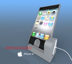
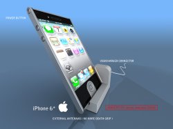
Become a MacRumors Supporter for $50/year with no ads, ability to filter front page stories, and private forums.

achikuda

macrumors newbie
Original poster
Oct 22, 2010
12
0
I'd like to represent my concept of :apple: IPHONE 6G
all we know that 5G will look like as 4G but who knows how 6G would look like
maybe i can predict?! lets take a look at my concept :apple:
 

Attachments

  • iphone 6 recharge.jpg
    iphone 6 recharge.jpg
    227.6 KB · Views: 466
  • iphone.jpg
    iphone.jpg
    483.3 KB · Views: 238
  • iphone 6 (b).jpg
    iphone 6 (b).jpg
    167.1 KB · Views: 160
  • iphone 6 (a).jpg
    iphone 6 (a).jpg
    195.2 KB · Views: 163
It looks kinda like a blackberry, I kinda like it. But I can tell you right now that it has too many different parts (silver sides, black front, silver front, and a button. Jobs would never approve something like that.
 
It looks kinda like a blackberry, I kinda like it. But I can tell you right now that it has too many different parts (silver sides, black front, silver front, and a button. Jobs would never approve something like that.

yea unfortunately i should agree with you about jobs, but i think all this changes will make iphone better device! just imagine solar charger integrated to your phone to extend battery life. aluminum button which will help to unify difference between color of iphone (due to g4 iphone white button do not match screen color , they have stop producing the white one) :cool:
 
you know, we pay a lot of money for iphone and i think they have to produce more solid and slick device, which would be good for teens and businessmen at once! :apple:
 
This looks more like a Sony product than anything Apple would ever release. Think minimalism and simplicity, not coolness.
 
thankfully we can rest assured that this only lives in your imagination and it will never look as ugly as this!
 
This would have been a pretty cool concept BEFORE the iPhone 4 was released, but now its looking a little outdated. I do like the placement of the power button though.
 
This looks more like a Sony product than anything Apple would ever release. Think minimalism and simplicity, not coolness.

all this parts are functional but it's up to you how to think about it :)
i think the most "coolnest" think is apples interface, with lot of colors and round-shaped forms so this is the most futuristic and minimalistic shaped phone which has ever been designed by :apple:
 
all this parts are functional but it's up to you how to think about it :)
i think the most "coolnest" think is apples interface, with lot of colors and round-shaped forms so this is the most futuristic and minimalistic shaped phone which has ever been designed by :apple:

I wouldn't call that dock minimal at all. Same with that home button design. Don't get me wrong, it's definitely a cool mockup, just drop a Sony logo on it and switch the iOS with Android and you're good to go.

I know my Apple, my thesis was a complete historical, environmental and trend analysis of the company, and this concept is NOT Apple worthy (or should I say, Steve Jobs worthy).
 
I think you can get rid of the 30-pin connector as well. Nowadays, charging without a connector is already possible*, and data exchange ofcourse as well.

*primairy winding and core of a transformer in the base, secondary winding inside the i-device.
 
This would have been a pretty cool concept BEFORE the iPhone 4 was released, but now its looking a little outdated. I do like the placement of the power button though.

i would like to be more real in what i'm doing and closer to apples view
i do not like concepts which are phantasmal and made from liquid materials
 
I think you can get rid of the 30-pin connector as well. Nowadays, charging without a connector is already possible*, and data ofcourse as well.

*primairy winding and core of a transformer in the base, secondary winding inside the i-device.

i agree
 
It's probably the render but it looks like an iPad threw up on an iPhone and then someone tried to cram it into a Sony PDA.
 
I would have to think the device will be different by the 6th Gen, only because Apple knows ppl are getting tired of the same icons look and feel, I can not imagine they will not change it up a bit.

Interesting Concept though :rolleyes:
 
in all seriousness.

Design should always serve some kind of purpose

why would you make such an ugly 'side cable' dock?
why that 'thumb shaped' silver patch around the home button? ... for collecting fingerprints, i suppose
why put the power button up there?

this isn't a concept, it's a 3D modeling exercise, really :/


edit: oh, i get the dock now, the 30pin's on the side, and you'll just slide it in that way. that's kinda neat
then again, i don't think they're gonna make the new phone incompatible to every single 'universal dock' sporting device just by moving the connector there.
 
I would have to think the device will be different by the 6th Gen, only because Apple knows ppl are getting tired of the same icons look and feel, I can not imagine they will not change it up a bit.

Interesting Concept though :rolleyes:

Ever hear of OS X? People aren't getting tired of the same icons look and feel, there's no need to completely redesign the interface or the hardware. Apple will keep making evolutionary improvements on iOS and the iPhone design for a long time to come.
 
Register on MacRumors! This sidebar will go away, and you'll see fewer ads.