Become a MacRumors Supporter for $50/year with no ads, ability to filter front page stories, and private forums.

deuxani

macrumors 6502a
Original poster
Sep 2, 2010
703
741
At this moment there are a lot of rumours about the iPhone 8 being bezel-less and the home button and finger print scanner being on/in the screen. So I was thinking how this could be implemented UI wise in combination with a large screen in a small body. I've made a design based on the following principles:

  • There must be room for the camera and speaker on top
  • The phone must be symmetrical (same size top and bottom bezel)
  • Apps must be able to work in the same 16:9 aspect ratio of the iPhone 5/5S/6/6S/7
  • The bezels can be reduced to a minimum
  • The home button must function the same way as current iPhones
  • The home button space can be dynamic

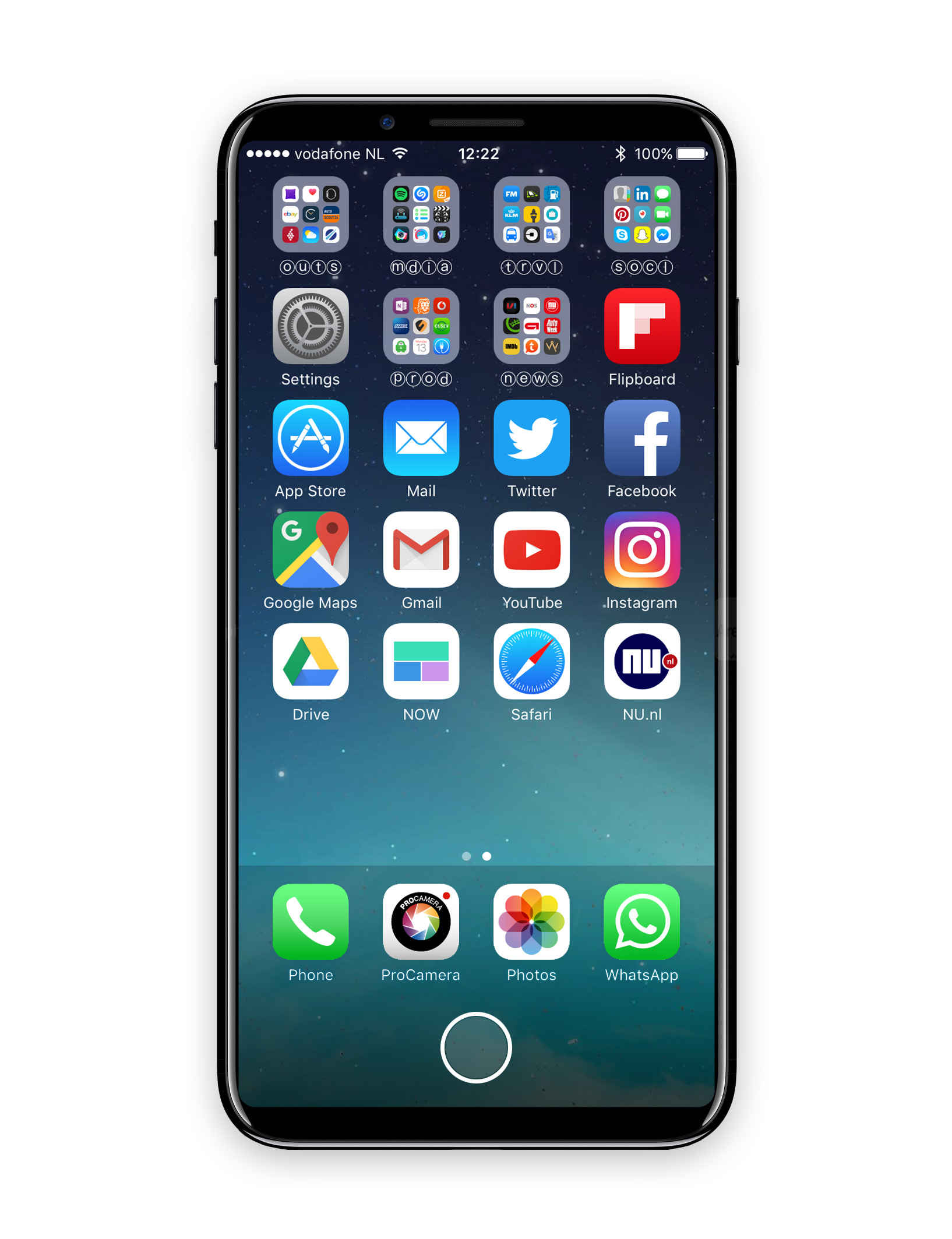
I came up with this for the home screen:
sMjdUUQ.jpg


The bezels are reduced to a minimum but they do exist as I don't think the tech is ready to have a camera behind the screen. The screen is very large, the aspect ratio has changed (the screen is longer), but the body is not much bigger than a regular iPhone 7. The part with the home button is about the same size as the space on all current iPhones. I don't think Apple is going to make the spacing smaller as that would cause for more accidental presses in the docked apps.
On the home screen I think only a home button would be present so the usage of the button would stay the same between all iPhones. However, it would also be possible to have for instance a button for recent apps and control center or Siri on the left and right of the home button. Or maybe a handoff icons.

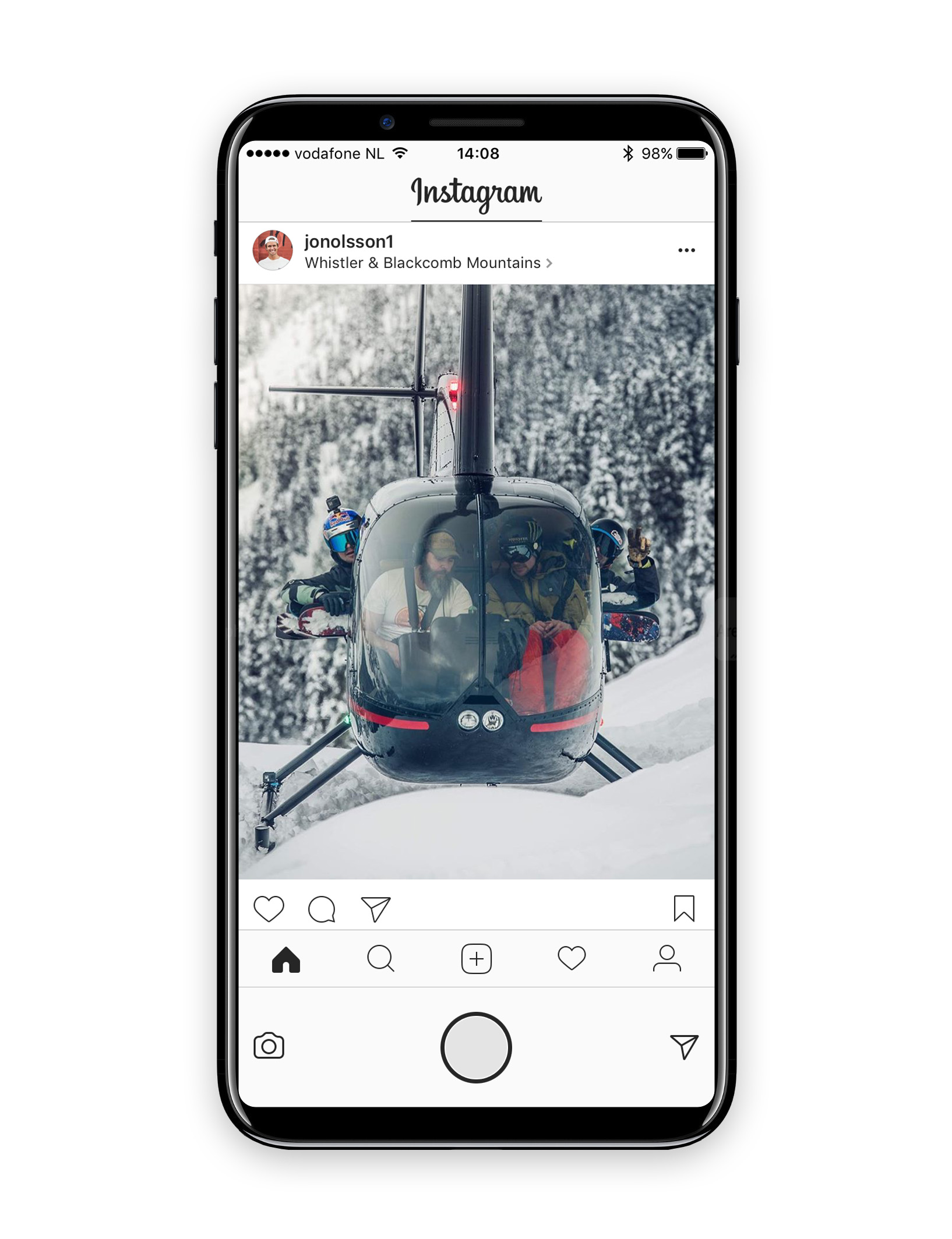
When going into an app like Instagram you could see how this implementation with the extra screen real estate on the bottom would gain some benefit:
g7smOdn.jpg


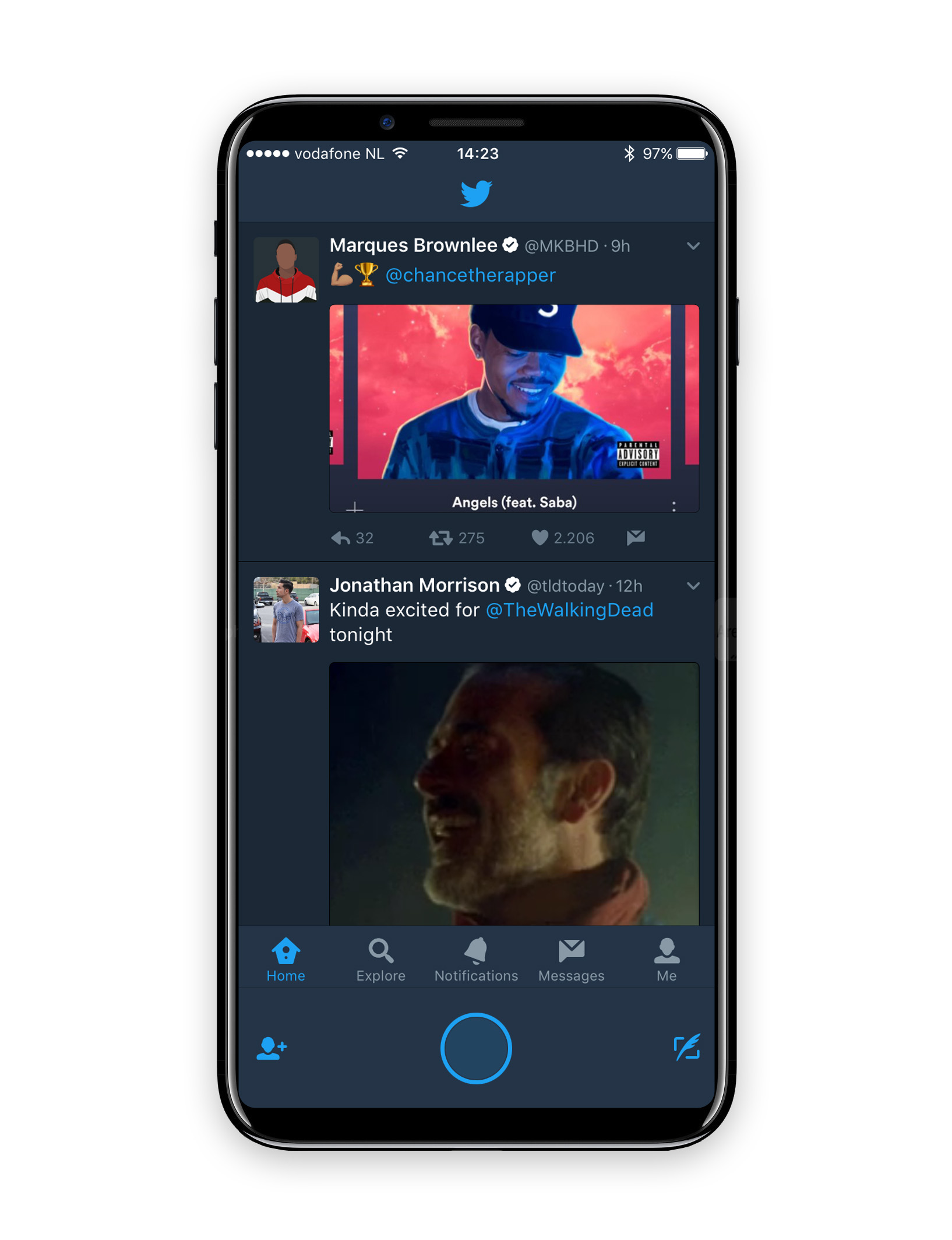
In the regular app on current gen iPhones the camera and messages buttons are on top of the screen and hard to reach. With this new long screen it's possible to move these buttons down to the left and right of the home button. The home button area is dynamic now instead of a static bar of unused space.

This same implementation can be seen in the Twitter app:
f0XyqAU.jpg


Because the screen is rumoured to be OLED, the home button and the place where the TouchID sensor is could always be shown on-screen even when the rest of the screen is turned off:

vGFbODe.jpg


I think this way Apple is able to create an iPhone that is almost entirely a screen from the front, let apps be usable from day one without the need for developers to change their apps (if they don't change their apps, the buttons next to the home button would just show on the top like on current gen iPhones) and the iconic design of the iPhone would remain the same.

What do you guys think?
 
Last edited:

sarahgad

Suspended
Jan 20, 2017
30
25
At this moment there are a lot of rumours about the iPhone 8 being bezel-less and the home button and finger print scanner being on/in the screen. So I was thinking how this could be implemented UI wise in combination with a large screen in a small body. I've made a design based on the following principles:

  • There must be room for the camera and speaker on top
  • The phone must be symmetrical (same size top and bottom bezel)
  • Apps must be able to work in the same 16:9 aspect ratio of the iPhone 5/5S/6/6S/7
  • The bezels can be reduced to a minimum
  • The home button must function the same way as current iPhones
  • The home button space can be dynamic

I came up with this for the home screen:
sMjdUUQ.jpg


The bezels are reduced to a minimum but they do exist as I don't think the tech is ready to have a camera behind the screen. The screen is very large, the aspect ratio has changed (the screen is longer), but the body is not much bigger than a regular iPhone 7. The part with the home button is about the same size as the space on all current iPhones. I don't think Apple is going to make the spacing smaller as that would cause for more accidental presses in the docked apps.
On the home screen I think only a home button would be present so the usage of the button would stay the same between all iPhones. However, it would also be possible to have for instance a button for recent apps and control center or Siri on the left and right of the home button. Or maybe a handoff icons.

When going into an app like Instagram you could see how this implementation with the extra screen real estate on the bottom would gain some benefit:

g7smOdn.jpg


In the regular app on current gen iPhones the camera and messages buttons are on top of the screen and hard to reach. With this new long screen it's possible to move these buttons down to the left and right of the home button. The home button area is dynamic now instead of a static bar of unused space.

This same implementation can be seen in the Twitter app:

f0XyqAU.jpg


I think this way Apple is able to create an iPhone that is almost entirely a screen from the front, let apps be usable from day one without the need for developers to change their apps (if they don't change their apps, the buttons next to the home button would just show on the top like on current gen iPhones) and the iconic design of the iPhone would remain the same.

What do you guys think?

Good job i must say amazing design. Let's see what apple has in store for their valued customers. Expecting the unexpected.
 

deuxani

macrumors 6502a
Original poster
Sep 2, 2010
703
741
Good job i must say amazing design. Let's see what apple has in store for their valued customers. Expecting the unexpected.

Thanks :) I really really hope they will present something like this, because just a 7S would be so disappointing for everyone (especially after all the rumours).

By the way, I've added a picture of what it looks like with the screen off:

vGFbODe.jpg


Being OLED the home button with touch ID could always show on screen.
 
  • Like
Reactions: ZeroGauge

idmean

macrumors regular
Feb 27, 2015
151
801
While I like your mockup a lot better than many others I have seen so far, I hardly doubt that Apple would 1) change the color of the home button 2) place buttons like that around the home button, they are far too small for like that and make little sense there as that space would seem to belong to the OS at first glance.
 

deuxani

macrumors 6502a
Original poster
Sep 2, 2010
703
741
While I like your mockup a lot better than many others I have seen so far, I hardly doubt that Apple would 1) change the color of the home button 2) place buttons like that around the home button, they are far too small for like that and make little sense there as that space would seem to belong to the OS at first glance.

The coloring might indeed not happen. Realistically there might just be a dark and light home button bar, just like with the keyboard. One can hope :)

However, I do think there will be developer specific sections that can be utilised. If that wouldn't happen, then in basically every app that entire bottom bar would be mostly unused. I can't think of an OS specific functionality next to the home button that could be shown there in 3rd party apps. So it would be a shame to not use that space so close to your thumb for something dynamic and app specific. Just look at the Touch Bar on the new MacBook Pro's. The icons in the mockup are the same size and same position as they were in the top bar. So perfectly usable but not too present that it takes the attention away from the important home button.
 

DanielDD

macrumors 6502a
Apr 5, 2013
524
4,447
Portugal
I like the concept but I don't think it looks symmetric, specially on the home screen. Everything seems crammed on top and very spaced out at the bottom
 
  • Like
Reactions: dontworry

MRU

macrumors Penryn
Aug 23, 2005
25,368
8,948
a better place
Nice work, but the implementation you envision would seemingly make extra screen estate granted by the full screen glass device somewhat then redundant in practice..
 

deuxani

macrumors 6502a
Original poster
Sep 2, 2010
703
741
I like the concept but I don't think it looks symmetric, specially on the home screen. Everything seems crammed on top and very spaced out at the bottom

I basically made a screenshot of my iPhone 6S and added the home button area on the bottom. All iPhones look that crammed on the top actually and all have a very spaced out bottom part where the home button is (only now it isn't part of the screen). If you have a Jet Black iPhone 7 with a black wallpaper it will almost look the same spacing wise (only you would have a large unused top part where the camera and speaker is).

Nice work, but the implementation you envision would seemingly make extra screen estate granted by the full screen glass device somewhat then redundant in practice..

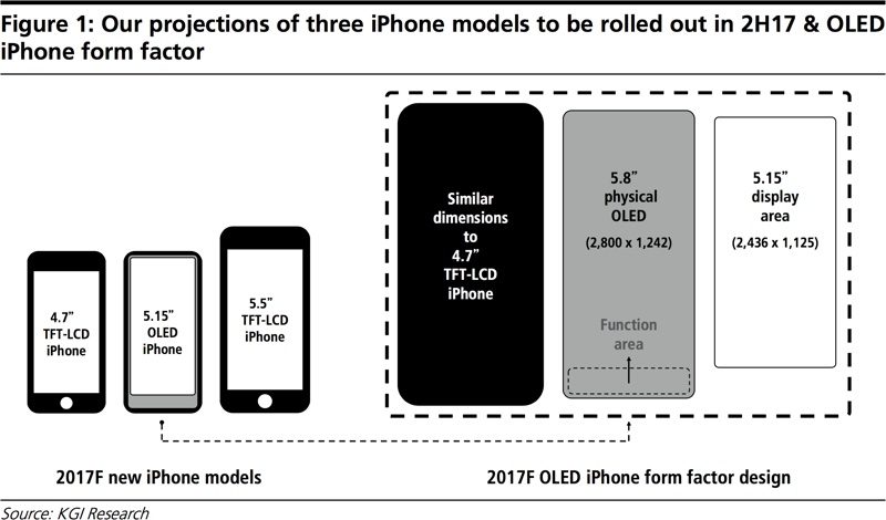
The usable screen part is wider and taller than the iPhone 7, but smaller than the 7 Plus. Adding this extra part of the screen would open up added functionality to the OS and apps, but I don't think the area will be used as pure extra screen real-estate. This post my Ming-Chi Kuo shows it well too:

kuoiphone8size-800x470.jpg
 
  • Like
Reactions: DanielDD and MRU

Sunny1990

Suspended
Feb 13, 2015
1,660
5,196
At this moment there are a lot of rumours about the iPhone 8 being bezel-less and the home button and finger print scanner being on/in the screen. So I was thinking how this could be implemented UI wise in combination with a large screen in a small body. I've made a design based on the following principles:

  • There must be room for the camera and speaker on top
  • The phone must be symmetrical (same size top and bottom bezel)
  • Apps must be able to work in the same 16:9 aspect ratio of the iPhone 5/5S/6/6S/7
  • The bezels can be reduced to a minimum
  • The home button must function the same way as current iPhones
  • The home button space can be dynamic

I came up with this for the home screen:
sMjdUUQ.jpg


The bezels are reduced to a minimum but they do exist as I don't think the tech is ready to have a camera behind the screen. The screen is very large, the aspect ratio has changed (the screen is longer), but the body is not much bigger than a regular iPhone 7. The part with the home button is about the same size as the space on all current iPhones. I don't think Apple is going to make the spacing smaller as that would cause for more accidental presses in the docked apps.
On the home screen I think only a home button would be present so the usage of the button would stay the same between all iPhones. However, it would also be possible to have for instance a button for recent apps and control center or Siri on the left and right of the home button. Or maybe a handoff icons.

When going into an app like Instagram you could see how this implementation with the extra screen real estate on the bottom would gain some benefit:


In the regular app on current gen iPhones the camera and messages buttons are on top of the screen and hard to reach. With this new long screen it's possible to move these buttons down to the left and right of the home button. The home button area is dynamic now instead of a static bar of unused space.

This same implementation can be seen in the Twitter app:


Because the screen is rumoured to be OLED, the home button and the place where the TouchID sensor is could always be shown on-screen even when the rest of the screen is turned off:


I think this way Apple is able to create an iPhone that is almost entirely a screen from the front, let apps be usable from day one without the need for developers to change their apps (if they don't change their apps, the buttons next to the home button would just show on the top like on current gen iPhones) and the iconic design of the iPhone would remain the same.

What do you guys think?
WOW!!! The concept looks amazing, btw can you please share this wallpaper
 
Last edited:

andyw715

macrumors 68000
Oct 25, 2013
1,844
1,404
I read a rumor (seemed pretty out there) that Touch ID would be gone and replaced by a facial rec/laser scanning system.
 
Register on MacRumors! This sidebar will go away, and you'll see fewer ads.