Mine too. But Europeans will be getting them before us if they had access to the same preorders. So you may see some actual impressions when you get up tomorrow. The time frame quoted for me is delivery before 9pm so you may want to live vicariously for a few hours tomorrow.I presume no one has actually received their iPhone 12 minis yet right? Mines arriving tomorrow
Got a tip for us?
Let us know
Become a MacRumors Supporter for $50/year with no ads, ability to filter front page stories, and private forums.
iPhone 12 iPhone Mini First Impressions
- Thread starter exterminator
- Start date
- Sort by reaction score
You are using an out of date browser. It may not display this or other websites correctly.
You should upgrade or use an alternative browser.
You should upgrade or use an alternative browser.
It literally eats up more screen real estate by percentage. The mini’s notch is roughly the same size as the notch on the larger phones, so the notch represents a much larger % of the surface area of the front of the phone.It literally eats up no more screen real estate as it compares to the other models of iPhone 12. You don’t lose a single thing. Same number of status bar icons, same amount of usable space for content.
Totally fair pointIt literally eats up more screen real estate by percentage. The mini’s notch is roughly the same size as the notch on the larger phones, so the notch represents a much larger % of the surface area of the front of the phone.
Shouldn't people from Australia/New Zealand be getting them in the next couple of hours or something?Mine too. But Europeans will be getting them before us if they had access to the same preorders. So you may see some actual impressions when you get up tomorrow. The time frame quoted for me is delivery before 9pm so you may want to live vicariously for a few hours tomorrow.
I am picking mine up from the Apple store in an hour!Shouldn't people from Australia/New Zealand be getting them in the next couple of hours or something?
Mine too. But Europeans will be getting them before us if they had access to the same preorders. So you may see some actual impressions when you get up tomorrow. The time frame quoted for me is delivery before 9pm so you may want to live vicariously for a few hours tomorrow.
Don’t forget Australians and New Zealanders- they will be the very first to get theirs.
I will post my feelings tomorrow. Since I traded my iPhone 11 for the SE 2020 and I find the 4.7 inch screen to be very good but would like the extra real estate and modern look with a slightly smaller device I think the Mini will be perfect for me. I am very excited for tomorrow. On a side note my wife is really enjoying the iPhone 12 compared to her iPhone 11 Pro. She says its lighter and more comfortable to hold. Only downside for her is the nit Count is lower and the phone while bright, is not perfectly bright enough for her. But overall she is happy and not changing. Enjoy guys!
Most of us here saw the oppositeFrom what I saw in youtube reviews the battery life is terrible
Most of us have different expectations for what terrible battery life even is.
For example, I’m only at an hour and a half of SOT today on my phone, so I think I’ll be just fine.
For example, I’m only at an hour and a half of SOT today on my phone, so I think I’ll be just fine.
Put a hinge in the middle, and you'll have a Fold.I glued 2 Mini's together. Now I have the 12 Pro Max
My sources say this will happen next year... that being said, how did you get next years model already?Looks like Apple removed the power brick and the phone from the box this year ...
View attachment 1660549
I don’t need a video to confirm my choice. I can think for myself. I was merely posting a video that was different from the Main Street click revenue streams that many probably haven’t seen.Easy to find a youtube review to support your choice
2 hours longer battery life the SE2 (4 hours with dark mode on, OLED helps a lot), and an hour less on screen time than 12. At least that's what I've seen on YT.From what I saw in youtube reviews the battery life is terrible
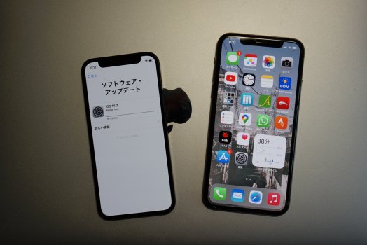
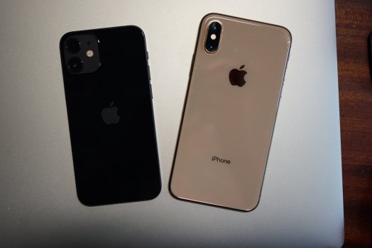
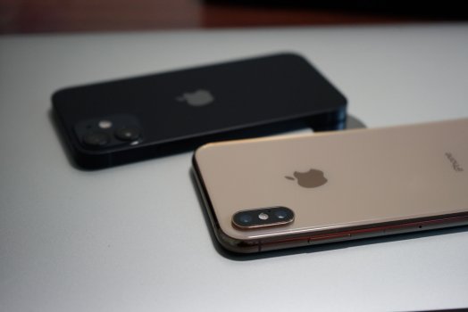
Man this thing is tiny! And so light! I can't wait to not notice it in my pocket.
I am picking mine up from the Apple store in an hour!
Attachments
The leather case looks great on it. I was talked into AppleCare+ instead of a case, ha.WOWOWOWOWOW im hyped :O
30,000 views. I think that is mainstream if smallish. Certainly enough views to be a pro YouTuber.I don’t need a video to confirm my choice. I can think for myself. I was merely posting a video that was different from the Main Street click revenue streams that many probably haven’t seen.
That case looks warped, and are the buttons straight?WOWOWOWOWOW im hyped :O
Lol you're about to make everyone's OCD go through the roof LOLThat case looks warped, and are the buttons straight?
A big dump of my thoughts. Enjoy:
The flat edges are a welcome departure from the sloped edges we've had since the iPhone 6, but swiping in the edges is definitely much less friendly. Most people would use these for the back swipe, or the home bar swipe. This shouldn't really affect you if you were using a case, but the edge will catch your finger on this design. It also makes the phone look and feel much thicker; visually, it doesn't hide its thickness by reflecting light as well, and physically it doesn't nestle into your hand as nicely. There's certainly a lot more comfort and grip though, since it's able to dig into your hand. I've never experienced the 'bar of soap' feeling with the previous designs, but I know it's been an issue for a lot of people.
The buttons all give a solid click - they feel a bit firmer than previous iPhones, but that may just be because they're flat now. The mute switch on mine is solid, without any rattle or movement in either position. The SIM tray has a lot of friction, and is inset ever-so-slightly on my device.
Other fit & finish details: The display doesn't seem to be bordered by a visible plastic rim, so there should only be one seam for any potential dirt/dust to get trapped in. The frosted camera bump has a nice soft touch. The antenna lines aren't too attractive, but they're diagonally symmetrical at least. 2 holes for the mic; 4 holes for the bottom speaker; colour-matched screws if you get the white (it's they're silver across the board). The display has a subtly more 'plasticky' quality to it - like there's a hollowness behind it. The back glass, by comparison, has a denser quality. This could be down to the internal structure rather than the material itself.
**This is my favourite white they've done to date.** It's elegant but also cute. It's a warm white, that has a really subtle yellow/gold/pink glint at certain angles, but it's very very subtle. The silver edges are also quite warm - like a very light champagne colour. It's classy. It's completely different to the bright whites (XR, 11, SE2), or the dull white (8/8 Plus), or the silvery metallic whites (iPhone X, Xs).
**The speakers are a significant improvement over the iPhone 8 and iPhone X.** Sound is 'fuller' (like more expanded if that makes sense), voices are clearer, and everything is better balanced. It's obviously still a set of phone speakers, but I think the audio quality is excellent.
If you listen to podcasts, voices sound a lot more natural. The iPhone 8/X separation has always caused a sort of garbled/digital effect on voices, but it's nearly perfect on this 12 Mini.
The display is a fantastic size. While I wouldn't say it's comfortable to reach the edges, it's much easier to do compared to the 5.8" iPhones. The lighter weight makes is easy to shimmy the iphone across your hand if you have smaller hands.
True Tone seems a bit more aggressive than it was on my iPhone 8. Compared to an OLED iPhone X, my 12 Mini has a more yellow/green cast with True Tone off, and is significantly yellower with True Tone on.
I've quickly tested the **downsampling** with a Netflix test pattern (1080p, Season 2 Episode 8). I'm definitely getting some artifacts on the centre horizontal pattern - it renders as blocks rather than discrete lines. I'm not sure that this is caused by downsampling though, as I thought that would usually cause a Moire pattern. This is tested with True Tone off, and any overlays disabled (no Assistive Touch). Tapping the display to show the Netflix UI has no effect on the displayed image - I believe the 6s Plus rendered video differently depending on if the UI was showing.
The rtings sharpness pattern definitely causes a Moire pattern in the pixel grid on the bottom left, but I'm not 100% sure how the Photos app handles its scaling.
I don't see any issues with text sharpness, or horizontal lines in apps, so the downsampling shouldn't be an issue in regular use.
Hardware, Design, Materials
The flat edges are a welcome departure from the sloped edges we've had since the iPhone 6, but swiping in the edges is definitely much less friendly. Most people would use these for the back swipe, or the home bar swipe. This shouldn't really affect you if you were using a case, but the edge will catch your finger on this design. It also makes the phone look and feel much thicker; visually, it doesn't hide its thickness by reflecting light as well, and physically it doesn't nestle into your hand as nicely. There's certainly a lot more comfort and grip though, since it's able to dig into your hand. I've never experienced the 'bar of soap' feeling with the previous designs, but I know it's been an issue for a lot of people.
The buttons all give a solid click - they feel a bit firmer than previous iPhones, but that may just be because they're flat now. The mute switch on mine is solid, without any rattle or movement in either position. The SIM tray has a lot of friction, and is inset ever-so-slightly on my device.
Other fit & finish details: The display doesn't seem to be bordered by a visible plastic rim, so there should only be one seam for any potential dirt/dust to get trapped in. The frosted camera bump has a nice soft touch. The antenna lines aren't too attractive, but they're diagonally symmetrical at least. 2 holes for the mic; 4 holes for the bottom speaker; colour-matched screws if you get the white (it's they're silver across the board). The display has a subtly more 'plasticky' quality to it - like there's a hollowness behind it. The back glass, by comparison, has a denser quality. This could be down to the internal structure rather than the material itself.
This Year's White
**This is my favourite white they've done to date.** It's elegant but also cute. It's a warm white, that has a really subtle yellow/gold/pink glint at certain angles, but it's very very subtle. The silver edges are also quite warm - like a very light champagne colour. It's classy. It's completely different to the bright whites (XR, 11, SE2), or the dull white (8/8 Plus), or the silvery metallic whites (iPhone X, Xs).
Speakers
**The speakers are a significant improvement over the iPhone 8 and iPhone X.** Sound is 'fuller' (like more expanded if that makes sense), voices are clearer, and everything is better balanced. It's obviously still a set of phone speakers, but I think the audio quality is excellent.
If you listen to podcasts, voices sound a lot more natural. The iPhone 8/X separation has always caused a sort of garbled/digital effect on voices, but it's nearly perfect on this 12 Mini.
Display
The display is a fantastic size. While I wouldn't say it's comfortable to reach the edges, it's much easier to do compared to the 5.8" iPhones. The lighter weight makes is easy to shimmy the iphone across your hand if you have smaller hands.
True Tone seems a bit more aggressive than it was on my iPhone 8. Compared to an OLED iPhone X, my 12 Mini has a more yellow/green cast with True Tone off, and is significantly yellower with True Tone on.
Downsampling/Display Scaling
I've quickly tested the **downsampling** with a Netflix test pattern (1080p, Season 2 Episode 8). I'm definitely getting some artifacts on the centre horizontal pattern - it renders as blocks rather than discrete lines. I'm not sure that this is caused by downsampling though, as I thought that would usually cause a Moire pattern. This is tested with True Tone off, and any overlays disabled (no Assistive Touch). Tapping the display to show the Netflix UI has no effect on the displayed image - I believe the 6s Plus rendered video differently depending on if the UI was showing.
The rtings sharpness pattern definitely causes a Moire pattern in the pixel grid on the bottom left, but I'm not 100% sure how the Photos app handles its scaling.
I don't see any issues with text sharpness, or horizontal lines in apps, so the downsampling shouldn't be an issue in regular use.
Register on MacRumors! This sidebar will go away, and you'll see fewer ads.


