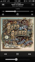
iOS 6 is a little more fine tuned. I like the improvements in the UI browsing through your music, but the Now Playing screen just seems so cluttered and an afterthought.
Due to the iPhone 5's longer screen they just permanently kept the time tracker on the screen, which to me makes it look cluttered and I insticintively tried to hide it like you do on a 4s. And on the lock screen it looks even worse.
I know the Album art is square and they have to work with that but that leads to another question. Do we need the square album art anymore? What do you all think?
Attachments
Last edited:


