
Two significant upgrades to Mac software are due within the next month.
10.6 Snow Leopard
Snow Leopard is arriving soon and despite a raft of under-the-hood changes and re-writes, features only minor adjustments to the dock, exposé and QuickTime. The candy-bar scrollbars that have long been obliterated from iTunes and recently iLife remain in all their out-of-place glory.
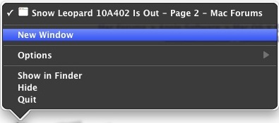
Dock contextual menus feature a new inverted look that many, I'm sure, would have seen as the first step to the much anticipated "Marble" redesign. No.
Many Apple apps are already ahead of Apple in switching to this new design now. Take Spotify, for example:

I'm not saying ALL apps need to take the inverted look on - but the scrollbars and flattened buttons are a must. Take Xtorrent for example:

All they needed to do was update the scrollbars and change the progress meters and all aqua elements to the new style. If they wanted to polish it (as Apple used to, but cares far less about now) they would have inverted the menu bar to match the dock menus, and revamp the dock to a more subtle, darker affair.
Unfortunately, the wondrous work done under-the-hood with Snow Leopard is all we're going to enjoy. Here's hoping Mac OS X 10.7 sorts out this mess. It's distressing to see that the first major OS X update since the iPhone hit the big time has no UI changes - preferential treatment? 🙁
iTunes 9
iTunes is a great piece of kit. But it's bloated and confused. It will, if not changed, be the only Apple app in Snow Leopard not to be rewritten in Cocoa. Joke.
The UI is also getting clumsy now and falling behind the times. Let's take a look at Spotify again:

Everything is nice and logical. The artwork is displayed in the bottom left, the playback controls are comfortably down in the bottom taking up minimal space, and the sidebar contains handy links to everything relevant.
It's simple, yes. And I'm not saying iTunes should remove any features. But a UI revamp to help consolidate all these features it now has is really overdue, I feel. That, and a rewrite in Cocoa.
Unrelated to OS X, but Apple, do a Safari 4 with iTunes 9 and let it take on the Windows look-and-feel. Why should people running Windows get the OS X look? 😉 Besides, it looks stupid and stunts development of the Mac version's UI.
To summarise, I feel Apple has become complacent with UI. I can't help thing this is due to the lack of Steve Jobs' input - he is a stickler for perfection and beauty. Phil Schiller seems far more focussed on evolution and conservative changes to the UIs. It's criminal that the aqua elements are still around, and that it seems Mac OS X's "perfection" is being sidelined for the iPhone's OS "perfection".
I just hope it's sorted by the next version and Apple returns to caring about the Mac's UI.
10.6 Snow Leopard
Snow Leopard is arriving soon and despite a raft of under-the-hood changes and re-writes, features only minor adjustments to the dock, exposé and QuickTime. The candy-bar scrollbars that have long been obliterated from iTunes and recently iLife remain in all their out-of-place glory.
Dock contextual menus feature a new inverted look that many, I'm sure, would have seen as the first step to the much anticipated "Marble" redesign. No.
Many Apple apps are already ahead of Apple in switching to this new design now. Take Spotify, for example:
I'm not saying ALL apps need to take the inverted look on - but the scrollbars and flattened buttons are a must. Take Xtorrent for example:
All they needed to do was update the scrollbars and change the progress meters and all aqua elements to the new style. If they wanted to polish it (as Apple used to, but cares far less about now) they would have inverted the menu bar to match the dock menus, and revamp the dock to a more subtle, darker affair.
Unfortunately, the wondrous work done under-the-hood with Snow Leopard is all we're going to enjoy. Here's hoping Mac OS X 10.7 sorts out this mess. It's distressing to see that the first major OS X update since the iPhone hit the big time has no UI changes - preferential treatment? 🙁
iTunes 9
iTunes is a great piece of kit. But it's bloated and confused. It will, if not changed, be the only Apple app in Snow Leopard not to be rewritten in Cocoa. Joke.
The UI is also getting clumsy now and falling behind the times. Let's take a look at Spotify again:
Everything is nice and logical. The artwork is displayed in the bottom left, the playback controls are comfortably down in the bottom taking up minimal space, and the sidebar contains handy links to everything relevant.
It's simple, yes. And I'm not saying iTunes should remove any features. But a UI revamp to help consolidate all these features it now has is really overdue, I feel. That, and a rewrite in Cocoa.
Unrelated to OS X, but Apple, do a Safari 4 with iTunes 9 and let it take on the Windows look-and-feel. Why should people running Windows get the OS X look? 😉 Besides, it looks stupid and stunts development of the Mac version's UI.
To summarise, I feel Apple has become complacent with UI. I can't help thing this is due to the lack of Steve Jobs' input - he is a stickler for perfection and beauty. Phil Schiller seems far more focussed on evolution and conservative changes to the UIs. It's criminal that the aqua elements are still around, and that it seems Mac OS X's "perfection" is being sidelined for the iPhone's OS "perfection".
I just hope it's sorted by the next version and Apple returns to caring about the Mac's UI.


