Hi,
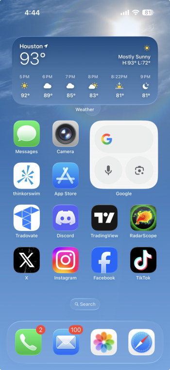
Just installed iOS 26, and I can't believe it, I can't believe how ugly this UI is...
Those "3D" looking fonts are something I did in Photoshop 20 years ago as a child and thought it looks cool, those animated margins around apps and widgets are so bad I really can't believe it.
A lot of my apps icons look like low resolution, and I'm talking about stock Apps.
It's obvious that the people in charge of Apple now are completely disconnected from reality and super incompetent.
Not to mention how they are in deep *** in AI department, their rubbish "AI" is so good that they integrated ChatGPT. 🤣
I can't believe that I actually started thinking about selling all my Apple devices and making a switch, Apple seems to be second Nokia.
I could get better UI and Apps design off Fiverr for probably 50 bucks.
I mean wtf is this 2005 design? And let me tell you it looks much worse IRL than on the internet.

If they can't even do acceptable looking design anymore, that is a really bad sign.
All iOS 26 did is messed up the design, and we got things like the option to generate fake kitty images?
Just my little rant
Just installed iOS 26, and I can't believe it, I can't believe how ugly this UI is...
Those "3D" looking fonts are something I did in Photoshop 20 years ago as a child and thought it looks cool, those animated margins around apps and widgets are so bad I really can't believe it.
A lot of my apps icons look like low resolution, and I'm talking about stock Apps.
It's obvious that the people in charge of Apple now are completely disconnected from reality and super incompetent.
Not to mention how they are in deep *** in AI department, their rubbish "AI" is so good that they integrated ChatGPT. 🤣
I can't believe that I actually started thinking about selling all my Apple devices and making a switch, Apple seems to be second Nokia.
I could get better UI and Apps design off Fiverr for probably 50 bucks.
I mean wtf is this 2005 design? And let me tell you it looks much worse IRL than on the internet.
If they can't even do acceptable looking design anymore, that is a really bad sign.
All iOS 26 did is messed up the design, and we got things like the option to generate fake kitty images?
Just my little rant