Become a MacRumors Supporter for $50/year with no ads, ability to filter front page stories, and private forums.
But having a crown on the Apple watch makes it look more appealing. The button on the moto 360, looks like a button. I think apple tried their best to mimic traditional watches and I'm sure it will help sales.

I think that being round trumps a crown, the latter of which many young people have never used or thought about, and which seems like a tacked on afterthought with the Apple Watch.

I.e. If Apple had two models, one the current square lump with a crown, and one that was round with a traditional stepped shape ( like the Huawei Watch) and a button, I betcha the round one would outsell the current nerdy square one like crazy.

Your opinion might be different of course. But for now, there's no such choice. It's like before Apple went with big displays.
 
What will replace the crown if/when battery tech facilitates a significantly slimmer Watch?

Is it really a need for a watch to be ultrathin? I mean I can understand the need for it on protablae devices like tablets or mobile phones, but the watch? And considering that most traditional watches that simply tell the time are just as thick and even thicker.
 
It's the crown that's won it for apple

I think that being round trumps a crown, the latter of which many young people have never used or thought about, and which seems like a tacked on afterthought with the Apple Watch.

I.e. If Apple had two models, one the current square lump with a crown, and one that was round with a traditional stepped shape ( like the Huawei Watch) and a button, I betcha the round one would outsell the current nerdy square one like crazy.

Your opinion might be different of course. But for now, there's no such choice. It's like before Apple went with big displays.


Although Apple Watch is a pretty significant departure from traditional watch case designs, the Moto is an even larger departure.
There have been plenty of non round watch cases (among traditional watch designs, not the newer post 2000 designs) but Moto's thin bezel combined with 45mm shape makes for a pretty new aesthetic, which seems to appeal to (seemingly) techies.
The apple watch is unconventional in the long rectangular case and the placement of crown near the top rather than in the center (probably because it's easier to access).
 
I don't think a crown was really necessary for navigation. It does make sense that it gives it more of a traditional watch design so maybe it was done to cater to watch collectors rather than make it feel like a gadget.

Most likely....
 
Android wear allows for scrolling and zooming, it also has a home button. It would work. Though for a crown to work you need a thick devive. As I stated previously, crowns are not used on watches when worn for traditional watches.

You're pretty dense, aren't you?

He's saying that the way Android Wear is architectured, it may be difficult to write something like a "driver" (I remember these, windowz) to support an extra instrument in the same way that you can't really write "drivers" to extend iOS to different devices or inputs.
 
I played with a watch in a store.

I actually felt like the crown was a retrograde step from the direct touch UIs we're all used to now.

I get the point about trying to avoid fingers obscuring the screen, but maybe they shouldn't putting so much info on the screen in the first place?

Also, why isn't it knurled or fluted?

I think the crown is visually important and not unworkable. It seemed more natural as a control mechanism for me however it felt it turned too freely. I also felt that it needed to be more knurled due to its size.

I point out Panerai (cause I do love them) a lot but this seemed more what I'd expect: http://www.paneristipix.com/72CD2A21-2B85-4609-9D1A-5635F17F5996/00018337.jpg
 
Is it really a need for a watch to be ultrathin? I mean I can understand the need for it on protablae devices like tablets or mobile phones, but the watch? And considering that most traditional watches that simply tell the time are just as thick and even thicker.

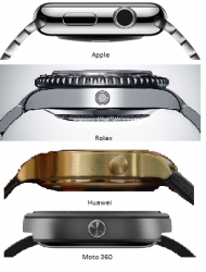
Sure, but most regular watches taper off. This is why, in comparison, that the Moto 360 looks odd to some people, and why the Apple Watch looks lumpy to some people, but that the Huawei looks more traditional, and less like an electronic gizmo.

sideviews.png
 
Sure, but most regular watches taper off. This is why, in comparison, that the Moto 360 looks odd to some people, and why the Apple Watch looks lumpy to some people, but that the Huawei looks more traditional, and less like an electronic gizmo.

View attachment 541299


Nice.
I totally agree.
I wish they would design the case and lugs more like a Richard Mille than a cheap smart watch.

Although industrial design is nice, this is a personal accessory that has been around for more than 200 years.
 
I think the crown is visually important and not unworkable. It seemed more natural as a control mechanism for me however it felt it turned too freely. I also felt that it needed to be more knurled due to its size.

I think it confused me because I wasn't sure when I could turn the crown and have it actually do something. And even then, it wasn't consistent in what it did:
  • Sometimes it scrolled a wall of text
  • Sometimes it scrolled through a pick list of options
  • Sometimes it zoomed in and out
  • Sometimes it did nothing
So I found myself continually swapping back and forth between touching the screen and playing with the crown to see what each did. It was a somewhat disjoint and haphazard experience. As a user, it made me feel ignorant - and that's not a good first experience for a potential customer.
 
What he is saying is that most crowns are not easy to turn while wearing, at least not easy enough to use all the time. By placing the crown higher off the wrist, the crown is easier to turn. If you lose that space, or make the crown much smaller, it becomes harder to turn. That's fine if it is to change the time or date on a mechanical watch. It's a nonstarter if it is meant to be used all of the time as a UI element.

But Apple's crown - unlike most traditional crowns - does not require two fingers (one atop & one under the crown) to operate. Just one finger to roll across the top of the crown.

I recently uncovered the last wristwatch I wore nearly 20 years ago. A Timex Indigo. Ha. Anyway, I recall (like most watches) it required me to completely remove it to operate the crown. And I can't really call a watch whose crown was operational on-wrist.

I agree with OP: Apple's digital crown is one of those shockingly obvious features that other smart watch manufacturers are like "well duh." Fullly expect to see a crown on all smart watch s go forward. ;)
 
Is it really a need for a watch to be ultrathin? I mean I can understand the need for it on protablae devices like tablets or mobile phones, but the watch? And considering that most traditional watches that simply tell the time are just as thick and even thicker.
As kdarling posted half an hour ago, the Watch doesn't attempt to disguise its chunkiness.

Many posters here have said that the Watch is (physically) a toy when compared to their Cousteau Aquanaut Marianas Trenchmeister. While that might be true, and while the vast majority of CAMT owners could afford to buy a stainless steel Apple Watch on a whim, Apple are trying to appeal to a much larger audience: people who no longer wear watches on a regular basis if at all. To me, the Watch is shockingly massive.

Statement of uninterest: having not worn a watch for over a decade, and having never had any interest in watches as 'art', I don't think there's anything any manufacturer could do to get me wearing a smartwatch at the current point in development. Ergo my thoughts and feelings are utterly irrelevant. Carry on!
 
As kdarling posted half an hour ago, the Watch doesn't attempt to disguise its chunkiness.

To me, the Watch is shockingly massive.

That's not the impression I got when I tried on, actually I felt the opposite. But each to their own of course.

----------

Sure, but most regular watches taper off. This is why, in comparison, that the Moto 360 looks odd to some people, and why the Apple Watch looks lumpy to some people, but that the Huawei looks more traditional, and less like an electronic gizmo.

View attachment 541299

Seriously, look at that Rolex!!!! :rolleyes:
 
Seriously, look at that Rolex!!!! :rolleyes:

I'll say!

I never quite understood that fashion of having chunky, useless* rotating bezels on an already chunky watch. I know I grew to hate them on the watches I had.

*at least Breitling has a watch with a bezel that does something arguably useful – function as a slide rule
 
I think the crown is visually important and not unworkable. It seemed more natural as a control mechanism for me however it felt it turned too freely. I also felt that it needed to be more knurled due to its size.

I point out Panerai (cause I do love them) a lot but this seemed more what I'd expect: http://www.paneristipix.com/72CD2A21-2B85-4609-9D1A-5635F17F5996/00018337.jpg

Yeah I love the Panerai crown. I too would have liked more mechanical Resistance on the crown, though I have to admit Apple did a very good job with rev 1
 
I.e. If Apple had two models, one the current square lump with a crown, and one that was round with a traditional stepped shape ( like the Huawei Watch) and a button, I betcha the round one would outsell the current nerdy square one like crazy.

You might very well be right, although that doesn't necessarily mean that Apple was wrong to go with a squared off design. I know that the Moto 360 sometimes has issues with text being cut off because you're essentially viewing a square screen through a round hole -- Android Wear doesn't make any accommodations for round screens.

16172181709_7542f3275d_z.jpg


(Admittedly this particular screenshot is from the browser, which Apple Watch doesn't even have, but I think the point stands.) The thing is, the benefit of a round display is that it looks more like a traditional watch. Full stop. A squared design just makes the display of text a lot easier.
 
You might very well be right, although that doesn't necessarily mean that Apple was wrong to go with a squared off design.

Oh, I don't think anyone said they were wrong to go square. But it was definitely the easiest and safest choice by far. They get no points for pushing the wrist tech envelope in any major way.

Judging from the fan concepts and predictions before it came out, I think the current relatively small rectangular screen was also the last thing that most people expected and/or hoped for.

I think this is mainly because Apple has been known to push the limits (or innovate, omg) whenever they come to a cross road like this. Honestly, I think in this case, they had a lot of trouble deciding between round or square and went with the form that had the most usability and least amount of compromises.
 
Does she use an android phone or no smartphone at all

She uses an Android phone, although it's one of those low-middle tier Android ones. I couldn't even tell you what model it is, just that's it's made by LG.

I just asked her to tell me what her overall view of the Apple Watch was, and she responded with "Geeky, but at the same time cool". Make of that what you will lol!
 
Register on MacRumors! This sidebar will go away, and you'll see fewer ads.