I prefer the old icon but I understand why they changed it (because they surpassed physical cd sales).
I prefer the old colorful icons but the new ones (gray) doesn't bother me.
I prefer the traffic light buttons (close, resize & minimize) the old way (you can change it back thru command line) so it doesn't bother me.
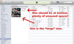
I simply HATE the new album artwork size in the new iTunes 10.
I have ALL my album covers in at least 500x500 px. Now the maximum size is something like 150x150 px.
To make it worse, the album title, artist and rating (stars) is in the right size instead of bottom.
I can't imagine some engineer at Apple saying "Oh, it looks better this way". WTH!!!
I prefer the old colorful icons but the new ones (gray) doesn't bother me.
I prefer the traffic light buttons (close, resize & minimize) the old way (you can change it back thru command line) so it doesn't bother me.
I simply HATE the new album artwork size in the new iTunes 10.
I have ALL my album covers in at least 500x500 px. Now the maximum size is something like 150x150 px.
To make it worse, the album title, artist and rating (stars) is in the right size instead of bottom.
I can't imagine some engineer at Apple saying "Oh, it looks better this way". WTH!!!
Attachments
Last edited: