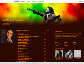
When listening to albums in Artist view, I've noticed that since iTunes 12.2, there's two different types of UIs displaying.
When I first launch the application and begin listening to an artist, I'll get a fairly standard view:

But then, if I start bouncing around between artists and then go back, suddenly, the UI turns into this:

If I close iTunes and restart it, then the first UI will appear.
Now I don't really care either way which one is used, but I'd at least like to see some consistency. Is anyone else experiencing this?
Thanks!
When I first launch the application and begin listening to an artist, I'll get a fairly standard view:

But then, if I start bouncing around between artists and then go back, suddenly, the UI turns into this:

If I close iTunes and restart it, then the first UI will appear.
Now I don't really care either way which one is used, but I'd at least like to see some consistency. Is anyone else experiencing this?
Thanks!

