While looking at the new iTunes 7, I noticed how they made some minor but nice changes to the UI, such as the colors. Do you think that this means that the UI in Leopard will be similar in terms of the colors used in iTunes 7? The DVD for Leopard had a black theme, what do you think? I hope it does end up like iTunes 7, I really like it.
Got a tip for us?
Let us know
Become a MacRumors Supporter for $50/year with no ads, ability to filter front page stories, and private forums.
iTunes 7 Hints at Leopard UI?
- Thread starter Zwhaler
- Start date
- Sort by reaction score
You are using an out of date browser. It may not display this or other websites correctly.
You should upgrade or use an alternative browser.
You should upgrade or use an alternative browser.
I kind of hope not, but I'll get used to it either way. If Apple does go with this new look, I hope they at least give the user the option under the Appearance preference pane, like it is now. I'd say chances are good of this new theme taking place. Notice Time Machine's UI is very similar?
I <3 the way iTunes 7 looks.
Beautiful Apple, just plain beautiful.")
Plus I love all the new features. ^_^
Beautiful Apple, just plain beautiful.
Plus I love all the new features. ^_^
iTunes 7 and the UI of "iTV" match perfectly. I expect Leopard to have the UI of iTunes 7 and FrontRow to take on the look of iTV.
I'll scream if Leopard's UI isn't uniform!!!
I'll scream if Leopard's UI isn't uniform!!!
jamesmcd said:It looks like the default KDE in a Linux Distro. Can't remember which one.
That's exactly how I feel. I was thrilled with aqua when I switched from Windows, please don't change to Linux gunmetal! I love the coverflow, but I think the scroll bars and buttons look like something out of linux.
I hope Leopard gives us the option of retaining aqua scroll bars.
thewhitehart said:That's exactly how I feel. I was thrilled with aqua when I switched from Windows, please don't change to Linux gunmetal! I love the coverflow, but I think the scroll bars and buttons look like something out of linux.
I hope Leopard gives us the option of retaining aqua scroll bars.
I totally HATE the blue, bubbly aqua scroll bars. I really like the new iTunes 7 look!
Even if they didn't continue making them blue and bubbly, I think the iTunes 7 scroll bars are too dark as to be distracting. I wish they were of a more subtle grey, as in the graphite look. And the buttons look less polished.
Other than that, iTunes 7 is a solid upgrade, I like the features, but not the 'darkness'
Lol, I am playing 'The Darkness' right now
Other than that, iTunes 7 is a solid upgrade, I like the features, but not the 'darkness'
Lol, I am playing 'The Darkness' right now
I do believe that Apple is moving away from the aqua look because of the upcoming copycat Vista. Vista is going to have that aqua look and Apple is gonna let them use that theme and move on to gunmetal because they need to be different if someone else is trying to copy them. Vista's "new" aqua theme will now seem out-date and Mac OS X gunmetal will be the newest and greatest theme. They're just staying one step ahead of Windows when it comes to GUI fashion.
MacVault said:I totally HATE the blue, bubbly aqua scroll bars. I really like the new iTunes 7 look!
ditto!
the jelly beans have gotta go
if you want to look in the future, just look to iTunes.
they started instant-searching (now Spotlight) in iTunes, which is now throughout the system.
they started instant-searching (now Spotlight) in iTunes, which is now throughout the system.
i like the new look personally.
to me it looks like a blend of aqua and the pro interface they implement in FCP/DVDSP etc. ive always liked the pro app look, but needed a bit more refinement..well iTunes has it. love it.
to me it looks like a blend of aqua and the pro interface they implement in FCP/DVDSP etc. ive always liked the pro app look, but needed a bit more refinement..well iTunes has it. love it.
i like the new iTunes look. it's different but not too different. i'm sure that this in itself is a preview of leopard. like this is funah said, iTunes has always led the way... just look back to iTunes 4 and brushed metal - next thing you know, Panther has brushed metal all over the place.
that said, if different users want to keep the current look, i don't think it would be much trouble for Apple to give them that choice.
that said, if different users want to keep the current look, i don't think it would be much trouble for Apple to give them that choice.
ReanimationLP said:I <3 the way iTunes 7 looks.
Beautiful Apple, just plain beautiful.
Plus I love all the new features. ^_^
Agreed. I really like the gui when you plug in your iPod. Love it!
L
Lau
Guest
I like the smooth new scroll bars, but the overall look is a bit drab. Lose the blue, just because I don't like it D ) and lighten it all up a bit, as in UNO colouring including the smooth scrollbars, and it would be very good looking indeed.
I think if you're going to go dark, you've got to go Aperture dark, or stick with the lighter uno look. The current grey is a bit uninteresting and stuck in the middle.
Hmm.
Having had another look, I'm not sure it's the grey itself that's the problem, but being paired with the muddy dark blue, the greyish light blue and the very flat icons on the buttons. It looks a bit, er, Windows.
D ) and lighten it all up a bit, as in UNO colouring including the smooth scrollbars, and it would be very good looking indeed. I think if you're going to go dark, you've got to go Aperture dark, or stick with the lighter uno look. The current grey is a bit uninteresting and stuck in the middle.
Hmm.
Having had another look, I'm not sure it's the grey itself that's the problem, but being paired with the muddy dark blue, the greyish light blue and the very flat icons on the buttons. It looks a bit, er, Windows.
What really gets me is why the "library bar" on the left now has to be so tall.
now i have a massive scroll bar to get through my playlists.
now i have a massive scroll bar to get through my playlists.
iKWICK7 said:Agreed. I really like the gui when you plug in your iPod. Love it!
Totally agree, was rather impressed by that, especially the data bar at the bottom. It also made the girlfriend realise how little of her 60gig she is using... 430 meg infact
I like the scrollbars and the rest of the UI for the most part.
I've always thought the shiny, over-saturated colorful buttons and UI elements in Aqua were over the top. Way too distracting (even graphite was too shiny).
I like when the app's functions and purpose are the focus, not the UI of the app.
However, the black highlight when you click an item in the side bar should go. It clashes big time. Same with the over-saturared blue hilight when you click on of the bottom buttons (such as shuffle). The color needs to be toned down.
L
Lau
Guest
Josh said:However, the black highlight when you click an item in the side bar should go. It clashes big time. Same with the over-saturared blue hilight when you click on of the bottom buttons (such as shuffle). The color needs to be toned down.
I wasn't very keen on the black at first, but I'm coming round to it now. I think the reason it clashes (for me) is because it's on that horribly muddy blue. If that was white or yellow the black would look a lot better, I think.
Edit: Did a couple of very quick (and crap, but you get the idea) mockups.
Attachments
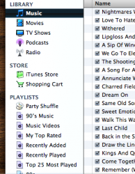
The Mellow look of itunes is nice. I was thinking about the black bar on the side bar and its nice and a big change from the everywhere aqua blue. This soft blue in the itunes store is really easy on my eyes and I like it...along with the black in the movie/tv shows section.
I'm thinking Leopard is going for that dark look...black/darker menu bar with transparent dock.
Bless
I'm thinking Leopard is going for that dark look...black/darker menu bar with transparent dock.
Bless
Register on MacRumors! This sidebar will go away, and you'll see fewer ads.