Got a tip for us?
Let us know
Become a MacRumors Supporter for $50/year with no ads, ability to filter front page stories, and private forums.
itunes album art now the size of a freaking thumbnail?
- Thread starter bobright
- Start date
- Sort by reaction score
You are using an out of date browser. It may not display this or other websites correctly.
You should upgrade or use an alternative browser.
You should upgrade or use an alternative browser.
Huh, so we can change the size...
how are you getting that option (btw im not on a mac pissy windows maybe thats why i cant find it LOL)
thanks turns out i was already on medium though and large is still small as heck
what the hell were they thinking? with all the 22" 24" and even bigger monitors out there i mean seriously this is a huge fail
edit: not sure how hard it is but i am strongly considering downgrading
Just switch back to the regular list view in the top right hand corner and stop complaining
NO and what good does that do genius
The moment I read the title I remembered how angry I was that my album artwork is no longer huge. I miss it 
I changed the size to large but its still no good. Not worth downgrading but I really hope apple addresses this in the next update.
I changed the size to large but its still no good. Not worth downgrading but I really hope apple addresses this in the next update.
The moment I read the title I remembered how angry I was that my album artwork is no longer huge. I miss it
I changed the size to large but its still no good. Not worth downgrading but I really hope apple addresses this in the next update.
theirs only one way Apple can address this in a future update, voice your opinion.
http://www.apple.com/feedback/itunesapp.html
This feature is new so how is the art smaller than before?
its been around since iTunes 8...they just made it very hard to find in iTunes 9
its been around since iTunes 8...they just made it very hard to find in iTunes 9
this hybrid view is a new feature of iTunes 10, so dunno what you're going on about... it was a way to enhance the normal list view that most people lived in, as stated by steve jobs at the media event, go watch the video if you don't believe me....
this hybrid view is a new feature of iTunes 10, so dunno what you're going on about... it was a way to enhance the normal list view that most people lived in, as stated by steve jobs at the media event, go watch the video if you don't believe me....
this hybrid view is a new feature of iTunes 10, so dunno what you're going on about... it was a way to enhance the normal list view that most people lived in, as stated by steve jobs at the media event, go watch the video if you don't believe me....
No, it really isn't new...I've been using it for a long time. In fact, it's been there since iTunes 7, which came out in 2006.

Menu-> View -> Always Show Artwork
As for the size, yes it's quite effed up. But what bothers me the most is they moved the album and artist name from below the artwork to THE LEFT of it... WTF? Wasting&contracting space, much??
New Icon. I'm more used to the old one but I understand why Jobs chose it. Doesn't make sense to have a CD if they're selling more digital downloads. If YOU want, you can easily use the old icon (changing the .icns file inside the app).
List icons: Many people doesn't like the grey-only icons. It looks more "clean" but I find it easier to find what I want with the colored ones. You can change it if YOU want.
Traffic Light buttons: You get a few more pixels of space but now it's (a little) harder to move the window around. Again, YOU can change it with a simple terminal command.
Now what about the bloody micro-size artwork? Just like it was said, many people have 20+ inch screens. Mine is 13' but my album covers are at least 500x500 pixels. Now the biggest is 200px? WTF?
Seems like Apple is pushing things before testing it properly. Now Apple is working like many other crap companies, filling software with new (crap) features f@cking the good ones.
Browsing looks faster but less smooth than version 9.2. maybe they disabled Vsync?
Traffic Light buttons: You get a few more pixels of space but now it's (a little) harder to move the window around. Again, YOU can change it with a simple terminal command.
Sweet, didn't realise that - now with the power of google I have my old UI appearance back. Cheers!
Menu-> View -> Always Show Artwork
Thanks! That was driving me crazy!!!!
New Icon. I'm more used to the old one but I understand why Jobs chose it. Doesn't make sense to have a CD if they're selling more digital downloads. If YOU want, you can easily use the old icon (changing the .icns file inside the app).
List icons: Many people doesn't like the grey-only icons. It looks more "clean" but I find it easier to find what I want with the colored ones. You can change it if YOU want.
Traffic Light buttons: You get a few more pixels of space but now it's (a little) harder to move the window around. Again, YOU can change it with a simple terminal command.
Now what about the bloody micro-size artwork? Just like it was said, many people have 20+ inch screens. Mine is 13' but my album covers are at least 500x500 pixels. Now the biggest is 200px? WTF?
Seems like Apple is pushing things before testing it properly. Now Apple is working like many other crap companies, filling software with new (crap) features f@cking the good ones.
Browsing looks faster but less smooth than version 9.2. maybe they disabled Vsync?
QFT what the hell Apple
Any news if Apple fix it in 10.1?
I reverted to version 9 but someday I'll have to update it.
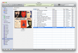
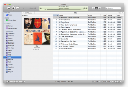
Put a screenshot so who's using iTunes 10 can compare. The second one is 9.2.1 with version 8 skin.
I reverted to version 9 but someday I'll have to update it.
Put a screenshot so who's using iTunes 10 can compare. The second one is 9.2.1 with version 8 skin.
Attachments
Last edited:
Any news if Apple fix it in 10.1?
I reverted to version 9 but someday I'll have to update it.
Put a screenshot so who's using iTunes 10 can compare.
My iTunes 9 does not look like that. I have 9.1 on Windows here and it's got the small icon, just like in 10.
And, just to clarify, I AM talking about the GRID view after I double-clicked on the album. (Which is what you're showing with your screenshot.)
(Some people here have been talking gout the "Album List" view which is new to iTunes 10 so, yeah, those people are confused. It never existed before so that mode can't be compared to 9.)
Register on MacRumors! This sidebar will go away, and you'll see fewer ads.


