Got a tip for us?
Let us know
Become a MacRumors Supporter for $50/year with no ads, ability to filter front page stories, and private forums.
Jony Ive Officially Takes 'Chief Design Officer' Title at Apple
- Thread starter MacRumors
- Start date
- Sort by reaction score
You are using an out of date browser. It may not display this or other websites correctly.
You should upgrade or use an alternative browser.
You should upgrade or use an alternative browser.
Thank you for your well-reasoned and well-informed opinion as a professional industrial designer. Please remind us of the many design patents and international design awards you have won.
By all means, enlighten us as to how the Apple Watch's UI should appear today, without the UI changes introduced in iOS 7. Explain to us how its 272 X 340 pixel display could accommodate lickable, glossy, 3D buttons, wood grain, and green felt - all while maintaining readability and usable touch target sizes.
Thanks for opening the door. Sure-with hardware like the watch's small screen, it makes sense to simplify the graphics and UI, even if a la ios7's less-interesting eye candy approach. But let's go the other direction - The iPhone has a bigger screen than the watch, followed by the iPad, followed by laptops, and then by desktops, each with more processing power than the one before it as well as vastly different interfaces: The watch has a wheel, the ipad and iPhone have a button, and laptops and desktops have a keyboard and mouse with no screen touch capability. We were smart enough to figure out how to work each. What again is the real benefit with UI's looking so alike across those platforms? In fact, it's a bit insulting to suggest that the consumer is not smart enough to work within and enjoy different UI's on completely different platforms, or that developers can't design differently across different platforms.
I'm just a consumer so I don't need to have recorded ID design patents to have an opinion about what I like and don't like. The complete whitewashing of prior intuitive design cues and rather interesting artwork that looked like it took real talent to create will never be rectified with a common UI across all platforms, and one that's not so intuitive and not really as fun to look at. Those changes occurred when Jony Ive took over UI leadership. I continue to contend that he's just not as good an overall designer as the world thinks.
You have a weird definition of depressed. Ok, how about this then?Actually, he looks depressed in this photo, too—like it's painful for him to come up with even the hint of a smile.
Attachments

Yep this sure was interesting 'artwork'. I'm so sad to Apple got rid of it....not.Thanks for opening the door. Sure-with hardware like the watch's small screen, it makes sense to simplify the graphics and UI, even if a la ios7's less-interesting eye candy approach. But let's go the other direction - The iPhone has a bigger screen than the watch, followed by the iPad, followed by laptops, and then by desktops, each with more processing power than the one before it as well as vastly different interfaces: The watch has a wheel, the ipad and iPhone have a button, and laptops and desktops have a keyboard and mouse with no screen touch capability. We were smart enough to figure out how to work each. What again is the real benefit with UI's looking so alike across those platforms? In fact, it's a bit insulting to suggest that the consumer is not smart enough to work within and enjoy different UI's on completely different platforms, or that developers can't design differently across different platforms.
I'm just a consumer so I don't need to have recorded ID design patents to have an opinion about what I like and don't like. The complete whitewashing of prior intuitive design cues and rather interesting artwork that looked like it took real talent to create will never be rectified with a common UI across all platforms, and one that's not so intuitive and not really as fun to look at. Those changes occurred when Jony Ive took over UI leadership. I continue to contend that he's just not as good an overall designer as the world thinks.


Yep this sure was interesting 'artwork'. I'm so sad to Apple got rid of it....
Ha ha, hey - even I thought the podcast reel to reel design was a bit silly, but imho it wasn't worth carpet bombing everything into ios7's bland UI and expecting everybody to like the radical change. I'll still choose Apple's products for my home computer over Microsoft, but I give Microsoft a lot of respect for offering an XP interface option within Windows 7. That was a good design choice. I personally can't work with all the transparency, which is a strong reason why I dislike iOS 7 and win7 so much. There is a reason why we don't use transparent paper in "real life." Contrary to what Jony Ive thinks, we really are smart enough to know that there's something underneath something that we can't see through.
") Thanks for reminding me about another form over function miss step within iOS 7. I would've had a lot more respect for Jony Ive if Apple offered at least some flexibility in the UI interface-one that's more iOS 6 and prior, and one that's more flat.
Thanks for reminding me about another form over function miss step within iOS 7. I would've had a lot more respect for Jony Ive if Apple offered at least some flexibility in the UI interface-one that's more iOS 6 and prior, and one that's more flat.And yes, that is interesting artwork you shared, noting that you chose to share the ones that were most whined about by the masses. Took a heck of a lot more talent to create those than most any flat design interface now. We're all allowed our opinions, but I think it's fair to say that universally, people more enjoy and appreciate artwork that they themselves feel they cannot re-create than artwork that they're pretty sure that they could create. I'm actually a good artist, but I doubt that I could ever create anything as interesting as the iOS 6 icon was for Safari, as an example. But I'm 100% sure I could re-create most any flat iOS 7 icon or app interface using the tools within Photoshop or illustrator. All the less intuitive interface thing is just icing on the cake of flat design disinterest for me at least.
OK, good news is that even I'm getting tired of my complaining about something that I can't change. But this sure is therapeutic.
Last edited:
You have a weird definition of depressed. Ok, how about this then?
Even that's a forced smile.
Yep this sure was interesting 'artwork'. I'm so sad to Apple got rid of it....not.
I love each and every one of those pictures, especially the tape deck. I miss that.
Apple senior executive Jonathan Ive has officially assumed the role of "Chief Design Officer" at Apple effective today, after being promoted from his previous role of "Senior Vice President of Design" nearly six weeks ago. Apple has updated Ive's executive profile on its leadership website to reflect the design chief's new position as Apple's third active C-level executive alongside CEO Tim Cook and CFO Luca Maestri.
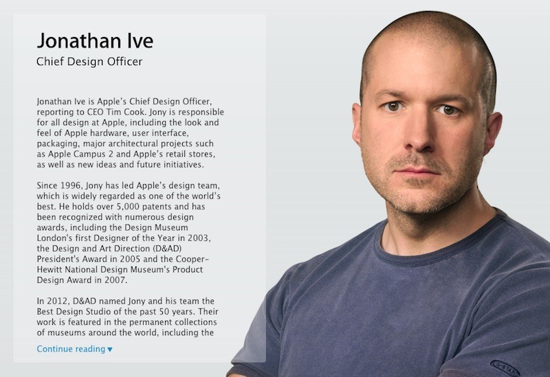
Apple announced in a company-wide email last month that Ive would be promoted to Chief Design Officer on July 1 and turn over his day-to-day management of the company's design teams to Richard Howarth and Alan Dye, who have both been elevated to vice president positions. Ive will remain responsible for all of Apple's design, with a focus on redesigning Apple Stores and other larger projects.Apple has also added executive profile pages for design vice presidents Howarth and Dye.

Ive spoke with The Telegraph journalist Stephen Fry last month about his decision to relinquish some of his control, stating that he is still in charge of Apple's design departments without needing to focus on administrative and management work, responsibilities that will now fall under his lieutenants Howarth and Dye. The move had been widely expected for several years.Ive has been a full-time Apple employee since 1992, and rumors about him scaling back at the company have gained momentum over the years. Ive in the past has expressed his desire to spend more time in his native England, where he grew up, and his promotion will enable him to travel more often and possibly work remotely at times. Ive and his family currently live in an upscale neighborhood in San Francisco.
Article Link: Jony Ive Officially Takes 'Chief Design Officer' Title at Apple

This is Great!
For everyone who has heartburn over this...
If there had been no Jony Ive designed iMac, there would have been no Apple resurrection in the late 90s and therefore no Apple today.
The iMac saved the company. It took Jony and Steve to realize that project and all of the successes that followed. Yes, there was a software component, but nobody was buying it when it was incased in a NeXt box. It was Ive’s product design that appealed to the masses and sparked the resurrection.
For those of you who think Ive wants to eventually become CEO, you really don’t understand design or designers at all. You have my condolences for your loss, attachment and dependence on poorly executed skeuomorphism.
This is long overdue recognition for Sir Ive’s contributions to Apple, as we know it today.
Trolling with a one day old MR membership? "That is great!"
Ive is an industrial designer (a very good one, noone doubts it), but not a software engineer/designer, i.e. Human Interface is not his territory.
Now we even have a "poorly executed skeuomorphism". No comment.
Ive is an industrial designer (a very good one, noone doubts it), but not a software engineer/designer, i.e. Human Interface is not his territory.
Now we even have a "poorly executed skeuomorphism". No comment.
This is Great!
For everyone who has heartburn over this...
If there had been no Jony Ive designed iMac, there would have been no Apple resurrection in the late 90s and therefore no Apple today.
The iMac saved the company. It took Jony and Steve to realize that project and all of the successes that followed. Yes, there was a software component, but nobody was buying it when it was incased in a NeXt box. It was Ive’s product design that appealed to the masses and sparked the resurrection.
For those of you who think Ive wants to eventually become CEO, you really don’t understand design or designers at all. You have my condolences for your loss, attachment and dependence on poorly executed skeuomorphism.
This is long overdue recognition for Sir Ive’s contributions to Apple, as we know it today.
This is Great!
I'm having fun imagining Jony Ive creating an account yesterday just to post that, pretending to be someone who's pretending to be the ultimate Jony Ive fan, while wearing silver sweatpants and a grey t-shirt with light blue monogramming on the inside collar that's not very easy to read so as to not distract any reader from the task of reading but where the monogramming is hidden on the inside of the collar so one can swipe at the neckline and discover the monogramming, while he sits on a beige grey couch that strangely no longer looks like a couch at all. While drinking Earl Grey tea. And with a TV on in the background where all the controls are hidden in the rear where you can't conveniently see or reach them.
Jony, you can't fool us!
Just don't get too angray at some good natured fun here.To Jony or any Apple employee reading this thread: Here's a great bit of user reviews over the new Jony iOS.
http://www.cnet.com/products/apple-ios-7/user-reviews/
iOS no longer just works, but that link above works.
http://www.cnet.com/products/apple-ios-7/user-reviews/
iOS no longer just works, but that link above works.
Stumbled upon this blog post -- she absolutely, positively nails it.
http://cheerfulsw.com/2015/destroying-apples-legacy/
A good quote too:
"JONY IS NOT SINGLE-HANDEDLY RESPONSIBLE FOR THIS.
But he’s the most powerful design leader inside Apple, and it’s his job to fix it."
Happy 2016
Let's hope some soul that Jony's team stripped away returns to apple design this year.
Jony Ive is a talented industrial designer—no question about it; but he doesn't know the first thing about interface design, and the last two versions of OS X prove it. The OS X interface designs coming out of Apple under his watch grossly violate the first rule of good user interface design: form must follow function. The user interface must never be made harder to use for the sake of an abstract design concept that merely pleases the designer's aesthetic sensibilities. For example, system text should never be unnecessarily small and hard to read no matter how cool it looks in light gray 8-point type.
Jony Ive is a talented industrial designer—no question about it; but he doesn't know the first thing about interface design, and the last two versions of OS X prove it. The OS X interface designs coming out of Apple under his watch grossly violate the first rule of good user interface design: form must follow function. The user interface must never be made harder to use for the sake of an abstract design concept that merely pleases the designer's aesthetic sensibilities. For example, system text should never be unnecessarily small and hard to read no matter how cool it looks in light gray 8-point type.
I hurriedly purchased a macbook air in the summer of 2014 to stay ahead of Yosemite. Instead of saying I feel no joy when working on Yosemite or El Capitan, it's more accurate to say I feel aggravation when working on them due to the dumbed down and shallow feel of the UI compared to Mavericks & prior.
The question that just dumbfounds me is, how can Apple's board & management team continue to approve these non-Apple-esque iOS and OS's? I watched the CNN special on Steve Jobs last week, which got me back to being irked by Jony Ive's minimalism interference. The show confirmed my fear that the magic Apple had with Jobs will never ever be repeated, and that the fun ride of surprise and delights and "it just works" that I enjoyed from 2005-2011 is truly over. When talking about the Macintosh and Steve's approach to things before computers became personal computers, one person who worked with Jobs or knew him really well (I forget which) says he didn't create something for you, he created "you." That sounded kind of like super hyperbole at first then you realize how he over-obsessed into ensuring everything about the products and UI experience was as much about creating relatable emotion inside the user as it was about the technology itself. Now the UI experience and mechanical experience is only about what a super-minimalist thinks the experience should be. Jobs may have been a real a**hole, but there's no doubt his tyrannical genius vision produced better products than any friendly committee ever will.
Jony isn't single-handedly responsible for it? Yes, he is! He didn't do all the work himself, but he sure as hell made the directive. When the Captain of a ship tells you to do something, you damn well do it! He's 100% respoinsible. It wasn't Tim Cook's idea to make iOS or OS X "flat" ! That was Jony's idea. When Scott Forestall was in charge, it looked proper. But he got fired over Maps because it wasn't accurate enough (that was beyond his control as people make errors and he didn't input all the data himself). Ridiculous. I do believe that Steve Jobs would have never gone for this flat look without ensuring it was a "usable flat". Flat itself isn't the real problem (although it might be ugly to some). Flat without indicators for things like buttons is the problem or fonts that are hard to read. That has nothing to do with "flat". Those are bad design choices. You could have flat that has other indicators for edges, good looking fonts and buttons without making them skeuomorphic. But they chose to the easiest route. Let's make "buttons" just "text". Sorry, that doesn't work so well.
The problem is FAR worse on iOS than OS X, though, IMO. I actually don't have any issue with El Capitan graphically/usability wise other than those horrid flat stoplight buttons and the lack of a "busy" indicator on the Spotlight search (seriously, it just sits there for minutes at a time sometimes giving no indication whether it produced no results or is still searching. Ridiculous.
The problem is FAR worse on iOS than OS X, though, IMO. I actually don't have any issue with El Capitan graphically/usability wise other than those horrid flat stoplight buttons and the lack of a "busy" indicator on the Spotlight search (seriously, it just sits there for minutes at a time sometimes giving no indication whether it produced no results or is still searching. Ridiculous.
The problem is FAR worse on iOS than OS X, though, IMO. I actually don't have any issue with El Capitan graphically/usability wise other than those horrid flat stoplight buttons and the lack of a "busy" indicator on the Spotlight search (seriously, it just sits there for minutes at a time sometimes giving no indication whether it produced no results or is still searching. Ridiculous.
Amen. It's taken some time, but finally I'm reading more and more complaints about the OSX and iOS UI's that reflect my feelings ever since Sept 2013. The unfortunate thing is that I feel there's absolutely zero opportunity to do something about it other than to hope and wait for someone at Apple to wake up.
Do read that blog post I shared, if you haven't already. She just incredibly nails it. It's good therapy sometimes to read it and know that there's someone out there who can really write well really gets it too.
Now just need those fashionistas in Cupertino to start drinking our kool-aid.It took what, about 6 or 7 years for a pretty iOS that "just worked" really well to get on the nerves of complainers who wanted something "new." Does that mean we have 3-4 more years of the current flat unpretty unintuitiveness before pitchforks & torches are raised for something "new?" Can't wait to see what's reinvented then.
Ugh. iCloud is also going to the dogs. It used to "just work". To say that this is no longer true would be the understatement of the year. Yes, the Steve Jobs era is truly over, and what we have now is just a pale shadow of what might have been had Steve continued to run the company for years to come; but Apple is making so much money doing what they're doing that no one inside the company even notices the difference.I hurriedly purchased a macbook air in the summer of 2014 to stay ahead of Yosemite. Instead of saying I feel no joy when working on Yosemite or El Capitan, it's more accurate to say I feel aggravation when working on them due to the dumbed down and shallow feel of the UI compared to Mavericks & prior.
The question that just dumbfounds me is, how can Apple's board & management team continue to approve these non-Apple-esque iOS and OS's? I watched the CNN special on Steve Jobs last week, which got me back to being irked by Jony Ive's minimalism interference. The show confirmed my fear that the magic Apple had with Jobs will never ever be repeated, and that the fun ride of surprise and delights and "it just works" that I enjoyed from 2005-2011 is truly over. When talking about the Macintosh and Steve's approach to things before computers became personal computers, one person who worked with Jobs or knew him really well (I forget which) says he didn't create something for you, he created "you." That sounded kind of like super hyperbole at first then you realize how he over-obsessed into ensuring everything about the products and UI experience was as much about creating relatable emotion inside the user as it was about the technology itself. Now the UI experience and mechanical experience is only about what a super-minimalist thinks the experience should be. Jobs may have been a real a**hole, but there's no doubt his tyrannical genius vision produced better products than any friendly committee ever will.
iCloud is also going to the dogs. It used to "just work". To say that this is no longer true would be the understatement of the year. Yes, the Steve Jobs era is truly over, and what we have now is just a pale shadow of what might have been had Steve continued to run the company for years to come; but Apple is making so much money doing what they're doing that no one inside the company even notices the difference.
Let's not even talk about iTunes since 12.0, which makes it absolutely painful to work with music that's "yours" (especially if you own a bunch of one-off music files that can't be cloned from the cloud library) and seems to be only about getting you towards cloud music.
You know the saying that anyone driving slower than you is an idiot and anyone driving faster than you is a maniac?
I'm trying to not call everyone else idiots or maniacs but in a world where there are enough people to substantiate the Kardashian tv shows, the horrible music industry of throwaway artists with throwaway songs seemingly written by robots, and presidential candidates like Hillary, unfortunately there are enough people who will buy anything while forgetting what "good" really was at one time. There's little sign that he is doing anything, not even monitoring what the design team is putting out. I doubt he's retiring after all the hype they've created about how great he is.Yea I'm kind of thinking is this his route to retirement?
What hasn't been talked about here is the truly obscene sky high salary he's getting. Rumor has him the highest paid of all, more than the $25 million Angela is paid. He's gonna milk that for years.
iTunes 12 was one of the main reasons why I skipped OS X Yosemite altogether. But one can hold out only so long. I upgraded from Mavericks to El Capitan last month and am now stuck with iTunes 12, which has one of the most dreadfully botched user interfaces I have ever seen. Really awful. But it's not just Apple—the whole society is slowly degenerating; and almost no one seems to notice.Let's not even talk about iTunes since 12.0, which makes it absolutely painful to work with music that's "yours" (especially if you own a bunch of one-off music files that can't be cloned from the cloud library) and seems to be only about getting you towards cloud music.
You know the saying that anyone driving slower than you is an idiot and anyone driving faster than you is a maniac?
But it's not just Apple—the whole society is slowly degenerating; and almost no one seems to notice.
Amen. It is quite shocking. Having interfaces that are less attractive and less interesting to interact with is one thing, but seeing virtually the entire software/web development world stick to an interface trend that's so nonintuitive and wasteful of the space available (requiring three swipes and presses when one used to do, just for the sake of hiding things away for supposedly tidiness of appearance) is astounding, especially when everyone seemed to have it right three or four years ago.
I sometimes call that the "peekaboo" school of user interface design. It's insane.Amen. It is quite shocking. Having interfaces that are less attractive and less interesting to interact with is one thing, but seeing virtually the entire software/web development world stick to an interface trend that's so nonintuitive and wasteful of the space available (requiring three swipes and presses when one used to do, just for the sake of hiding things away for supposedly tidiness of appearance) is astounding, especially when everyone seemed to have it right three or four years ago.
I notice very little difference between iTunes 12.x and iTunes 11.x other than the move of the store and lists to the upper center position. I really think most people are just whiny and have no clue how to even use a computer and should perhaps consider going back to FM radio with only 2-knobs if a simple playlist with a double-click is too damn complicated for them to figure out. (I would stay the hell away from Apple Music, though; I prefer to own copies so they can't take them away from me and leave the entire Apple Music interface turned OFF).
In playlist mode, it looks almost the same for music, etc. The worst changes are in the editing. They removed many editing fields and newer AppleTVs will not offer sub-categories for movie collections like the 1st Gen units did (Kodi will do this and it's one of the reasons I moved to a Kodi based unit instead of AppleTV, although you can now get a version of Kodi (MrMC) for the newest AppleTV and can side-load a beta full version of Kodi as well so the new AppleTV may become useful, after all.
(I would stay the hell away from Apple Music, though; I prefer to own copies so they can't take them away from me and leave the entire Apple Music interface turned OFF).In playlist mode, it looks almost the same for music, etc. The worst changes are in the editing. They removed many editing fields and newer AppleTVs will not offer sub-categories for movie collections like the 1st Gen units did (Kodi will do this and it's one of the reasons I moved to a Kodi based unit instead of AppleTV, although you can now get a version of Kodi (MrMC) for the newest AppleTV and can side-load a beta full version of Kodi as well so the new AppleTV may become useful, after all.
Blame Steve.
"He has more operational power than anyone else at Apple except me.” --Steve Jobs
Register on MacRumors! This sidebar will go away, and you'll see fewer ads.