The other day Apple issued a new beta of iOS to devs.
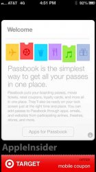
I am going to go on record and say that the new Passbook welcome screen (below) is the first sneak peek into iOS UI/UX designed by Jony Ive's oversight!
What do you all think? Discuss")
I am going to go on record and say that the new Passbook welcome screen (below) is the first sneak peek into iOS UI/UX designed by Jony Ive's oversight!
What do you all think? Discuss