Become a MacRumors Supporter for $50/year with no ads, ability to filter front page stories, and private forums.

Rogifan

macrumors Penryn
Original poster
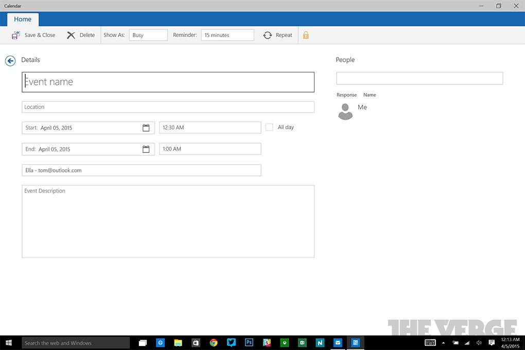
Below are two screen shots from the Windows 10 mail and calendar app. All this white space and lack of information density really annoys me. I hate it in iOS too. Is it not possible to have a more 'modern' design without all this white space everywhere?

http://www.theverge.com/2015/4/4/8345881/windows-10-mail-calendar-apps

windows10mailcalendarapps4_1020.0.jpg


windows10mailcalendarapps6_1020.0.jpg
 
I have noticed that as the screen gets bigger, it becomes more of a problem. It is definitely not the UI for a 17"+ screen.
 
That top picture is fine, since that currently empty inbox will usually be filled with emails, and that big space on the right is where you'll read them, and/or reply.

That bottom shot is a good example of wasted space, though.
 
This is exactly my issue with Yosemite. That and it's ridiculously buggy and gives me headaches to use. I hope this won't be the case for Windows 10 since I really like Windows 8.x.

One could argue that you wouldn't have these windows maximised normally, thus less space being used. We have no idea how big the user's screen is.
 
Register on MacRumors! This sidebar will go away, and you'll see fewer ads.