Become a MacRumors Supporter for $50/year with no ads, ability to filter front page stories, and private forums.
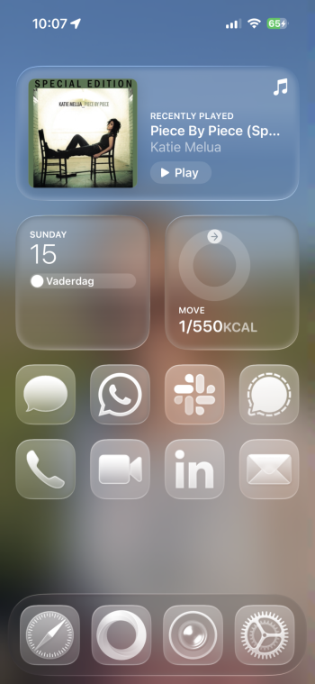
I have a slightly different take on LG. I think the UX of using it is too inconsistent. When it hits, it really hits. It looks great, and feels very satisfying to use.

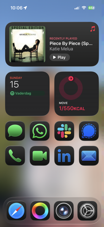
And then it misses, like the current implementation of Finder windows, and you find yourself thinking, “what is this absolute horseapples?”

It has some serious usability issues especially around lacking contrast to differentiate UI elements. I know you can turn on high contrast mode, but shouldn’t the UI be generally reasonably accessible, to everyone, from the outset?

I mean, look at this slider:

Screenshot 2025-07-01 at 07.59.02.png


No-one should ever have looked at that and gone “yep, that’s absolutely fine”, even for a minute.
 
Liquid Glass is novel but bland
Needs colors for fast eye detection of Apps
Not Apples best software design
 
Pretty much what Apple wants these days it feels. Throw out a 70% solution and let the dedicated masses figure out the rest for free. How Apple thought monochrome = glass was beyond me. I would argue people are used to looking at colors of icons first then muscle memory of location. With “clear” mode I lose one of those and all hell breaks loose in the app library ha.
 
  • Like
Reactions: redcarian
People have been posting a concept for colorized Liquid Glass icons on Twitter that looks SO much better IMO

I actually also submitted feedback with a concept of allowing to choose the foreground and background color of the icons. So instead of just allowing the 4 options default, dark, glass or tinted for the entire icons, you can create a combination for the foreground and the background. This way you can choose the dark foreground icon on a glass or tinted background. or the default foreground icon on a dark, glass or tinted background icon.

The problem with the current option is that all options have problems regarding design uniformity, cohesiveness and usability.
The default option has no uniformity and no cohesion and looks very messy. The Clear option has high uniformity and cohesion, but the lack of color makes it very difficult to identify the correct icon at a glance. The Dark option is currently the best combination of uniformity, and usability. The only problem is that the dark background does not always fit the background or the overal theme. It lacks cohesiveness. This new option will be the best combination of all.
See screenshots for the possible outcome:
 

Attachments

  • Proposed possibility-Dark icons with clear background.png
    Proposed possibility-Dark icons with clear background.png
    996.5 KB · Views: 49
  • Default.png
    Default.png
    1 MB · Views: 50
  • Clear.PNG
    Clear.PNG
    990.5 KB · Views: 47
  • Dark.PNG
    Dark.PNG
    980.1 KB · Views: 47
Last edited:
I like the colorized liquid glass icons better.
How do we get Apple to bite? This is what liquid glass should have been. I'll submit feedback, but I feel like we need a petition or something. The last time I gave feedback about a clearly broken design issue (transparent names in the Siri app suggestion widget), I got a reply back several months later that it was "intentional." They finally fixed it in a future major release (can't remember the year).
 
How do we get Apple to bite? This is what liquid glass should have been. I'll submit feedback, but I feel like we need a petition or something. The last time I gave feedback about a clearly broken design issue (transparent names in the Siri app suggestion widget), I got a reply back several months later that it was "intentional." They finally fixed it in a future major release (can't remember the year).
I think that so many people independently reported this feature. They will have to implement it at some point. I'm not sure if they can do it for the initial release though.
 
I was skeptical of the liquid glass aesthetic when it was rumored, but when Apples invitations for WWDC came out and it showed the glass picking up highlights from the space around it, I though that looked cool and could work. I still think this might be a better look for it.
 

Attachments

  • WWDC-2025-Sleek-Peek.jpg
    WWDC-2025-Sleek-Peek.jpg
    31.9 KB · Views: 12
  • wwdc25-05-1536x1152.jpg
    wwdc25-05-1536x1152.jpg
    77.2 KB · Views: 11
Register on MacRumors! This sidebar will go away, and you'll see fewer ads.