Hi
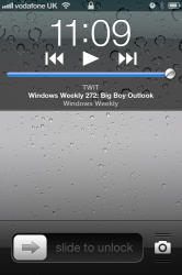
In iOS5 the lock screen controls are too close together. Has this been improved in iOS6? It's currently far too easy to accidentally fast forward or rewind when you mean to pause or play. There's a lot of wasted space at each side so wouldn't be too hrd to move the icons a bit.
Particularly annying for podcasts or audiobooks
thanks