Become a MacRumors Supporter for $50/year with no ads, ability to filter front page stories, and private forums.
Apple=Simple

i think one of apples selling points is its simplicity by design, i think this new logo adds just a little more complication that isnt needed.
i personally like the flat color
i like the new metal interface, but i really hope they dont start reverting back to the os 9 interface, i thought that was ugly,
aqua isnt my favorite, but ill take it any day over the os 9 gray crap look
my .2
Andreas
 
Desperately seeking Panther

As a OS 9 user using a 4 year old iMac , I am desperately waiting to get my hands on one of the new powerbooks, but, like about half of the working world it seems, I am waiting for Panther. When I do switch over, I'm wondering--what happens to apps that don't run on OS X? is there some way I can run 9 on a new powerbook or am I SOL???

dazed and confused

:confused:
 
Re: Desperately seeking Panther

Originally posted by Innagoddadavida
As a OS 9 user using a 4 year old iMac , I am desperately waiting to get my hands on one of the new powerbooks, but, like about half of the working world it seems, I am waiting for Panther. When I do switch over, I'm wondering--what happens to apps that don't run on OS X? is there some way I can run 9 on a new powerbook or am I SOL???

dazed and confused

:confused:

It's called "Classic Mode". You can run your OS 9 programs in OS X.
 
Re: Apple=Simple

Originally posted by blueflame
i think one of apples selling points is its simplicity by design, i think this new logo adds just a little more complication that isnt needed.
i personally like the flat color
i like the new metal interface, but i really hope they dont start reverting back to the os 9 interface, i thought that was ugly,
aqua isnt my favorite, but ill take it any day over the os 9 gray crap look
my .2
Andreas
I think you guys are jumping way too fast to conclusions. There is no way in hell that Apple are going to go back to a OS9 type of look, after putting so much emphasis on Aqua and its beautiful, smooth, clarity.
It's just that they are trying to tone down the eye-candy, pulsating thingies to give it a tad more serious look.
 
Re: Desperately seeking Panther

Originally posted by Innagoddadavida
As a OS 9 user using a 4 year old iMac , I am desperately waiting to get my hands on one of the new powerbooks, but, like about half of the working world it seems, I am waiting for Panther. When I do switch over, I'm wondering--what happens to apps that don't run on OS X? is there some way I can run 9 on a new powerbook or am I SOL???

dazed and confused

:confused:
Pardon me for being direct, but I can't believe what I am reading. REALLY. Don't you know about Classic??? That's OSX's compatibility mode in case you didn't know. And that should run a large percentage of your OS9 apps (a few might not work, I'm afraid). Now that you have waited so long, you might as well wait for Panther to switch to OSX.
Good luck to you.
 
the only thing that i want apple to do is have something like demetallifizer, or something like it, so i can get the non-metal look in anything i want. i hate it on just about everything but the iApps, and it's pushing it for iPhoto, if you ask me. safari just looks like crap in brushed. it's beautiful in aqua.

i'm still trying to get over the removal of the stripes... i'm not using panther till there's a stable third party res-hack that restores the old jaguar theme.
 
Apple's goal is to reduce the visual weight of the UI while increasing the feedback. So they have toned down Metal and they have toned down the thick corduroy grey backgrounds of Aqua. They have given Active and inactive title bars their own smooth textures.

The other goal is to no interfere with the look of a windows content. That means that the surrounding color schemes need to be visually neutral. This way the colors and whiteness of images will be more vibrant. You can see this in their professional Apps color choices.

Increasing the feedback includes animated cinematic visual cueing. The animation of the drawer is one example. But, the animation is actually faster than Jaguar's and Drawers and Windows are significantly more responsive. Apple is evidently adding additional cinematic effects using the Extreme portion of the system.

Overall it will make for a very professional and technological advanced system, that should please professionals and consumers alike. The new Panther is an awesome refinement of OS X.
 
Originally posted by stingerman
Overall it will make for a very professional and technological advanced system, that should please professionals and consumers alike. The new Panther is an awesome refinement of OS X.
I have managed to keep away from Panther pre-release seeds. But I am really looking forward to seeing what it's capable of, and the wait is now becoming unbearable.... AAAArgh!!!
 
Putting aside my thoughts on Brushed Metal, the new Aqua in Panther is a real step forwards for me. The darker grey, various tones of grey makes text more legible, and the interface easier on the old eyes. I like Jaguar's stripes, and was kinda worried at first by the look in Panther, but having used it, it gets my vote.
Fire up Mail in Panther, then look at the toolbar and how the icons now fit so well into the colour scheme.

Also, I with the types of apps I use, the new look blends in far better with them. so moving from app to app, the contrast isn't so great anymore, the eyes tend to float back onto the data, rather than the GUI.
 
Who cares???

this is the bit excites me most about panther:

"The latest builds are said to boast 'sizzling' speed improvements -- from user installation to interaction -- over previously seeded builds."

sizzling
 
Re: Who cares???

Originally posted by dongmin
this is the bit excites me most about panther:

"The latest builds are said to boast 'sizzling' speed improvements -- from user installation to interaction -- over previously seeded builds."

sizzling

Agreed!
 
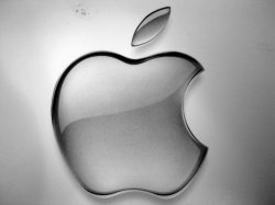
Does one of the world's great logos really need a 'swoosh?'

To me, the new reflective Apple logo eschews the company's overarching design philosophy, simplicity. The reflection's trendy, logo-ish shape defaces one of the truly classic icons of organizational identity.
 
Re: Does one of the world's great logos really need a 'swoosh?'

Originally posted by wHo_tHe
To me, the new reflective Apple logo eschews the company's overarching design philosophy, simplicity. The reflection's trendy, logo-ish shape defaces one of the truly classic icons of organizational identity.
I disagree. The logo identity comes from its shape, not its colour or texture. That's why seeing it in blue, red, green, white or multicolor doesn't make any difference. Everyone now recognizes the logo by the shape. Apparently, the patent on the logo only describes its silhouette.
Besides, the ability to change the colour has provided Apple with ways to adapt to design fashion/trends, giving it a dynamism that a logo set in stone wouldn't give them.
 
In using LCD screens, pre-Panther Aqua is sort of drowned out in the brightness some of these screens have. My Lombard looks bright and almost painful, even when I run through a screen calibration.

Panther makes elements much clearer on these earlier LCD displays and less is drowned out by the display. I much prefer Panther's aqua to Jaguar's because of the fact that is is easier on the eyes with my laptop.
 
Re: Re: Does one of the world's great logos really need a 'swoosh?'

Originally posted by NicoMan
I disagree. The logo identity comes from its shape, not its colour or texture. That's why seeing it in blue, red, green, white or multicolor doesn't make any difference. Everyone now recognizes the logo by the shape. Apparently, the patent on the logo only describes its silhouette.
Besides, the ability to change the colour has provided Apple with ways to adapt to design fashion/trends, giving it a dynamism that a logo set in stone wouldn't give them.


I agree a million percent. Great strategy, and the new logo is awesome.
 
Re: Re: Desperately seeking Panther

Originally posted by NicoMan
Pardon me for being direct, but I can't believe what I am reading. REALLY. Don't you know about Classic???

Yes, believe it or not--I am still slugging away on 9.1 and have had no contact with OS X--Why torture yourself learning about something you can't afford? Sometimes, ignorance is bliss...

I am, however, now ready to take the dive to hyperspace.

A PB 15" 1.25 with Panther? --Bring it on baby!

:p
 
Okay here it is. This is the image off of the system disk folder that came with my MDD PowerMac.

Looks familiar doesn't it.
 

Attachments

  • img_5326.jpg
    img_5326.jpg
    27.6 KB · Views: 493
kinda reminds me of that apple up in the top left of my screen (i have the graphite theme on)... heh.

but the panther one is a little different. it seems to be a lot crisper, like the safari buttons and the new buttons in iTunes/QT/etc.
 
Originally posted by shadowfax
kinda reminds me of that apple up in the top left of my screen (i have the graphite theme on)... heh.

but the panther one is a little different. it seems to be a lot crisper, like the safari buttons and the new buttons in iTunes/QT/etc.

I agree the new Apple looks much more modern but I was simply pointing out that there use os Silver in the Apple is nothing new. In fact if you read the interview with the guy who originally designed the Apple logo for Steve Jobs he remarks that he in fact designed many monochrome versions at the same time he did the rainbow version one of which was chrome/silver. Amazing to think that was like 25 years ago.
 
Originally posted by shadowfax
kinda reminds me of that apple up in the top left of my screen (i have the graphite theme on)... heh.

but the panther one is a little different. it seems to be a lot crisper, like the safari buttons and the new buttons in iTunes/QT/etc.

Totally.

One Apple is graphite, the other is chrome. Just look at the two next to each other.
 
Originally posted by Phil Of Mac
Totally.

One Apple is graphite, the other is chrome. Just look at the two next to each other.
the coloration isn't really the difference. the difference is that they are moving towards a sharper, less rounded look. the graphite one looks like it's a gel-cap pill, vaguely. the other one looks like a piece of almost flat metal--really, just like the apple logo on the iMac base. notably, it's totally opaque, which the aqua logo really isn't (which is why it looks like a gel-cap).
 
Register on MacRumors! This sidebar will go away, and you'll see fewer ads.