Become a MacRumors Supporter for $50/year with no ads, ability to filter front page stories, and private forums.

tadziak

macrumors regular
Original poster
Jan 4, 2011
165
6
Hello,
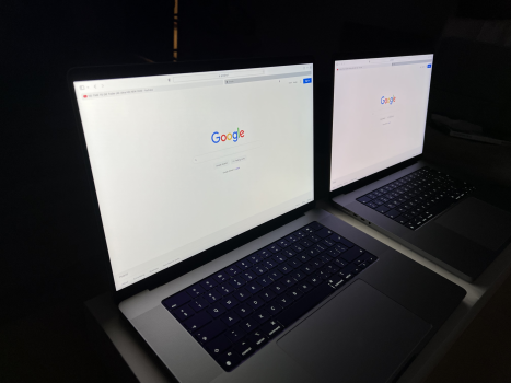
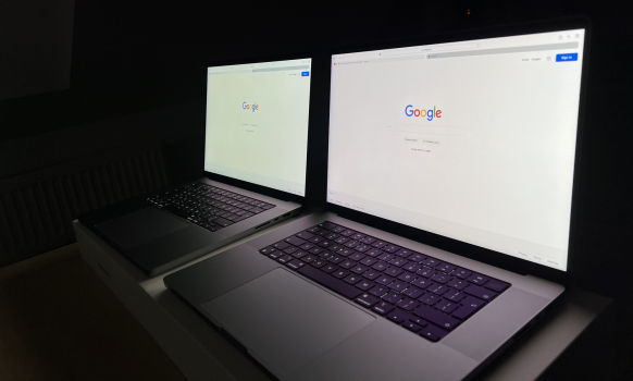
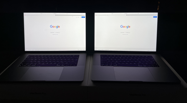
I have two new MBP 16' M1 units and both seem to have visible tint/hue of the screen. One of them get's greenish and the other pinkish.

It's mostly visible from the side/different angles - when working in front of them - there is almost no visible difference. Maybe it's normal behaviour, but for some reason - my brother's unit seem to be much less visible.

I know that almost with every iteration of new Macbooks there are some "yellow gates" etc. However with the new ones - everybody seems to be 100% happy with their screens. Could you please share your thoughts/experiences?

Of course I can live with any of those two, but somehow feel like those tints are a bit extreme for such a praised display. If it would be only one unit - I would think it's some 'lemon'. But here both exhibit this problem - just differently.

I would be grateful for any thoughts :)
 

Attachments

  • tempImagepEl8xW.png
    tempImagepEl8xW.png
    2.6 MB · Views: 3,439
  • tempImagem3dgeG.png
    tempImagem3dgeG.png
    2.1 MB · Views: 931
  • tempImagelfaRoy.png
    tempImagelfaRoy.png
    1.6 MB · Views: 898
  • Like
Reactions: alwayspicky
Interesting how it's far more noticeable from an angle. Straight on it's hard to notice. I wonder it's a matter of the screen coatings? You could try adjusting the white point under screen calibration to see what that does. If you're going to want the most accurate color, you may have to do a full calibration, or do an exchange.
 
Thanks. Honestly, the availability of those new Macs is really poor (Apple says 4-5 weeks) and I don't have that much time to play the 'panel lottery'. I could try sending those two and get one from a reseller, but they don't offer a return policy, so it's a gamble. I wonder if it's something that might improve a bit over time. I have the feeling that my previous panels 'burned in' a bit.
 
  • Like
Reactions: Sanpete
You just need to calibrate your display. You don't have a hardware problem. Almost all panels have tint out of the box even expensive professional monitors. Some will be little pink, some little blue, some little yellow.

Mine had a slight warm yellow tint out of the box.

When you calibrate you must disable Night Shift and True Tone. The latter adjusts screen temperature based on your surroundings.

Find some guides on YouTube, such as these great ones

 
Last edited:
I've been around several new 16" and 14" MacBook Pros and they all had different display color shifts while viewing them on an angle. I am thinking that the coating used on these displays are coming from different manufacturers, or perhaps the displays themselves are sourced by more than one manufacturer.

I used the internal display color calibration tool on all of them, and this did not change the color shift (at all) with side viewing angles, so I am not sure if hardware calibrators would correct this. I prefer the slight pink-ish tint as that will always be more pleasing to my eyes than a green/blue tint (if there has to be a tint at all), but the funny thing is, there doesn't seem to be a difference in tint/color when looking at all these displays head on (other than your typical variances from one display to the next).

One more observation, the displays that have a slight pink color shift (while viewing on an angle) seem to have better viewing angles than those that shift green/blue. Again, this could also come down to a difference in the display coatings used.

If anyone is able to correct this via calibration (of any kind), please share the method and results.

It's not the display coating that would cause this, I am fairly certain it's the panel itself, different tolerances on the built and different color calibrations.
 
Likely display panels are being sourced from different suppliers but are within spec. as all are likely white when viewed on-axis (center). I use both nightshift and True Tone and turned these off to compare my display. Mine looks mostly white like Parisi's display in post #4, but I can see a very minute hint of blue/green if anything when viewed off-axis (angled). This is normal for display panel technology that is based on LCD/LED, unlike plasma, and is not typically an issue with the coatings. In any event, I am over the moon with my 16" display's clarity and how vibrant and gorgeous it is. This panel lottery is why I would not exchange a MBP with tiny cosmetic imperfections that is otherwise perfect. The reality is that your eyes will adjust to whatever white balance variance these displays put out...unless of course the variance causes images/text/colors to become noticeably washed out.

You may also want to make sure that the Accessibility Color Filters (in system preferences) are all turned off (especially color tint) when comparing two displays.
 
Last edited:
Well, my display was as good as it was going to get on these 16", unfortunately I couldn't take the slow refresh any longer, the ghosting was just too distracting and ruined almost the entire experience for me. After a week of loving everything else about it including the screen size I sold it tonight and I am going back to a 14", at least on the 14" from what I remember the ghosting was tolerable. Apple dropped the ball on this one, so close to being a perfect machine to me but I am super highly sensitive to slow refresh screens. Meh.
 
I've been around several new 16" and 14" MacBook Pros and they all had different display color shifts while viewing them on an angle. I am thinking that the coating used on these displays are coming from different manufacturers, or perhaps the displays themselves are sourced by more than one manufacturer.

I used the internal display color calibration tool on all of them, and this did not change the color shift (at all) with side viewing angles, so I am not sure if hardware calibrators would correct this. I prefer the slight pink-ish tint as that will always be more pleasing to my eyes than a green/blue tint (if there has to be a tint at all), but the funny thing is, there doesn't seem to be a difference in tint/color when looking at all these displays head on (other than your typical variances from one display to the next).

One more observation, the displays that have a slight pink color shift (while viewing on an angle) seem to have better viewing angles than those that shift green/blue. Again, this could also come down to a difference in the display coatings used.

If anyone is able to correct this via calibration (of any kind), please share the method and results.
Welll i have two units ,one of which is pinkish ,the other is yellow

And that's noticeable even when looking in front of the Mac ,is that weird ?

I gotta say,in normal usage ,only the yellow one is noticeable ,the red/pink being mainly visible when staring at a solid white Fullscreen lol


Even so,I'm tempted to keep the yellow one cuz it looks...brighter ,and smoother even ...but since displays get yellow as they age ,isn't it bad to have a panel that's already quite yellow from the beginning?
 
Well, my display was as good as it was going to get on these 16", unfortunately I couldn't take the slow refresh any longer, the ghosting was just too distracting and ruined almost the entire experience for me. After a week of loving everything else about it including the screen size I sold it tonight and I am going back to a 14", at least on the 14" from what I remember the ghosting was tolerable. Apple dropped the ball on this one, so close to being a perfect machine to me but I am super highly sensitive to slow refresh screens. Meh.
The ghosting is also terrible on the 14 imo
 
Why does it matter if there is a tint on an angle anyway? Straight on my screen looks great.
It doesn't. Honestly, the use of "NightShift" and the ability in "Accessibility" to adjust the whitepoint using "color filters" negates any color bias of displays these days, for me. With, of course, the exception of a dim and/or washed-out looking screen. I remember the "Yellow Tint" screen issue on the early iPhones that created a screen lottery with some folks going through 4-5 iPhones with "yellow" screens to try and get a "blue-toned" screen. I now choose to keep yellow-bias "Nightshift" on all my devices for eye comfort and to avoid the intensity a bright blueish screen. On my new 16", I recently adjusted the bright white display with a hint of Magenta tint to increase contrast a bit...seems easier on my eyes.
 
Last edited:
It doesn't. Honestly, the use of "NightShift" and the ability in "Accessibility" to adjust the whitepoint using "color filters" negates any color bias of displays these days. With, of course, the exception of a dim and/or washed-out looking screen. I remember the "Yellow Tint" screen issue on the early iPhones that created a screen lottery with some folks going through 4-5 iPhones with "yellow" screens to try and get a "blue-toned" screen. I now choose to keep yellow-bias "Nightshift" on all my devices for eye comfort and to avoid the intensity a bright blueish screen. On my new 16", I recently adjusted the bright white display with a hint of Magenta tint to increase contrast a bit...seems easier on my eyes.
my whole display is yellowish,and not when watching from the sides,but actually from watching up front

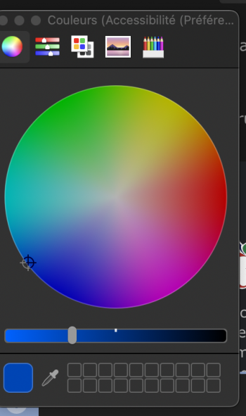
what color should i set the whitepoint at ?

also by doing this,wont i need to recalibrate the display entirely ? i mean u cant just change the whitepoint wihtout chaning the rest as well am i wrong ?
 

Attachments

  • 1640190327272.png
    1640190327272.png
    305.6 KB · Views: 126
my whole display is yellowish,and not when watching from the sides,but actually from watching up front

what color should i set the whitepoint at ?

also by doing this,wont i need to recalibrate the display entirely ? i mean u cant just change the whitepoint wihtout chaning the rest as well am i wrong ?
Sorry, I was referring to my own display white-point tolerance. In your case, I am not sure. Having two displays to compare would certainly heighten the disparity, especially if it is front facing. Is this with your "Nightshift" and "True Tone" and "Assessibilty" display adjustments all turned off? I use all these, so any disparity from "white" wouldn't really be noticeable or bother me...unless it inherently causes things to look washed out (as some of those old yellow iPhone screens did).
 
Sorry, I was referring to my own display white-point tolerance. In your case, I am not sure. Having two displays to compare would certainly heighten the disparity, especially if it is front facing. Is this with your "Nightshift" and "True Tone" and "Assessibilty" display adjustments all turned off? I use all these, so any disparity from "white" wouldn't really be noticeable or bother me...unless it inherently causes things to look washed out (as some of those old yellow iPhone screens did).
Oh but I have.i have two MBP (gonna keep only one )

everything disabled.the first looks a tad reddish/pinkish id say...and the second is clearly yellow

and like its not just the white thats yellow,but everything.the gray of macrumors page is rather yellow (i can quickly forget about it tbh but it has me thinking this isnt a good choice to keep such a display).especially when put side by side i can see how yellow this panel is ,opening a finder window will reflect it as well

im quite undecided ,perf is about the same(yellow unit being 1-2% faster with geekbench score of 10020 vs 9950 on the other ..but i dont think it matter does it ?) ....but the keyboard on the second unit is nicer ,both the feel and sound of it . besides the display looks smoother (is this possible ? maybe different manufacturer ?) ,idk but it IS smoother when scrolling ,switching spaces,launchpad pages

ssd speeds are similar too,temps as well,battery look identical to me,blooming is same ,brightness too(perhaps is the yellow one slighly brighter,i aint sure )

what would u do ?
In my case, I would likely keep reddish-tinted one given my indifference to the display variances as I described earlier and that I tend to get used to the color variance and perceive it less after a while and the better keyboard variance of the reddish-tinted one would stick in my mind after I returned it. When I compared my 16" M1 to my old 2008 15", I was shocked to see how reddish-tinted my old display was and I really liked that display. With that said, only you can know (based on instincts) which of these two MBPs functions better and you like better or if you will regret keeping either one. These variances are all likely due to Apple typically using multiple component suppliers.
 
In my case, I would likely keep reddish-tinted one given my indifference to the display variances as I described earlier and that I tend to get used to the color variance and perceive it less after a while and the better keyboard variance of the reddish-tinted one would stick in my mind after I returned it. When I compared my 16" M1 to my old 2008 15", I was shocked to see how reddish-tinted my old display was and I really liked that display. With that said, only you can know (based on instincts) which of these two MBPs functions better and you like better or if you will regret keeping either one. These variances are all likely due to Apple typically using multiple component suppliers.
Ok I haven't been clear

The yellowish one is noticeably yellow,watching the display i front of it ,and even in finder or Mac rumors.com

On the other hand it seems to have smoother display,better keyboard,1/2% faster CPU and GPU(tho unimportant given the margin of error )

As compared to the red which has worse kb ,not as smooth display (with perhaps less blur however )1/2% worse CPU and GPU

The red however isn't noticeably red ,and i mainly notice it when comparing the two displays side by side ,and on a full white window
 
In my case, I would likely keep reddish-tinted one given my indifference to the display variances as I described earlier and that I tend to get used to the color variance and perceive it less after a while and the better keyboard variance of the reddish-tinted one would stick in my mind after I returned it. When I compared my 16" M1 to my old 2008 15", I was shocked to see how reddish-tinted my old display was and I really liked that display. With that said, only you can know (based on instincts) which of these two MBPs functions better and you like better or if you will regret keeping either one. These variances are all likely due to Apple typically using multiple component suppliers.
Yep multiple manufacturer as well as high tolerance is a ****ing pain i the arse
 
Ok I haven't been clear

The yellowish one is noticeably yellow,watching the display i front of it ,and even in finder or Mac rumors.com

On the other hand it seems to have smoother display,better keyboard,1/2% faster CPU and GPU(tho unimportant given the margin of error )

As compared to the red which has worse kb ,not as smooth display (with perhaps less blur however )1/2% worse CPU and GPU

The red however isn't noticeably red ,and i mainly notice it when comparing the two displays side by side ,and on a full white window
Ah ok. That changes the calculus...I would then probably stick with the yellow-tinted one...especially in my case since I turn night shift on anyway (it yellows the display to a warmer white) and I would just use a lower night shift intensity setting to compensate or turn it off completely (Night shift similarly warms the entire color palate not just whites). You could then also purchase Apple Care+ and if it still bothers you in 3-4 months see if Apple will address it (especially if you can see the difference in the Apple Store). You might even want to document your Yellow-tinted display issue now with Apple, but agree to keep it for now. Plus it will be a lot easier to address only the one issue in the Yellow-Tinted one, as opposed to the several (more subjective) issues in the red-tinted one.
 
Ah ok. That changes the calculus...I would then probably stick with the yellow-tinted one...especially in my case since I turn night shift on anyway (it yellows the display to a warmer white) and I would just use a lower night shift intensity setting to compensate or turn it off completely (Night shift similarly warms the entire color palate not just whites). You could then also purchase Apple Care+ and if it still bothers you in 3-4 months see if Apple will address it (especially if you can see the difference in the Apple Store). You might even want to document your Yellow-tinted display issue now with Apple, but agree to keep it for now. Plus it will be a lot easier to address only the one issue in the Yellow-Tinted one, as opposed to the several (more subjective) issues in the red-tinted one.
i see

hmm.doesnt that fall under consumer law i wonder ,like do i need to buy applecare+ for that ,really...
 
I still think this tint variance is due to the coatings on the display panels - they must be sourced from different suppliers.

I've noticed (albeit with a very small sample size), that the displays with the greenish side-viewing tint also have more visible vertical (what may be 'coating application') lines compared to the displays with the more pinkish side-viewing tint. These lines are very subtle, but they can be seen on a bright all white display at certain angles. Not a big deal, just something I noticed between the green and pink tinted displays.

I also noticed that the displays with the more pink side-viewing tint have better (clearer) viewing angles. So my theory is, the green/yellow side-view tinted displays are using inferior coatings (at least to my eyes). However, this coating doesn't seem to impact the display quality when looking at them straight on versus from angles so this is a non-issue for most buyers (most people seem to be fine with the green-tinted factory color profiles that Apple and Samsung love to use, so they will never notice this).
 
Last edited:
I still think this tint variance is due to the coatings on the display panels - they must be sourced from different suppliers.

I've noticed (albeit with a very small sample size), that the displays with the greenish side-viewing tint also have more visible vertical (what may be 'coating application') lines compared to the displays with the more pinkish side-viewing tint. These lines are very subtle, but they can be seen on a bright all white display at certain angles. Not a big deal, just something I noticed between the green and pink tinted displays.

I also noticed that the displays with the more pink side-viewing tint have better (clearer) viewing angles. So my theory is, the green/yellow side-view tinted displays are using inferior coatings (at least to my eyes). However, this coating doesn't seem to impact the display quality when looking at them straight on versus from angles so this is a non-issue for most buyers (most people seem to be fine with the green-tinted factory color profiles that Apple and Samsung love to use, so they will never notice this).

This is just a function of how the pixels are arranged. Try viewing your panel from an above angle what color is it now?
 
Another vote for preferring the pinker tinted at an angle panels. I had quite few of these units, out of the 6 I had(they all had other various issues), one 16" had the greenest yellow tint and one 14" which is what I have now looks very grey greenish as well. The way I like to describe is it looks kinda dull and the colors don't pop as the pinkish one. I'm exchanging one last time tomorrow before I call it quits.
 
Last edited:
Register on MacRumors! This sidebar will go away, and you'll see fewer ads.