

Become a MacRumors Supporter for $50/year with no ads, ability to filter front page stories, and private forums.

MacRumors

macrumors bot
Original poster


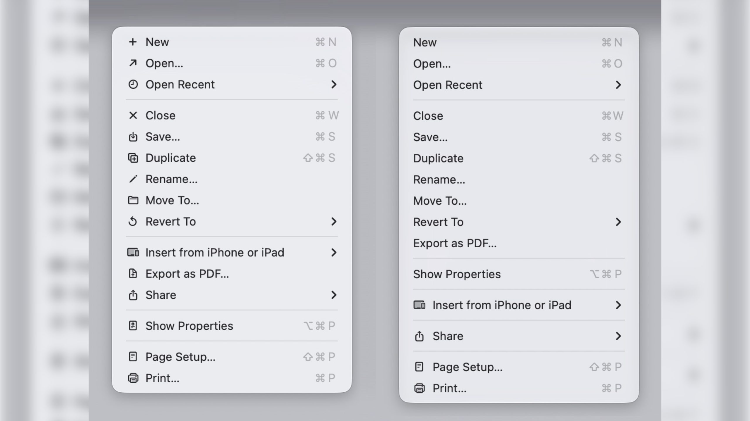
In macOS 27 Golden Gate, Apple has removed many of the menu item icons that are so prevalent throughout macOS 26 Tahoe, as spotted by Nikita "Tonsky" Prokopov (via Daring Fireball). The developer shared before-and-after screenshots on Mastodon to evidence the reversal.
macos-27-vs-macos-26-menu-item-icons@2x-scaled.jpg
Menu item icons in macOS 26 (left) vs. macOS 27 (image: Nikita Prokopov)

Tahoe was the first version of macOS to place a small icon next to nearly every entry in the menu bar across Apple's apps, but the change drew swift criticism from designers and developers. Many of the icons are inconsistent and often difficult to understand on their own, with different Apple apps showing different icons for the same menu items.

The third-party developer pushback was strong enough that some even adopted open-source code provided by NetNewsWire's Brent Simmons to switch the icons off by default.

In Golden Gate though, they're gone – or only used where genuinely useful. Apple has also revised its Human Interface Guidelines to tell developers to use menu item icons "sparingly and with purpose," reserving them for common actions, file system locations, connected devices, and similar cases.

macOS 27 is currently in developer beta, with a public beta to arrive next month, followed by a general release in the fall.

Article Link: macOS 27 Golden Gate Reverses a Divisive Tahoe Design Choice
 
I really love that they reversed this - the whole point of the icon was to make it easier to quickly identify commonly used menu items. This went back to the earliest days of the Mac. As the saying goes, if everything is special, nothing is special. 🙂
 
They should have reversed their new app icon design philosophy on macOS. Now that they’ve new people controlling software design choices the opportunity is there.

For starters they should reverse the decision that no object on a macOS app icon can draw outside the lines that are the squircle. The clapper in FCP needs to return. The paintbrush in Pixelmator. The guitar in Garage Band. The pen (or even a yellow pencil) on the Text Edit app icon. Single hero objects that make the icon more distinctive and interesting, and more creative and attractive. With the right compromise it’s plausible the squircle approach can work.

Though perhaps specific to macOS, a second option in the style of the pure circle shape is ultimately probably the right move.

Choose squircle or circle, and now choose a hero object to stay within the frame or punch the edge. They need a better icon story here. I can understand in iOS and iPadOS not allowing circle app icons, but on Mac it’s a regression.

They also need to make the Weather app icon across all of their platforms dynamic, and offer that same API ability to third party weather apps so a user can glance to any weather app icon on any platform and instantly gain insight into the weather and temperature outside their door—charming.

They should further sharpen the corners of windows on Mac too. Return to a more serious and professional aesthetic there.

And bring back the old Settings UI design, and bring it to iPad too.
 
Last edited:
macOS 27 is currently in developer beta, with a public beta to arrive next month, followed by a general release in the fall.
Do we really need this at the end of every software feature update article? We get it. We know when it comes out. We don’t need a constant reminder of the timeline unless it changes.
 
What is the basis for changing the grouping and ordering of the menu items?

Were any changed because of the presence/absence of the small icons?

The most annoying single issue for me is that some apps allow right-click & Paste Without Formatting [Firefox], some have Paste and Match Style [Notes], some require you to go off to the Edit menu -> Paste and Match Style [Pages and Numbers].

Yes - I know there are keyboard shortcuts...

1781191493279.png
 
It's interesting because I never even noticed. I was either so used to the icons not being there that I never noticed they were added or my brain just filters out the noise for me. Its sort of like the social media surveys, "did you notice this ad". I've never once seen an ad on social media, not because they don't exist but because I have a tunnel vision ad avoidance system.
 
The only problem I ever saw in these icons as that they aren't aligned centered between the left edge and the text on the right. Apart rom that they make it far more easy for newcomers to quickly get to know the menus better.
Hopefully Apple reverses this or, I don't know, give user the option to decide themselves instead of some stranger in sunny CA.
 
I


In macOS 27 Golden Gate, Apple has removed many of the menu item icons that are so prevalent throughout macOS 26 Tahoe, as spotted by Nikita "Tonsky" Prokopov (via Daring Fireball). The developer shared before-and-after screenshots on Mastodon to evidence the reversal.

macos-27-vs-macos-26-menu-item-icons@2x-scaled.jpg

Menu item icons in macOS 26 (left) vs. macOS 27 (image: Nikita Prokopov)

Tahoe was the first version of macOS to place a small icon next to nearly every entry in the menu bar across Apple's apps, but the change drew swift criticism from designers and developers. Many of the icons are inconsistent and often difficult to understand on their own, with different Apple apps showing different icons for the same menu items.

The third-party developer pushback was strong enough that some even adopted open-source code provided by NetNewsWire's Brent Simmons to switch the icons off by default.

In Golden Gate though, they're gone – or only used where genuinely useful. Apple has also revised its Human Interface Guidelines to tell developers to use menu item icons "sparingly and with purpose," reserving them for common actions, file system locations, connected devices, and similar cases.

macOS 27 is currently in developer beta, with a public beta to arrive next month, followed by a general release in the fall.

Article Link: macOS 27 Golden Gate Reverses a Divisive Tahoe Design Choice
I always assumed this and the corner radius stuff was to get it more ready for touch like iPadOS is.
 
  • Like
Reactions: Nclaire44
I really liked the expansion of menu glyphs/icons across macOS. I was hoping Apple would complete the job and fill in the small number of gaps, as well as make sure the usage was consistent throughout the operating system, included applications and third-party apps.

I found the glyphs not only aided my understanding of what the menu item did, but sped up my comprehension. For me, they generally seemed to work on, and reinforce, the existing Mac principle of 'if you learn it in one place, you've learnt how it works in any app' (with the current exception of small instances of inconsistent usage).

Given that once the job is done, it would only require new icons to be created occasionally, I'd have preferred Apple to finish the work and then make a preference in System Settings to globally switch these on, off or perhaps show only prominent glyphs.
 
When I look at the line of icons on the left, I couldn't tell you what most of them mean. These icons are meaningless symbols to me. But I can tell you what the word to the right of the icon means. Removing the icons was the right decision.
It was not the right decision. Appel shouldn't go back and forth with UI elements like this.
Considering they are calling this version Golden Gate, it really should still have these icons for new users so they can get more accustomed to the menus without being blasted with a wall of text as these icons are easily digestible and glanceable indicators that can work great for many people. Apparently Apple agreed until this recent 180.
Just because you can't be bothered to recognize their meaning doesn't mean they are useless or meaningless.
 
Register on MacRumors! This sidebar will go away, and you'll see fewer ads.