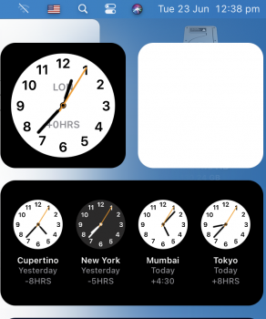
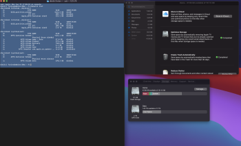
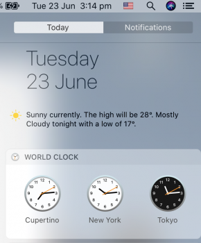
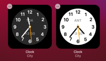
Really appreciate the UI refresh. Elements come together to create a nice, fresh experience. I think that font display is tweaked too, I am on a MacBook Air 2017 and text is looking really good. Text is the first thing I noticed on my display, and I am very happy with it. I can imagine that macOS Big Sur would look stunning on Retina displays.
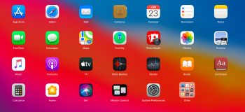
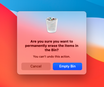
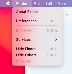
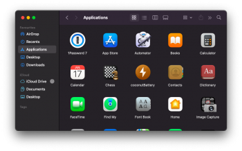
The new dialog boxes, the icons, sounds, so far I like where they are at now. Trash sound could be improved. Feels more like "booted" than something thrown in the trash. Animations are smooth on my hardware, I can only imagine how blistering performance we are going to have on tap in the coming years. I thought I wouldn't like the iOS-like icons, but they are fine. Skeuomorphism is coming back in a nice way, particularly in icons. Launchpad never looked so clean. Design language and symbols and iconography are done well. This is feeling better than the preceding macOS. Optimised height between menu options is a huge plus.
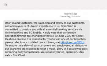
In Messages, if the sender does not support replies, the To field is empty.
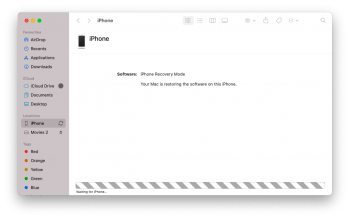
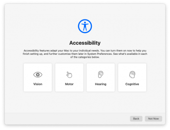
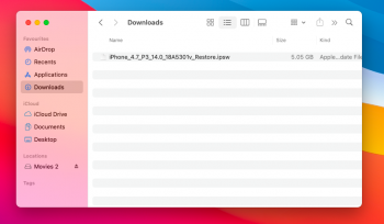
Also, Finder continues to improve on the iPhone connection experience and initial setup has Accessibility options. I do not think these options were presented at initial setup before.
I have high hopes from this release and the future now, from the consumer point of view. The whole system feels eerily similar to iOS/ iPadOS, which means familiar, and that is probably what Apple is aiming for, while keeping the macOS experience and functionality (and purpose). Developer point of view remains to be seen and will become clearer in the coming days.
EDIT: Added some more screenshots. Also, noticed that tab titles in Safari are now readable for me at the angle I use my screen. Previously on Catalina, they were hard to read. So far, text and readability improvements are under-appreciated facets of Big Sur, in my opinion.
Attachments
-
 Screenshot 2020-06-23 at 11.28.18 AM.png132.8 KB · Views: 920
 -
 LWScreenShot 2020-06-22 at 10.05.08 PM.png86.9 KB · Views: 339
 -
 Screenshot 2020-06-23 at 11.39.22 AM.png614.6 KB · Views: 449
 -
 Screenshot 2020-06-23 at 11.50.46 AM.png159.6 KB · Views: 344
 -
 Screenshot 2020-06-23 at 11.51.53 AM.png66.5 KB · Views: 341
 -
 Screenshot 2020-06-23 at 11.52.27 AM.png195.3 KB · Views: 352
 -
 Screenshot 2020-06-23 at 12.07.25 PM.png59.9 KB · Views: 354
 -
 Screenshot 2020-06-23 at 8.09.12 PM.png204.3 KB · Views: 381
 -
 Screenshot 2020-06-23 at 8.09.43 PM.png134.7 KB · Views: 346
 -
 Screenshot 2020-06-23 at 8.14.30 PM.png232.9 KB · Views: 331
Last edited:


