Become a MacRumors Supporter for $50/year with no ads, ability to filter front page stories, and private forums.

MacRumors

macrumors bot
Original poster
Apr 12, 2001
68,253
39,053


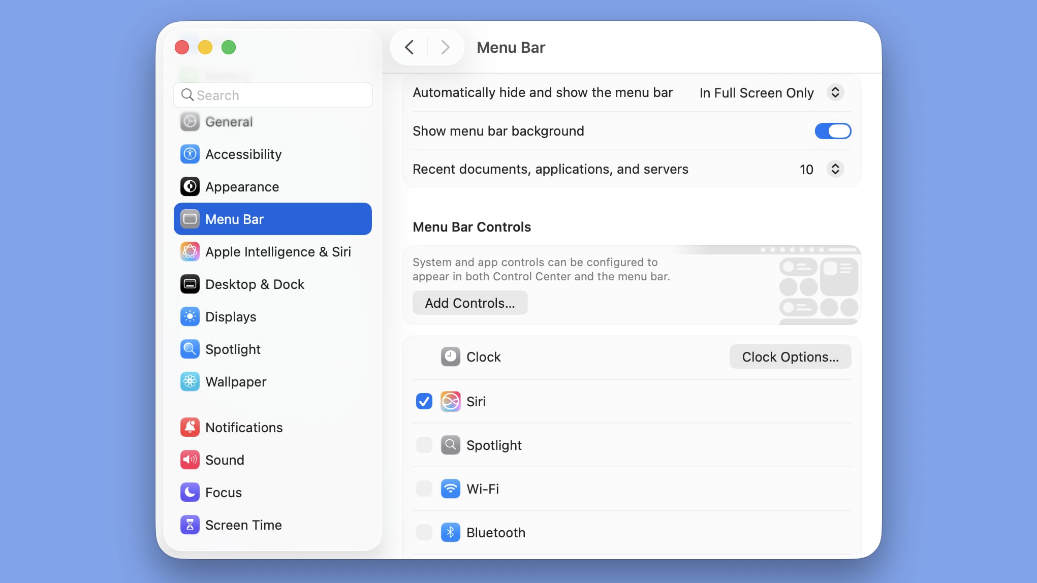
In macOS Tahoe Beta 2, Apple included a new option to add a background to the menu bar, making it possible to have a menu bar design that’s similar to the menu bar in macOS Sequoia.

macos-tahoe-show-menu-bar-background.jpg

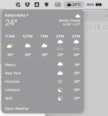
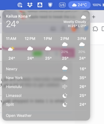
As part of macOS Tahoe’s Liquid Glass design, Apple removed the background of the menu bar, so it blends into the wallpaper or background behind it. The icons of the menu bar are more free floating with the transparent look, though Apple does add a slight gradient to wallpapers to improve visibility.

The menu bar toggle is available in the System Settings app under the Menu Bar section. Turning it on clearly delineates the background from the menu bar for those that prefer the non-transparent aesthetic.

With the second beta of macOS Tahoe, Apple is making updates to address some of the issues that developers have raised. Apple also changed the color of the Finder icon to better match the traditional Finder colors.

Article Link: macOS Tahoe Beta 2 Lets You Add a Menu Bar Background
 
I wish they made the close, minimize and maximize buttons more glass-looking. Just like they did in Aqua. Not sure why these basic and most obvious areas that should be redesigned are still flat.

There is no glassy look at all in the apps, especially Finder, it doesn't even have the slightest transparency. Maybe it will change later.
 
I see the mixed feelings and the pun going on with Windows Vista but I say it’s a welcome direction. The Vista pun is so flawed, given how hard MS tried to copy Aqua and Tiger back in the day. This is very subjective but for me Aqua in 10.2 and 10.4 Tiger were the most beautiful OSs ever made. I see Liquid Glass as a comeback of some sort. Skeuomorphic just enough but a firm departure from Cartoon Network. From now on this will mature, adapt and evolve.
 
Dark Mode diesn't change much.

Screenshot 2025-06-23 at 21.57.23.png
Screenshot 2025-06-23 at 21.57.43.png


Edit: I just wondered about the sun, because it's almost completely dark but now the moon is there.
 
  • Like
Reactions: Starfia
The transparency still makes my M2 mac which used to feel super fast, like it's suddenly 20 years old, even with Beta 2.

In Accessibility I enabled "Reduce Transparency" but the Messages app almost becomes unusable - flickering everywhere. Can others report this, so Apple listen? So far, β1 and β2 have the issue.

My M4 Pro Mini is always very warm when doing nothing. I already thought about downgrading but in low power mode it's only slightly warm. In Sequoia it was permanently cool.

It's the WindowServer process, that is stressing the GPU and the Efficiency Cores.
 
My M4 Pro Mini is always very warm when doing nothing. I already thought about downgrading but in low power mode it's only slightly warm. In Sequoia it was permanently cool.

It's the WindowServer process, that is stressing the GPU and the Efficiency Cores.
That's unfortunate. In Accessibility I have enabled "Reduce Transparency" but check out what it does to the Messages app (it's more obvious when in Light Mode).

Apple really had an opportunity to make macOS lightning fast, but instead they seem set on slowing it down as much as possible with bloat features. It's very, very frustrating to see the direction it's going. Literally, Linux in a VM operates much, much faster than macOS native. Yes, I know it's a beta, but the point still remains - this is all bloat features that nobody is asking for. I just hope they allow us to turn this **** off.
 
I sure hope TopNotch still works. I really like the fact that I’ve been able to completely forget there even is a notch at the top of my M1 Pro’s screen.
 
Good. The default new Tahoe background is a pretty smooth, non-complex water image that works great for using transparent controls, but if you use something closer to what Sequoia defaults to then icons can get a bit lost in the noise. Nice to have the option please everyone.
 
I sure hope TopNotch still works. I really like the fact that I’ve been able to completely forget there even is a notch at the top of my M1 Pro’s screen.
Screenshot 2025-06-23 at 22.34.26.png


This is still working but I don't have a notch. I am just getting am black menu bar. It doesn't hide the simulated notch completely, because it's bigger than the menu bar.
 
Yes, but look at the implementation, they take a sample of the wallpaper colour. It's subtle enough to be nice to have the option. User can turn this bar on or off. Choice like this is good.
and it really depends on your background image. If you use a photo with any amount of complexity then the men bar (and other things) can get lost in the noise.
 
  • Like
Reactions: haydesigner
Compare w/ Reduce Transparency mode on. I'd love to know why they even remotely thought that it would be a good idea to make things more difficult to read. The design team for Tahoe quite frankly need fired. Yes, I know this is a beta, but in days gone by this kind of nonsense would never have even been allowed. Sad to see the ridiculous lowering of standards.
 

Attachments

  • Screenshot 2025-06-23 at 10.27.17 AM.png
    Screenshot 2025-06-23 at 10.27.17 AM.png
    88.6 KB · Views: 54
  • Screenshot 2025-06-23 at 10.26.07 AM.png
    Screenshot 2025-06-23 at 10.26.07 AM.png
    261.1 KB · Views: 45
Register on MacRumors! This sidebar will go away, and you'll see fewer ads.