Mac Fly (film)
macrumors 68040
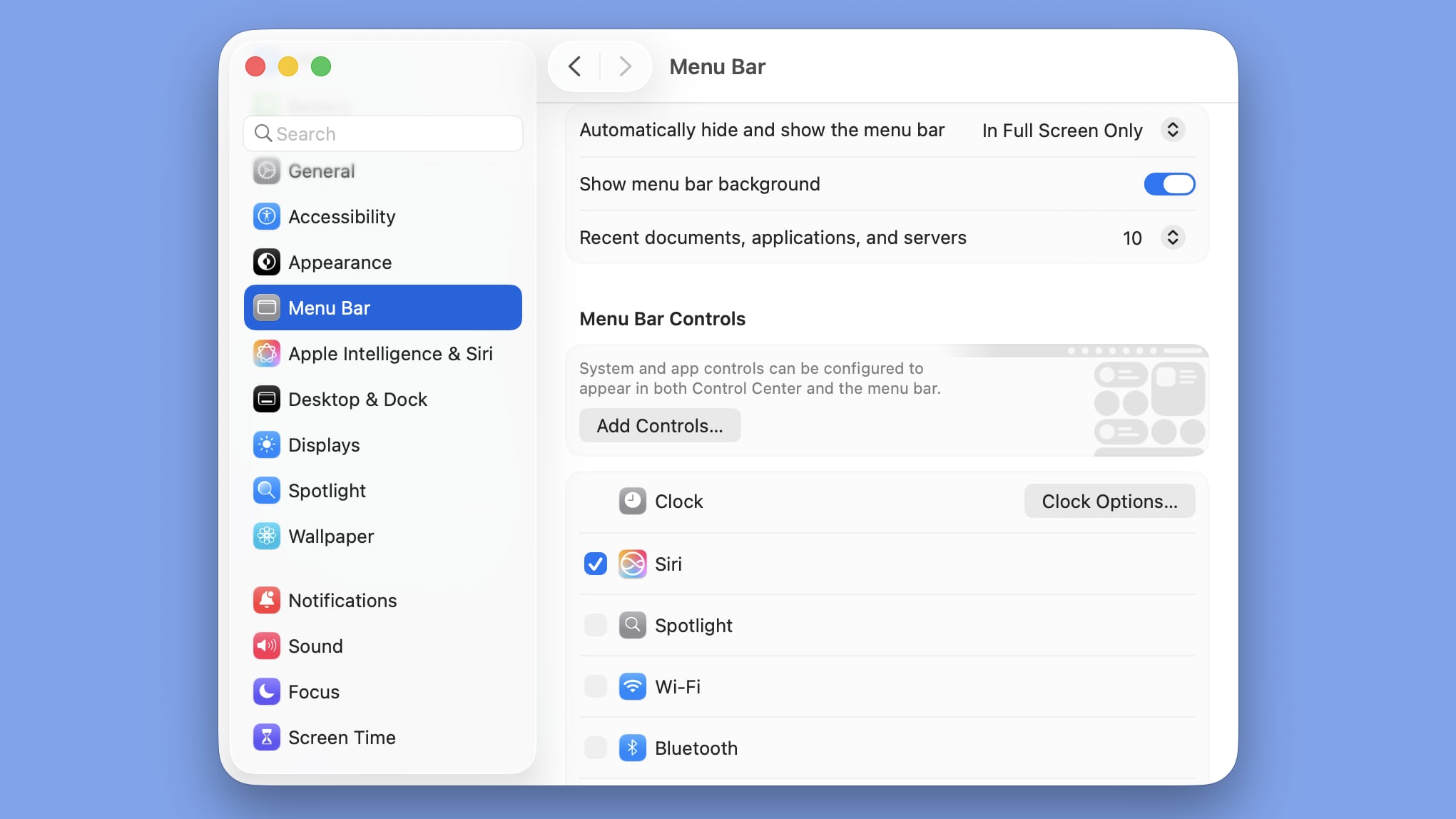
I believe it selects the predominant colour and brigs that across the whole way, thus accounting for such a situation. Do you have beta 2, and can you show me an example image with beta 2?and it really depends on your background image. If you use a photo with any amount of complexity then the men bar (and other things) can get lost in the noise.