Become a MacRumors Supporter for $50/year with no ads, ability to filter front page stories, and private forums.
Is there a way to change only certain folder's color? I'd love to use it as Tags - for example all of my clients' invoices folders in a certain color etc...
If it only can be set system wide then I'll stick with blue, I guess... ;)
I have macOS Tahoe installed on an external drive, and the folders’ colors are controlled by Tags. This preference is just a default for untagged folders.
 
They need to revisit the way the tinted icons work.

The current method where it appears to take the dark mode icon, desaturate it and apply a colour tint over the whole icon looks awful. It reminds me of a printer that's run out of black ink.

They should instead require App developers to submit an icon in a file format that supports layers. The background layer would be the black squircle consistent with the dark mode icons, and then foreground elements could be black, white, or tinted the ability to set tint vibrancy. It would hopefully end that horrible washed out appearance so many of the tinted icons get.
 
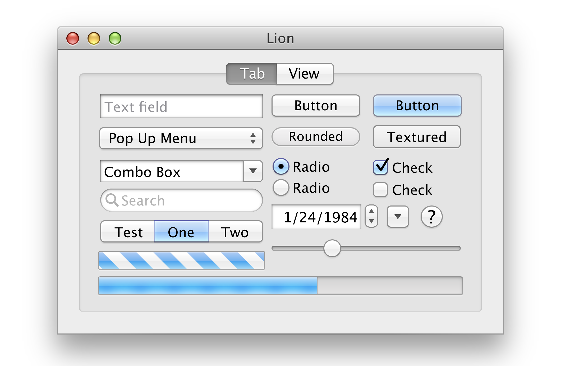
Can I get an entire "OS X Lion" theme?

That's what I actually want here.

4902070e08832861-png.2519466
Where did you find this image? Was it AI upscaled?
 
Ooooof, I just noticed that they REALLY rounded off those window corners. There's a lot of padding around many things on the OS and they say that MacOS isn't "optimized" for touch screens. It sure seems like they're moving the OS into that direction though.

Yeah, it sort of feels like it will be "macOS isn't optimized for touch screens" right up until it suddenly very much "is".
 
I have macOS Tahoe installed on an external drive, and the folders’ colors are controlled by Tags. This preference is just a default for untagged folders.
Sorry, just to clarify, so if I have 2 tags on a folder (say purple and green) will it just pick to one of them to tint the folder? Or are multiple tags no longer an option?
 

Done in Sketch it looks like.
He did others.

10.1 is the nicest looking, but 10.4 is more readable while still being pretty. I don't really like the gray title bar in 10.6 as well.

Speaking of title bars, what idiot thought getting rid of them was a good idea? Dumb.
 
Apple's operating systems are getting ugly and unrecognized with so much customization. Steve Jobs would never approve of this. Apple should give the best experience and not let the user customize.
One of many reasons Jobs should have been fired again immediately (or at the very least confined to marketing and never been allowed to have any control over products) after Apple bought NeXT.
 
Tahoe themes make me feel that Windroid was the inspiration. The return of Aqua in a modern twist is so obvious to me (Aqua in Liquid Glass), and I wish that it would happen. All subjective at the end of the day. Just undo the destructive Ives calling software design shots, the executive “Yes Tim, yes Finance” team, and polish the stone from there. Apple used to explain their thinking as they unveiled the products, not after the fact to read as late apologies or damage control. Damn, I miss those days. To be fair, they did reveal liquid glass in that manner, but the fact that it is still in its infancy makes it feel so alpha. I hope they move a lot faster to refine this, but my confidence in them is at an all time low.
 
Last edited:
One of many reasons Jobs should have been fired again immediately (or at the very least confined to marketing and never been allowed to have any control over products) after Apple bought NeXT.
Yes, because eventually making Steve the CEO and the overseer of everything went badly for the near bankrupt . The iMac, MacBook, OSX, the iPod, and then the iPhone. Oh the horror of gold standards. 🙄 /s

I don’t deify the guy, he was a jerk in many ways, but when it came to making the best products for the  brand, his approach and the results it yielded speaks for itself.
 
Last edited:
Register on MacRumors! This sidebar will go away, and you'll see fewer ads.