Become a MacRumors Supporter for $50/year with no ads, ability to filter front page stories, and private forums.

MacRumors

macrumors bot
Original poster
Apr 12, 2001
67,604
37,995


Apple today previewed macOS Ventura, its latest operating system for the Mac, and one of the new features is a redesigned and renamed System Settings app that replaces System Preferences on macOS Monterey and previous versions.

macos-ventura-system-settings-1.jpg

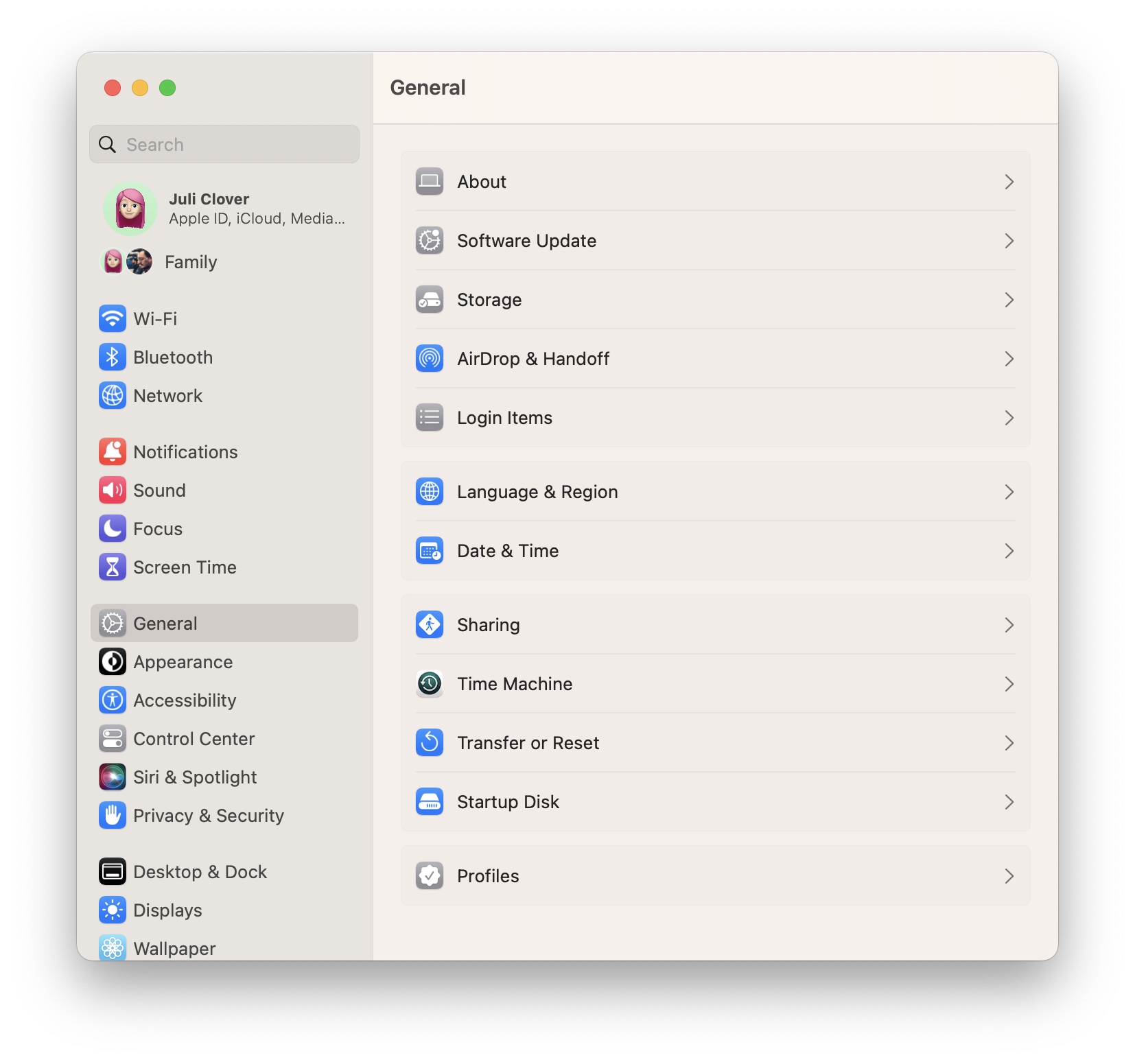
The new System Settings app looks more similar to the Settings app on the iPhone and iPad, with settings placed in a sidebar for easy access.

macos-ventura-system-settings-2.jpg

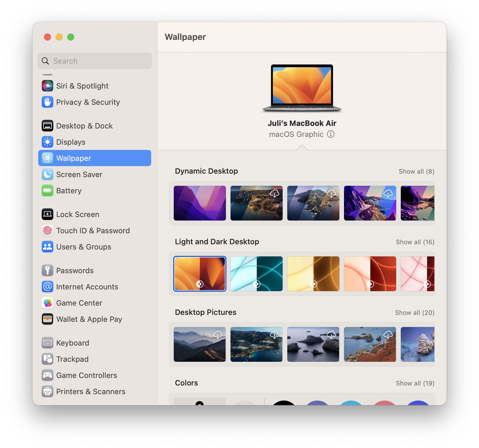
System Preferences had been the app's name for over 20 years, but System Settings is the new name going forward. The redesigned app is limited to macOS Ventura, which will be publicly released in the fall. The first beta of macOS Ventura was seeded to developers today for testing, and Apple said the first public beta will be released in July.

Article Link: macOS Ventura Features Redesigned 'System Settings' App
 
And is it just me, or are they fazing out the dynamic desktop wallpapers in favor of simple dark/light options?

(edit)
They didn’t add a new dynamic this year it seems.
 
Last edited:
  • Sad
Reactions: maxoakland
Take note Microsoft. This is how it is done.

No spreading system settings across a revamped (settings) and legacy interface (control panel) making the user search to find what they need.

It'll take some getting used to but I like transitioning to similarity between MacOS and iOS in how settings are presented.
 
Instead of making macOS look more like the mess in iOS and iPadOS, I wish they would make iOS and iPadOS function more like macOS. I don’t want my Mac to turn into an iPad with a built in keyboard.

TBH, none of the OS updates seem to be anything I can get excited about. If they want to impress me, leave the darn interfaces alone and fix the dang bugs!
 
With every release more and more I just want them to leave the things that work alone and fix the things that don’t. I don’t have any issues with system preferences. How about fixing Music or mouse swipes in Apple Mail.
System preferences is a cluttered mess and hasn't changed aside from its frame. This is far more intuitive and easier to find things.

Your biggest problem is that you use Apple Mail. That needs a ground up redesign.
 
This looks great. Curious about that “macOS Graphic”. I thought it could be Juli’s MacBook name, but no, Juli’s MacBook is the name of her MacBook. So no clue about what ”macOS Graphic” means… On the other hand, I am curious as well to know how do you change now your mac’s name. Currently -and for the last 25 years- you have to go to sharing, and there you can change your machine‘s name. I hope they moved it to Settings -> General -> Information.

By the way, it would have been awesome to have a new dynamic wallpaper just like the Mojave/Catalina ones…
 
If this allows navigation through the various choices via keyboard, it's a worthwhile update.
 
Take note Microsoft. This is how it is done.

No spreading system settings across a revamped (settings) and legacy interface (control panel) making the user search to find what they need.

It'll take some getting used to but I like transitioning to similarity between MacOS and iOS in how settings are presented.
I take it you haven't seen or used Windows 11. Microsoft is ahead of the game.
 
"What if we took the settings menu and made it harder to uses with a mouse?"

"Harder with a mouse? Are we adding a touchscreen?"​

"No, I just think it would be funny."
Why would this new design be harder to use with a mouse? It appears we may now be able to now navigate with keystrokes (or a mouse), so that's a plus.
 
  • Like
Reactions: mhnd and zecanard
Design wise this is a step back. For a landscape display the current control panel displays all the icons to the sub windows. This new layout is more appropriate for a portrait display like an iPad or iPhone. In a landscape display you will have to scroll to see the entire menu. It is like in finder selecting to display icons vs the detail list.

I really wish these types of updated or new layouts would be introduced as an option. Let the market decide if the new layout is preferable. I hope this goes the way of last year’s safari layout update. I find it much harder to change a particular setting on my iPhone vs Mac.
 
Register on MacRumors! This sidebar will go away, and you'll see fewer ads.