Got a tip for us?
Let us know
Become a MacRumors Supporter for $50/year with no ads, ability to filter front page stories, and private forums.
MacRumors dark mode
- Thread starter AppleMythos
- Start date
- Sort by reaction score
You are using an out of date browser. It may not display this or other websites correctly.
You should upgrade or use an alternative browser.
You should upgrade or use an alternative browser.
I disagree, I think its horrible. So hard to read and navigate things. Went back to light mode.
yep agreed. I think its difficult to navigate and the white font on the light blue is borderline unreadable.I love it. Much easier on my eye (don’t really see well in one eye) and I do find it easier to read.
The white font, especially bolded, doesn't work well.
Font needs to be medium/light gray, IMO. Much easier to read and not fuzzy like white font.
Font needs to be medium/light gray, IMO. Much easier to read and not fuzzy like white font.
Home page isn't dark but the forums are for me. I am not sure how I like it so I turned off dark mode on my mac to look at it like normal again. That was a mistake. All 3 of my screens went really really bright white and blinded me. I wasn't thinking......
Don’t like dark mode, how do I get out of dark mode
Go down to the very bottom right of the page and use this button to select the Light style.
One can also go into their preferences as well. I have mine set to "MacRumors Autodetect" right now, and last night experimented with the dark mode just to see but as expected, it was too harsh and hard on my eyes so I quickly went back to Autodetect, which for me displays everything in Light Mode, which makes sense as that is how I've got the computer set up as well. Dark mode is great when working on editing images and displaying images, but for text, not so great....also not so great for aging eyes! I could also simply have chosen "light Mode rather than Autodetect.
I agree, on the forum home page where some of the writing is grey it looks sooo much betterThe white font, especially bolded, doesn't work well.
Font needs to be medium/light gray, IMO. Much easier to read and not fuzzy like white font.
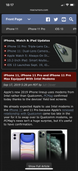
So only mobile version has the main site in dark mode? I have dark mode in the forums, just not the main pages.
Correct, for now. Dark mode for desktop on the news side is still in the works. Several different pieces to the site, so we're rolling things out one at a time.So only mobile version has the main site in dark mode? I have dark mode in the forums, just not the main pages.
I'm very happy for the dark mode option. It's something I've wanted here for a very long time.
The updates they have done for dark mode since this morning are nice. Easier to read now.
It's hard to tell what alerts are new, in dark mode. There isn't enough of a difference in background color. The Apple smilie  in dark mode should be white or rainbow.
 in dark mode should be white or rainbow.
Last edited:
How do you opt out. Is there a way. The home page is still white but the forums are dark. How do you transition back...?I disagree, I think its horrible. So hard to read and navigate things. Went back to light mode.
I love the dark mode. And the new forum software upgrade in general. It is much snappier for me. Thanks MacRumors!
Do you people find this sort of thing easy to read or is it just me?
Dark mode is ok in the main text body but there are way too many links that are either difficult to see or which actually disappear.
Plus, a personal thing- I react badly to unnatural colours. Fluoresent, acid or colours next to each other that jar and vibrate.
Dark mode is ok in the main text body but there are way too many links that are either difficult to see or which actually disappear.
Plus, a personal thing- I react badly to unnatural colours. Fluoresent, acid or colours next to each other that jar and vibrate.
Attachments
Register on MacRumors! This sidebar will go away, and you'll see fewer ads.


