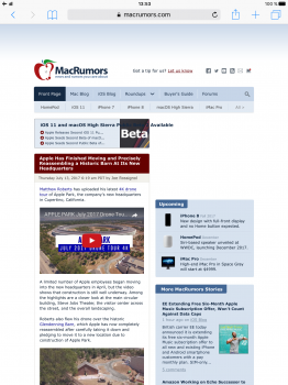
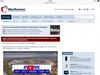
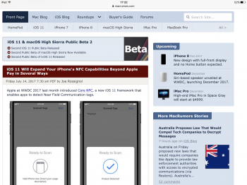
The site works perfectly on my iPad when it's used in landscape mode. However, when I turn it to portrait the main website looks narrowed, with very small text and images and a lot of empty and wasted space on the sides.
Is it supposed to work like this?
Is it supposed to work like this?


