Become a MacRumors Supporter for $50/year with no ads, ability to filter front page stories, and private forums.
An Experiment. Today I am going to Best Buy with calibration hardware.

Many people in this thread seem to be under the impression that a "normal/untreated" screen is matte, and that "glossy" is some sort of add-on that is applied to the matte screen. After further research I am convinced this is not the case.

Both glossy and matte are two different types of screen treatment. Neither is pure, natural, or untreated. Both have advantages and disadvantages. The Matte screen coating deals with reflections by diffusing the incoming light so it is randomly scattered around, whereas the glossy screen coating deals with reflections with an interference layer causing reflections from multiple surfaces to destructively interfere with one another and cancel.

The matte treatment does a better job at dealing with these reflections, but it also has the undesirable side effect of scattering the light originating from the actual image we are trying to see. Because of this, it has the side effect of lower overall image quality in situations not dominated by reflections.

(Here is an analogy: We've all heard of anti-reflective coating for eyeglasses. This is a glossy treatment. Have you ever seen matte eyeglass lenses? Would anybody rough up their lenses with fine sandpaper to deal with reflections? Why not? Because while it would effectively deal with reflections, it would also distort your vision. Matte screen does the same thing.)

But, and there is always a "but", this all depends on the quality of screen treatment applied by the manufacturer. A cheap glossy screen coating may have only a single layer or be highly frequency (color) dependent, so it effects some colors more than others. This would cause distortion of the grayscale of the display. I do not know what quality Apple uses.
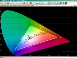
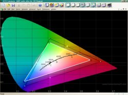
An Experiment.
Today I am going to Best Buy with calibration hardware. I have already arranged it with the store's Apple rep. I will calibrate a glossy and matte MBP and record the before and after results of each. If all goes well I plan to publish these tomorrow if I can figure out how to post images of the histograms.

My goal is to find out conclusively if a glossy MBP can be calibrated as well as the matte can. I believe the glossy looks better, but I won't buy it is it is distorting contrast, gamma, or grayscale.

Rich

Sweet, cant wait to see the results (since i bought a glossy, haha)
 
Sweet, cant wait to see the results (since i bought a glossy, haha)

How do you like it so far?

I wish I knew somebody nearby who owned a glossy, then I wouldn't have to go to Best Buy to do the calibration. I would rather calibrate in a darkened room then under the Blazing Best Buy lights. I plan to use a hood made of poster board to shade the screens during the measurements. I hope this is sufficient. I don't want to look to "strange"... But I guess that's unavoidable. I hope they don't balk at installing the calibration SW to generate the profiles.
 
The thing I find odd is that Matte seems to be the default for desktop displays, and Glossy is becoming the default for laptops. This seems weird to me and it seems like the reverse would make more sense. After all, a desktop display is always indoors, and generally in a "computer room" or other situation where it can be optimally situated so as to avoid glare. In that situation, it seems the glossy display would be ideal, because you can set up the screen and the room so as to eliminate the negatives.

Laptops on the other hand are frequently used in a variety of conditions - outside in sunlight, in coffee shops, in harshly lit boardrooms, in classrooms, in rooms with big windows, and so forth. All of these are situations where the light sources simply cannot be controlled. In that situation, it seems the matte would be preferable.

Just my 2 cents. I personally like the look of the glossy display, but at the same time, I want to be able to use my laptop anywhere and not have to worry about lighting conditions.. so I may go matte. Choices, choices.
 
sweet (after reading 23679 posts of pro and con threads
that where interesting to read but somehow all the same)
finally somebody is taking it from a
"scientific" approach rather than just the
opinion exchange
 
I have read the opposite is true, but let's see what others say. If you are right I will choose the matte screen hands down.

Here is what I've learned from my research:

(1) A regular(clear) LCD screen (like plain glass) would be very reflective and hard to use. Nobody uses these.

(2) A modern "glossy" LCD screen is an otherwise clear screen that has been coated with an anti reflective treatment to somewhat reduce the "mirror effect". It is essentially transparent when looking directly at the screen.

(3) a "matte" screen is coated with a diffusing anti-glare layer that is designed to spread out incoming light from the viewer's environment so that when it is reflected it no longer looks like a what's behind him, but is just a "vague brightness" instead. All the reflected light energy is still there, but it is no longer distracting since it doesn't look like a mirror anymore.

It's not coated with anything. You have no idea what you are talking about. Theres NO "diffusion" coating on a matte screen, its RAW. Look at a matte and a glossy side by side and you will see the color difference. One looks true to color and the glossy will look way over-saturated and contrasty. I guess if you like "shock-and-awe" movies and pictures then go for it; otherwise if you like perfect REAL images then get matte.

No.

First of all, glossy screens are in the minority, as evidenced by Apple stores only stocking the matte high-res displays.

Second, you don't mix music for people with horribly EQ'd speakers. You mix for people with accurate systems. Same goes for graphics.

Thank you! Great point.
 
Personally, I went through an extra hastle to get the glossy. I've used it in the sunlight, np, I'm using it right under a light, and it's great. It's just like matte but looks better. I have a friend who has a new Lenovo Y710 w/ the glossy, and that sucks balls, but Apple's glossy screens are amazing. Think about it: they only offer that on their macbook, it must be pretty good. Just my $0.02.
 
Try to use a glossy with a dark background or a dark image. You just see yourself reflected. You don't need a mirror any more, it's so convenient. Ridiculous. And I work in an environment with diffuse lights. Precise or bright colors? Who cares, the point is r e f l e c t i o n s, lots and lots. Just unbearable. Yes, I work with images and Apple forces me to use this kind of screen. Give me the freedom to c h o o s e! I do not want a glossy screen. I do not.
 
have the perfect solution!
there's a BTO option.. to be announced this Tues! mar 18
you can enjoy both GLOSSY and MATTE in one single screen.
customize.. you can choose:

1. top MATTE and bottom GLOSSY
2. top GLOSSY and bottom MATTE

YES! that's right finally!
now the question you need to ask yourself..
are you TOP or BOTTOM :D

Try to use a glossy with a dark background or a dark image. You just see yourself reflected. You don't need a mirror any more, it's so convenient. Ridiculous. And I work in an environment with diffuse lights. Precise or bright colors? Who cares, the point is r e f l e c t i o n s, lots and lots. Just unbearable. Yes, I work with images and Apple forces me to use this kind of screen. Give me the freedom to c h o o s e! I do not want a glossy screen. I do not.

i know how you feel:)
 
have the perfect solution!
there's a BTO option.. to be announced this Tues! mar 18
you can enjoy both GLOSSY and MATTE in one single screen.
customize.. you can choose:

1. top MATTE and bottom GLOSSY
2. top GLOSSY and bottom MATTE

YES! that's right finally!
now the question you need to ask yourself..
are you TOP or BOTTOM :D

HAHAHAHHAHAHAH;)
too funny
 
All I can say is that I got the matte and I couldn't be happier. It's very bright, great colors and no reflections.
 
Honestly... I don't know what's all the arguing is about. :rolleyes:

People such as myself who are working in print, will usually calibrate their screens, using either a hueyPro or a Spydar. Therefore, it doesn't really matter, the issue of their screens being Matte or Glossy should be personal taste and preference. Your ultimate output or proofs will be the same.
 
Matte and glossy are different types of anti-glare coating for LCD screens. There are windows everywhere I use my MBP, so I prefer the matte screen as it reflects less light.

I know it's Wikipedia, but here.

To reiterate, for those who missed this post, read up on the displays at Wikipedia:
http://en.wikipedia.org/wiki/Glossy_display
They BOTH have a finish or coating. So mostly it sounds like it depends on the end user's needs and preferences.
rjp, I think it's really cool the more serious and scientific approach you're taking. I look forward to reading your results. I would have to disagree with your anti-glare glasses analogy though. I'm not sure that is an accurate portrayal. I think if the matte screens were scratched up glass that weren't at all accurate with image quality, photo, design, and other graphic professionals would not be using them.
 
I wish there was better information on matte vs. glossy features. And that Apple had equivalent matte and glossy machines in stores for comparison.

Obviously it's a personal choice -- there's no "right" answer. I chose matte. The store had the glossy MBP; it had clear reflections of the ceiling lights. I figured that if it gave me equally clear reflections of my office window or living room lamps, it would really distract and bother me. So I bought a matte MBP -- at the loss of the glossy vibrancy everyone raves about.

Did I make the optimal choice? I don't know. Without the ability to test drive both screen types, I really can't know. I just had to make the best decision with the minimal information available.
 
Matte all the way!

Just got my 2.6 17" hi-res matte MBP.

As a web and print designer, I would conclude that the colors are more "lifelike" on the matte. Accuracy conclusions would probably require testing, but I would think matte would be slightly more accurate.

For me, the glossy screen is like the "Vivid" setting on my Panasonic Plasma - colors are certainly more saturated and there's a little bit more pop. Though while initially impressive, after too long it becomes annoying and cartoon-like. But hey, that's just my opinion!
 
In this picture the glossy certainly looks better - the matte just looks washed out. I know it's a picture and lighting and such will change your picture, but Anandtech generally does good reviews. The reviewer preferred the glossy display.

displays7.jpg


http://www.anandtech.com/showdoc.aspx?i=3246&p=9

That says a lot. I have a MB and MBP, both glossy. People do get stunned by the glossy display when watching movies and pictures on my MBP when they compare it with how it looks on their Matte Dell's and HP's...
I had a Matte LCD for 5 years now and glossy comes as a very pleasant change now. Factors here are personal preference (saturation,contrasts etc) or technical requirements (color correction, accuracy etc)

Let people choose what they want in a Store - side by side.
PEACE
 
Results from Best BUy test (preliminary)

I just got back from Best Buy after 2 hours calibrating and measuring. Unfortunately , they do not have the most recent machines there, so I was not able to test a new MBP with a glossy screen. As a substitute, I tested a Macbook Air, which also has a glossy screen with LED backlight. They had the MBP in matte only, and it was the previous generation. I am not sure if the MBP would be better or worse or the same as the MBA, but at least it's a sample of calibration on a glossy mac.

So I tested three machines.

(1) a 15 inch Macbook Pro (matte). Previous generation, but still LED backlit.

(2) A Macbook Air (glossy) LED backlit.

(3) A white Macbook. Previous generation (glossy) CCFL backlit.

I can not upload the results yet since I am at work, but I wanted to give at least a brief summary of the findings.

The glossy MBA calibrated very well. The end results were actually a little better than the matte MBP. The deltaE (which is a measurement of color error over the full range of brightness) was fairly consistent around 2 for the MBA, but in the 2-6 range for the MBP. I have seen MBPs calibrate better than this, so perhaps this one was a little tired.

Anyway, the really interesting news to me was that the glossy MBA did so well. There is no longer any doubt in my mind that this screen can be effectively calibrated. btw, I used the Pantone (now Xrite) Display LT probe and EyeOne Match 3.6.2 SW to do the calibration. Before and after measurements were taken using the freely available HCFR color monitor measurement SW running on another laptop (mine).

In all cases I set the target gamma to 2.2 and target color temp to 6500K. I did not fiddle with the LED brightness. It was left at full in all cases. It is too bright here (about 271 and 385 cm2 for the MBP and MBA respectively. If I had more time I would turn this down and repeat and I'm sure the results would be better. However, even at this blazing level I did not observe any color channel behaving funny at the high end.)

The regular MB really stinks compared to the other two. This surprised me.

Here are a few quantitative results:

MBA (Glossy)

before: gamma=1.74, Contrast=839:1. DeltaE=2-6 range.
after: gamma=2.26, Contrast=788:1, DeltaE=2-3 range

MBP (matte)

before: gamma=2.28, Contrast=650:1, DeltaE=off_the_chart (>10)
after: gamma=2.18, Contrast=556:1, DeltaE=2-6 range

MB (basic white glossy)
after: gama=2.21, Contrast=234:1, DeltaE=8-off_the_chart range.
 
the glossy screen is more durable, a matte screen is much more flimsy this alone is a good reason to go glossy for me at least... but I can see both sides of the argument.

LOL!...please tell me you weren't being serious. Otherwise, I've got this bridge I'm trying to sell....
 
Glossy vs matte calibration results PART1: glossy pre.

I am uploading the calibration screen shots from today in 4 separate postings. Each posting contains 4 images as follows:

(a) grayscale and primary raw color data in xyY format.
(b) luminance histogram (RGB gamma curves)
(c) RBG relative levels and deltaE curve (purple)
(d) CIE diagram (color gamut)

All the windows are labeled.

The postings will contain the following tests
(1) (Glossy) Macbook Air before calibration
(2) (Glossy) Macbook Air after calibration
(3) (Matte) Macbook Pro before calibration
(4) (Matte) Macbook Pro after calibration

Conclusion:
I would welcome any discussion/comments on this data. I hope it is helpful to others out there wanting to go glossy but worried that the colors might not be as accurate. From what I can see the glossy MBA responded very well to calibration. Any deviation in color over the brightness range would have been visible in the RGB gamma curves as a deviation from their optimal 2.2 exponential curve shape. As we can see, the three color curves fall almost directly on top of each other after calibration. They are not perfect, but pretty darn good. Excellent, in fact, for a laptop. It is my opinion that based on this data we can conclude that the color accuracy of the glossy LCD screen is every bit as good as the matte, arguably even a little better, at least in terms of grayscale, which is arguably the most important aspect of color accuracy. This data does not test saturation, however, which could possibly be too high on glossy based on what people are saying. Another test could be run for this.

Rich


EDIT:
Since posting these results I realized that some people may not be familiar with plots like these so I would like to offer some explanation for how to interpret them. First of all, you can find a forum discussing this HCFR freeware product here.

http://www.avsforum.com/avs-vb/showthread.php?t=983943

The First plot in each set is just a spreadsheet of the actual numerical values of the samples taken by the probe placed on the mac screens. There are 11 separate readings made as the program steps through 11 grayscale patterns each with increasing values of brightness from 0% (black) to 100% (brightest white) in 10% steps. The data in the smaller chart at the bottom show the values of the R,G, and B primaries measured separately.

The second plot shows the measured display brightness as a function of input value for each of the three colors. Ideally these three curves should be identical and fall directly on top on the white curve, which is the target. The curved shape of these lines is intentional. It is designed to place more resolution in darker regions of the image since the human eye is more sensitive to changes in brightness there. Mathematically is should be y=x^gamma, thus sometimes it is referred to as the "gamma curve". In this case the target gamma was set to 2.2 (hence the white curve is exactly 2.2). The original RGB curves are coming in closer to 1.8 in this plot.

The third plot is probably the most important. The top shows the relative contributions of R, G, and B at each of the sampled brightness levels when interpreted with a target color temp of 6500K. Again, if perfect, these three lines should fall directly on top of each other across the entire brightness range. In reality, the measurements made form 0% through 20% are never well behaved. In order to get good readings here you need a dark room, and you need to average the measurments over a long time. I suggest you just ignore the values at 0 and 10%. The bottom curve (purple) is the deltaE. This is a well known metric of color accuracy that seeks to combine errors in the R,G,B, and luminance values and how they are perceived by human vision. Lower numbers are better. 2 is excellent. If any color is stronger or weaker than it ought to be for a given sample, the pattern will not be 6500 gray, but will take on a slight tint. When this happens the deltaE increases. The goal is a nice flat deltaE as low as possible indicating all colors are contributing in perfect balance.

The fourth plot shows the color gamut. This is the total range of colors able to be produced by the screen. The outer triangle shows the three ideal R, G, and B primary points and the inner (white) triangle shows the primary points measured from the mac displays. Colors outside this triangle can not be displayed on the mac screen. It is interesting to note that the glossy mac has a larger and slightly more accurate color gamut. The red value is closer to where it should be and so is the blue. I'm guessing that the reason the gamut does not cover the entire HDTV space is because of the 6-bit resolution.
 

Attachments

  • Untitled1.jpg
    Untitled1.jpg
    66.8 KB · Views: 124
  • Untitled2.jpg
    Untitled2.jpg
    59.3 KB · Views: 98
  • Untitled3.jpg
    Untitled3.jpg
    62.5 KB · Views: 125
  • Untitled4.jpg
    Untitled4.jpg
    63.5 KB · Views: 112
Glossy vs matte calibration results PART2: glossy post.

glossy MBA post calibration
 

Attachments

  • Untitled8.jpg
    Untitled8.jpg
    63.2 KB · Views: 91
  • Untitled7.jpg
    Untitled7.jpg
    59.8 KB · Views: 75
  • Untitled6.jpg
    Untitled6.jpg
    54.4 KB · Views: 75
  • Untitled5.jpg
    Untitled5.jpg
    64.7 KB · Views: 77
Glossy vs matte calibration results PART3: matte pre

Matte MBP before calibration.
 

Attachments

  • Untitled12.jpg
    Untitled12.jpg
    63.3 KB · Views: 79
  • Untitled11.jpg
    Untitled11.jpg
    59.8 KB · Views: 82
  • Untitled10.jpg
    Untitled10.jpg
    55.8 KB · Views: 80
  • Untitled9.jpg
    Untitled9.jpg
    65.7 KB · Views: 102
I prefer matte a lot more because I'm sit outside a lot. My first MBP was glossy and I was going to keep it but in the dark, I would see the keyboard lights and sometimes when I'm next to a window the glare is horrendous.

Matte don't have as good as contrast as glossy, I'm willing to forgo some contrast for less glare.
 
Glossy vs matte calibration results PART4: matte post.

Matte after calibration.
 

Attachments

  • Untitled13.jpg
    Untitled13.jpg
    63.9 KB · Views: 100
  • Untitled14.jpg
    Untitled14.jpg
    56.4 KB · Views: 95
  • Untitled15.jpg
    Untitled15.jpg
    61.7 KB · Views: 71
  • Untitled16.jpg
    Untitled16.jpg
    63.1 KB · Views: 77
have the perfect solution!
there's a BTO option.. to be announced this Tues! mar 18
you can enjoy both GLOSSY and MATTE in one single screen.
customize.. you can choose:

1. top MATTE and bottom GLOSSY
2. top GLOSSY and bottom MATTE

YES! that's right finally!
now the question you need to ask yourself..
are you TOP or BOTTOM :D


i know how you feel:)

Can I get left and right options or maybe quadrants? :D
 
Register on MacRumors! This sidebar will go away, and you'll see fewer ads.