Become a MacRumors Supporter for $50/year with no ads, ability to filter front page stories, and private forums.

MacRumors

macrumors bot
Original poster
Apr 12, 2001
69,530
40,698


Apple today updated its TestFlight and Apple Support apps, adding Liquid Glass designs to match the rest of iOS 26.

apple-support-app-liquid-glass.jpg

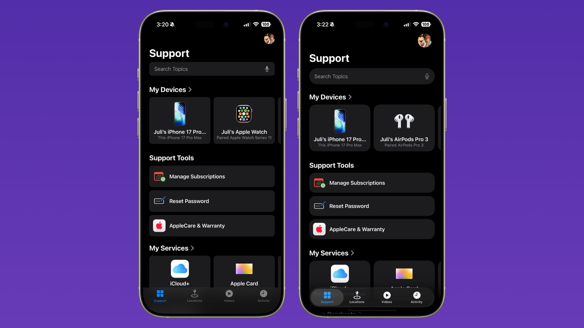
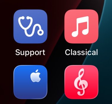
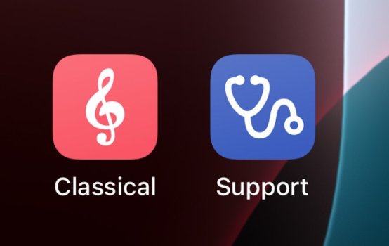
Both apps now feature Liquid Glass interface elements, such as more rounded buttons, floating navigation bars, and translucency in some areas. They also feature Liquid Glass app icons that look like multiple layers of glass stacked on one another.

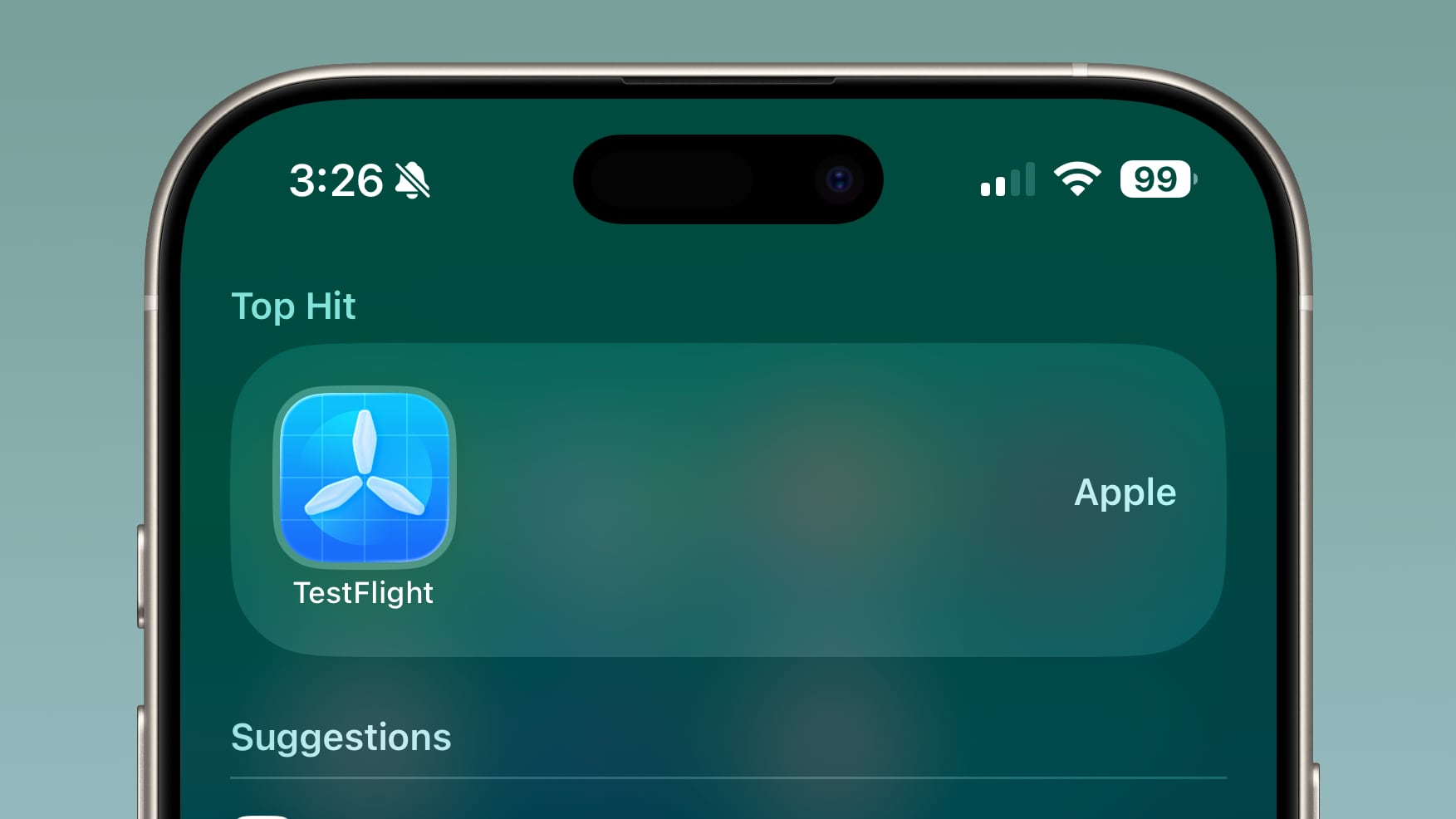
TestFlight got an icon overhaul, and the new design features simplified propellers that work better with the Liquid Glass look.

TestFlight is an app that allows iPhone users to download beta apps from developers for testing purposes. Apple says that TestFlight also includes Accessibility improvements, including VoiceOver, Voice Control, and Larger Text.

testflight-liquid-glass.jpg

TestFlight also appears to include a new Tester Matching feature that helps users discover apps they might like to try based on their interest.

Apple Support is Apple's dedicated app for getting help with your devices.

Both apps are free to download.

Article Link: More Apple Apps Get Liquid Glass Redesign
 
I do not understand the lack of consistency with these icons.

Why are the propellers on TestFlight not glass but, well, you know actual propellers, yet the envelope on Mail is some bizarre frosted glass variety that wouldn’t even survive a mailbox?

There are loads of examples on macOS, it just goes to show how flawed this concept is.

I'm assuming somebody thought "flight" ... launching new Apps = "taking flight!"... "propellers look cool and sort of make one think about planes ... and flight, kind of? Sort of? right? ... anyone with me here?"

It's really a bizarre icon when one thinks about it, to your point.
 
It's incomprehensible to me that Apple would change the UI to Liquid Glass in iOS 26, but not update all their own damn apps to utilize it right away. It's just not a great look. They knew what the UI was going to be long before the developer and public betas began, much less when the official 26.0 release occurred on 9/15. Someone(s) in Cupertino dropped the ball.
 
FOR IMMEDIATE RELEASE
Apple Unveils iOS 26: Now with 400% More Alien Skin Eye Candy™


Cupertino, CA — In a stunning display of courage, Apple today announced iOS 26 — a software update so glossy, so hyper-beveled, and so dripping in layer effects that the entire design team now suffers from permanent lens flare like they watched five J.J. Abrams movies back to back.

“People told us skeuomorphism was dead,” said Senior VP of Visuosity, Dorian Bling. “We disagreed — and then we found Alien Skin Eye Candy in an ancient USB archive labeled ‘Aqua, Do Not Touch.’ We knew what we had to do.”

The result? Every icon now looks like it’s been dunked in liquid glass, buffed by a cherub, and lit by a thousand-point light source from an alternate dimension. The Weather app animates rain so realistically it voids AppleCare if your phone gets wet looking at it. Messages now feature real-time chrome refraction physics — because texting your friend “ok” should shimmer.

“Eye Candy is no longer just a plugin,” said Bling. “It’s our philosophy. We built the OS around it. It’s Eye CandyOS now.”

When asked about performance, Apple confirmed that iOS 26 runs smoothly on any iPhone 17 Pro with at least 64GB of GPU memory. Devices older than 2024 will instead receive a nostalgic “flat” version, rendered entirely in grayscale out of shame.

Apple CEO Tim Apple concluded the announcement with trademark subtlety:

“Other companies innovate. We emboss.
 
Register on MacRumors! This sidebar will go away, and you'll see fewer ads.